
Product
A Fresh Look for the Socket Dashboard
We’ve redesigned the Socket dashboard with simpler navigation, less visual clutter, and a cleaner UI that highlights what really matters.
By André Staltz, Jeppe Hasseriis, Nolan Lawson - Jun 23, 2025
@engr-lukman/vue-secure-pin
Advanced tools
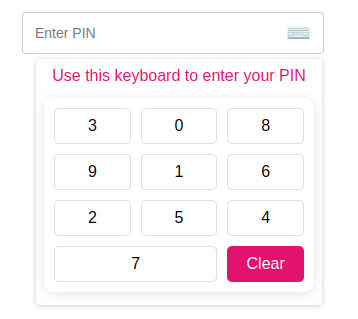
A secure PIN input component for Vue.js applications with virtual keyboard and PIN masking, designed for financial applications
A secure PIN input component for Vue.js applications with a virtual keyboard and PIN masking, specifically designed for financial applications.
Check out the interactive Storybook demo to see the component in action.
# Using npm
npm install @engr-lukman/vue-secure-pin
# Using yarn
yarn add @engr-lukman/vue-secure-pin
# Using pnpm
pnpm add @engr-lukman/vue-secure-pin
// main.ts
import { createApp } from "vue";
import App from "./App.vue";
import SecurePinPlugin from "@engr-lukman/vue-secure-pin";

const app = createApp(App);
app.use(SecurePinPlugin);
app.mount("#app");
// In your Vue component with script setup
import { SecurePin } from "@engr-lukman/vue-secure-pin";

// For Vue 3 script setup syntax
// No further registration needed
<template>
  <div>
    <SecurePin
      :max-length="5"
      :is-error="hasError"
      :error-message="errorMessage"
      :is-enable-shuffle="true"
      @callback-event="handlePinChange"
    />
  </div>
</template>

<script setup lang="ts">
import { ref } from 'vue';
import { SecurePin } from "@engr-lukman/vue-secure-pin";
import type { PinEventPayload } from "@engr-lukman/vue-secure-pin";

const hasError = ref<boolean>(false);
const errorMessage = ref<string>("");

const handlePinChange = (payload: PinEventPayload): void => {
  // Get the actual and masked PIN values
  const { pin, pinMasked } = payload;

  // Example validation
  if (pin === "12345") {
    hasError.value = false;
  } else if (pin.length === 5) {
    hasError.value = true;
    errorMessage.value = "Invalid PIN. Please try again.";
  }
};
</script>

// For Vue 3 Options API or Vue 2
export default {
  components: {
    SecurePin
  }
}
<template>
  <div class="form-group">
    <label>{{ $t("pin.label") }}</label>
    <secure-pin
      :max-length="5"
      :is-error="v$.pinMasked.$error"
      :error-message="v$.pinMasked.$errors[0]?.$message"
      :placeholder="$t('pin.placeholder')"
      :is-enable-shuffle="true"
      :show-keyboard="true"
      :title="$t('keyboard.title')"
      :clear-label="$t('keyboard.clear')"
      @callback-event="onPinHandler"
    />
  </div>
</template>

<script setup lang="ts">
import useVuelidate from "@vuelidate/core";
import { helpers, required } from "@vuelidate/validators";
import { reactive } from "vue";
import { useI18n } from "vue-i18n";

// Import the SecurePin component and its types
import { SecurePin } from "@engr-lukman/vue-secure-pin";
import type { PinEventPayload } from "@engr-lukman/vue-secure-pin";

const { t } = useI18n();

// Define validation rules
const rules = {
  pin: { required: helpers.withMessage(t("pin.required"), required) },
  pinMasked: {
    required: helpers.withMessage(t("pin.required"), required),
    policy: helpers.withMessage(
      t("pin.validation"),
      helpers.regex(/^[\d*]{4,5}$/)
    ),
  },
};

// Type-safe reactive form payload
interface PinPayload {
  pin: string;
  pinMasked: string;
}

const payload = reactive<PinPayload>({
  pin: "",
  pinMasked: "",
});

const v$ = useVuelidate(rules, payload, { $autoDirty: true });

// Type-safe callback handler
const onPinHandler = (event: PinEventPayload): void => {
  const { pin, pinMasked } = event;

  console.log("Actual PIN:", pin); // Shows "12345" (the actual PIN)
  console.log("Masked PIN:", pinMasked); // Shows "*****"

  payload.pin = pin;
  payload.pinMasked = pinMasked;
};
</script>
The Secure PIN component consists of:
| Prop | Type | Default | Description |
|---|---|---|---|
| maxLength | number | 5 | Maximum PIN length |
| isError | boolean | false | Shows error styling when true |
| errorMessage | string | "" | Error message to display |
| placeholder | string | "Enter PIN" | Placeholder text when empty |
| isEnableShuffle | boolean | true | Randomize keypad numbers for additional security |
| showKeyboard | boolean | true | Show keyboard when component loads |
| title | string | "Use this keyboard to enter your PIN" | Title above virtual keyboard |
| clearLabel | string | "Clear" | Label for the clear button |
| Event | Payload Type | Description |
|---|---|---|
| callbackEvent | PinEventPayload | Emitted when PIN value changes or clears |
// PinEventPayload interface
interface PinEventPayload {
  pin: string;       // Actual PIN value (e.g. "1234")
  pinMasked: string; // Masked PIN value (e.g. "****")
}
The component uses BEM-based CSS classes which you can target for styling. Below are the key CSS selectors you can customize:
.pin__field - The main input field container.pin__field--error - Error state styling.pin__error - Error message text.pin__display - PIN display area.numeric-keyboard - Main keyboard container.numeric-keyboard__button - Individual number keys.numeric-keyboard__button--clear - Clear buttonWhen using the component in Vue files with scoped styles, remember to use the :deep() selector (Vue 3) to target the component's internal elements.
<style scoped>
/* Target the pin field container */
:deep(.pin__field) {
  border-color: #3498db;
}

/* Target the keyboard buttons */
:deep(.numeric-keyboard__button) {
  background-color: #f8f9fa;
}
</style>
This package includes full TypeScript support with:
// Example of importing types
import { SecurePin } from '@engr-lukman/vue-secure-pin';
import type {
  SecurePinProps,
  PinEventPayload,
  SecurePinExpose
} from '@engr-lukman/vue-secure-pin';

// Type-safe component ref
const pinComponent = ref<InstanceType<typeof SecurePin> | null>(null);

// Access exposed methods with proper types
const clearPin = () => {
  pinComponent.value?.clearHandler();
};
MIT © 2025 Mohammad Lukman Hussain
FAQs
A secure PIN input component for Vue.js applications with virtual keyboard and PIN masking, designed for financial applications
The npm package @engr-lukman/vue-secure-pin receives a total of 9 weekly downloads. As such, @engr-lukman/vue-secure-pin popularity was classified as not popular.
We found that @engr-lukman/vue-secure-pin demonstrated a healthy version release cadence and project activity because the last version was released less than a year ago. It has 1 open source maintainer collaborating on the project.
Did you know?

Socket for GitHub automatically highlights issues in each pull request and monitors the health of all your open source dependencies. Discover the contents of your packages and block harmful activity before you install or update your dependencies.
Product
We’ve redesigned the Socket dashboard with simpler navigation, less visual clutter, and a cleaner UI that highlights what really matters.

Industry Insights
Terry O’Daniel, Head of Security at Amplitude, shares insights on building high-impact security teams, aligning with engineering, and why AI gives defenders a fighting chance.

Security News
MCP spec updated with structured tool output, stronger OAuth 2.1 security, resource indicators, and protocol cleanups for safer, more reliable AI workflows.