Huge News!Announcing our $40M Series B led by Abstract Ventures.Learn More →
@esri/calcite-colors
Advanced tools
@esri/calcite-colors - npm Package Compare versions
Comparing version 1.2.1 to 1.3.0
@@ -5,2 +5,7 @@ # Change Log | ||
| ## 1.3.0 - 2019-08-01 | ||
| ### Added | ||
| - :sparkles: new `ui-` and `ui-XXX-dark` variables | ||
| ## 1.2.1 - 2019-06-01 | ||
@@ -7,0 +12,0 @@ |
@@ -454,3 +454,31 @@ { | ||
| "blk-235": "#060606", | ||
| "blk-240": "#000000" | ||
| } | ||
| "blk-240": "#000000", | ||
| "ui-blue": "#007ac2", | ||
| "ui-blue-hover": "#2890ce", | ||
| "ui-blue-pressed": "#00619b", | ||
| "ui-green": "#35ac46", | ||
| "ui-green-hover": "#50ba5f", | ||
| "ui-green-pressed": "#288835", | ||
| "ui-yellow": "#edd317", | ||
| "ui-yellow-hover": "#f9e54e", | ||
| "ui-yellow-pressed": "#d9bc00", | ||
| "ui-red": "#d83020", | ||
| "ui-red-hover": "#e65240", | ||
| "ui-red-pressed": "#7c1d13", | ||
| "ui-background": "#f3f3f3", | ||
| "ui-foreground": "#353535", | ||
| "ui-blue-dark": "#3db8ff", | ||
| "ui-blue-hover-dark": "#59d6ff", | ||
| "ui-blue-pressed-dark": "#009af2", | ||
| "ui-green-dark": "#3bed52", | ||
| "ui-green-hover-dark": "#73ff84", | ||
| "ui-green-pressed-dark": "#00b81b", | ||
| "ui-yellow-dark": "#ffee33", | ||
| "ui-yellow-hover-dark": "#fff766", | ||
| "ui-yellow-pressed-dark": "#f5d000", | ||
| "ui-red-dark": "#ff0015", | ||
| "ui-red-hover-dark": "#ff624d", | ||
| "ui-red-pressed-dark": "#d90012", | ||
| "ui-background-dark": "#353535", | ||
| "ui-foreground-dark": "#f3f3f3" | ||
| } |
| { | ||
| "name": "@esri/calcite-colors", | ||
| "version": "1.2.1", | ||
| "version": "1.3.0", | ||
| "description": "Authoritative color variables for Esri", | ||
@@ -5,0 +5,0 @@ "private": false, |
@@ -19,2 +19,5 @@ # Calcite Colors | ||
| ## UI Colors | ||
| In both the SASS and JSON file are UI Color variables. These variables should be the standard usage of color for most applications. They'll serve as an easy way for users to grab the main usage colors, as well as staying consistent across applications. They include both Light and Dark theme variables. Dark theme variables have `-dark` appended. For example, the primary blue color in light theme is `$ui-blue`. In dark theme the primary blue is `$ui-blue-dark`. Additionally, both light and dark include variables for hover and pressed states (`$ui-blue-hover`, `$ui-red-pressed`) For more information and best practices visit the [Calcite Design System](https://calcite.esri.com) website [color section](https://calcite.esri.com/colors). | ||
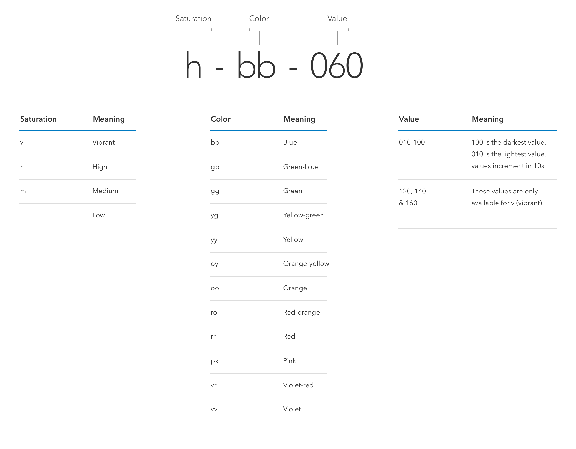
| ## Colors naming anatomy | ||
@@ -21,0 +24,0 @@  |
Sorry, the diff of this file is not supported yet
New alerts
License Policy Violation
LicenseThis package is not allowed per your license policy. Review the package's license to ensure compliance.
Found 1 instance in 1 package
Fixed alerts
License Policy Violation
LicenseThis package is not allowed per your license policy. Review the package's license to ensure compliance.
Found 1 instance in 1 package
Improved metrics
- Total package byte prevSize
- increased by32.07%
45870
- Number of package files
- increased by14.29%
8
- Lines of code
- increased by5.93%
482
- Number of lines in readme file
- increased by6.38%
50
No dependency changes