Product
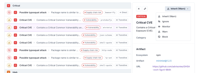
Introducing Enhanced Alert Actions and Triage Functionality
Socket now supports four distinct alert actions instead of the previous two, and alert triaging allows users to override the actions taken for all individual alerts.
@farbenmeer/react-spring-slider
Advanced tools
[](https://hitsofcode.com/view/github/farbenmeer/react-spring-slider)  [![Minified Size]
Readme
This is a slider which uses react-spring under the hood.
This project aims to be flexible through configuration as well as be easy to use by sane and reasonable defaults.
You can have a real life look how this can be used within storybook (source) at: farbenmeer.github.io/react-spring-slider.
yarn add @farbenmeer/react-spring-slider
// OR
npm install --save @farbenmeer/react-spring-slider
The module provides a default export which you can import and use in your own component.
import Slider from "@farbenmeer/react-spring-slider";

const App = () => {
	return (
		<Slider>
			<div>child 1</div>
			<div>child 2</div>
			<div>child 3</div>
		</Slider>
	);
};
The slider can gain any children as long as there are a react node, so you can show images, text or some more complex components.
You can also use Typescript as the package contains type definitions.
The slider currently provides the following interface:
| Name | Type | Default | Description |
|---|---|---|---|
| activeIndex | number | 0 | Controlles the shown index |
| ArrowComponent | function | - | A custom component for the arrows |
| auto | number | 0 | 0 = disabled auto sliding. Indicates the pausing time in milliseconds per slide before next slide is shown. |
| BulletComponent | function | - | A custom component for one bullet |
| BulletsComponent | function | - | A custom component for the bullets wrapper |
| bulletStyle | object | { } | custom styles for the bullets |
| children | node | [ ] | The children of the slider, every child is a single slide |
| hasArrows | boolean | false | Whether the slider should have arrows or not |
| hasBullets | boolean | false | Whether the slider should have bullets or not |
| onSlideChange | function | - | Callback which is triggered when the slides changed either manually or automatically |
| setSlideCustom | function | - | A function to overwrite the default setSlide behavior. |
| slidesAtOnce | number | 1 | A number which represents how many slides should be shown at once. |
| slidesToSlide | number | 1 | A number which represents how many slides should be slided with one interaction |
<Slider hasBullets bulletStyle={{ backgroundColor: "#fff" }}>
	<MySlide />
	<MySlide />
	<MySlide />
</Slider>
import Slider from "@farbenmeer/react-spring-slider";

const App = () => {
	const onSlideChange = (index) => console.log(`changed to slide ${index}`);
	const setSlideCustom = () => 1;

	const BulletComponent = ({ onClick, isActive }) => (
		<li
			style={{
				width: "25px",
				height: "25px",
				backgroundColor: "red",
				margin: "0 2px",
				opacity: isActive && "0.5",
			}}
			onClick={onClick}
		/>
	);

	BulletComponent.propTypes = {
		onClick: PropTypes.func.isRequired,
		isActive: PropTypes.bool.isRequired,
	};

	const ArrowComponent = ({ onClick, direction }) => {
		return (
			<div
				style={{
					border: "1px solid black",
					padding: "1em",
					backgroundColor: "white",
				}}
				onClick={onClick}
			>
				{direction}
			</div>
		);
	};

	ArrowComponent.propTypes = {
		onClick: PropTypes.func.isRequired,
		direction: PropTypes.string.isRequired,
	};

	return (
		<Slider
			activeIndex={2}
			slidesAtOnce={2}
			auto
			hasBullets
			BulletComponent={BulletComponent}
			ArrowComponent={ArrowComponent}
			onSlideChange={onSlideChange}
			setSlideCustom={setSlideCustom}
		>
			<div>child 1</div>
			<div>child 2</div>
			<div>child 3</div>
		</Slider>
	);
};
For more examples have a look at storybook (storybook source code).
See CONTRIBUTING.md
FAQs
[](https://hitsofcode.com/view/github/farbenmeer/react-spring-slider)  [![Minified Size]
The npm package @farbenmeer/react-spring-slider receives a total of 755 weekly downloads. As such, @farbenmeer/react-spring-slider popularity was classified as not popular.
We found that @farbenmeer/react-spring-slider demonstrated a not healthy version release cadence and project activity because the last version was released a year ago. It has 3 open source maintainers collaborating on the project.
Did you know?

Socket for GitHub automatically highlights issues in each pull request and monitors the health of all your open source dependencies. Discover the contents of your packages and block harmful activity before you install or update your dependencies.

Product
Socket now supports four distinct alert actions instead of the previous two, and alert triaging allows users to override the actions taken for all individual alerts.

Security News
Polyfill.io has been serving malware for months via its CDN, after the project's open source maintainer sold the service to a company based in China.

Security News
OpenSSF is warning open source maintainers to stay vigilant against reputation farming on GitHub, where users artificially inflate their status by manipulating interactions on closed issues and PRs.