Product
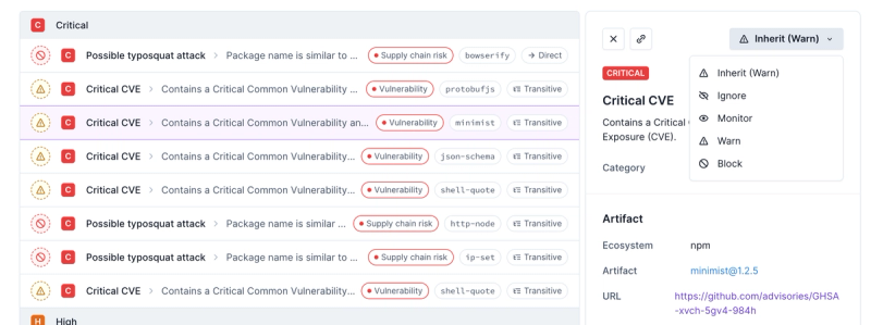
Introducing Enhanced Alert Actions and Triage Functionality
Socket now supports four distinct alert actions instead of the previous two, and alert triaging allows users to override the actions taken for all individual alerts.
@gemeente-denhaag/button
Advanced tools
Readme

Buttons are used for actions such as "Add", "Close", "Cancel" or "Save". Button labels indicate what action will take place when the user interacts with it.
Use buttons to communicate actions users can take and to allow users to interact with the page. Each page should have one primary button, and any remaining calls to action should be represented as lower emphasis buttons.
Use Link for navigation actions that appear within or immediately after a sentence.
The button consists of:
The button contains the states normal, hover, disabled and focus.
Large
Medium
Primary button
Secondary button
Primary button
Secondary button
Large
Medium
Primary button
Secondary button
Alert provide context and assist workflows for users with disabilities.
Users generally expect buttons to send data or take action, and to be able to navigate links. If navigation is required for the button component, use the url prop. The control displays an anchor in the form of a button, instead of a button in HTML, to convey this difference.
See links for more information on creating accessible links.
Buttons use the browser's default settings for keyboard interactions.
Buttons should be clear and predictable. Users should be able to anticipate what will happen when they select a button. Never mislead anyone by mislabeling a button.
Buttons should always lead with a strong verb that encourages action. To provide users with enough context, you can use the content formula {verb} + {noun} on buttons, except in the case of general actions such as "Done", "Close", "Cancel" or "OK".
Buttons must:
Buttons must:
Buttons are mainly used for actions such as "Add", "Close", "Cancel" or "Save". Regular buttons similar to links are used for less important or less frequently used actions, such as "View details".
Links are mainly used for navigation and usually appear in or immediately after a sentence.
The HTML displayed for the Button and Link components has meaning. Using these components intentionally and consistently results in:
https://uxmovement.com/buttons/5-rules-for-choosing-the-right-words-on-button-labels/
https://uxplanet.org/7-basic-rules-for-button-design-63dcdf5676b4
https://www.invisionapp.com/inside-design/comprehensive-guide-designing-ux-buttons/
FAQs
A Button component
We found that @gemeente-denhaag/button demonstrated a healthy version release cadence and project activity because the last version was released less than a year ago. It has 0 open source maintainers collaborating on the project.
Did you know?

Socket for GitHub automatically highlights issues in each pull request and monitors the health of all your open source dependencies. Discover the contents of your packages and block harmful activity before you install or update your dependencies.

Product
Socket now supports four distinct alert actions instead of the previous two, and alert triaging allows users to override the actions taken for all individual alerts.

Security News
Polyfill.io has been serving malware for months via its CDN, after the project's open source maintainer sold the service to a company based in China.

Security News
OpenSSF is warning open source maintainers to stay vigilant against reputation farming on GitHub, where users artificially inflate their status by manipulating interactions on closed issues and PRs.