
Security News
The Changelog Podcast: Practical Steps to Stay Safe on npm
Learn the essential steps every developer should take to stay secure on npm and reduce exposure to supply chain attacks.
By Sarah Gooding - Oct 31, 2025
@geometricpanda/storybook-addon-badges
Advanced tools
A Storybook addon which allows you to add badges to your stories
Using @geometricpanda/storybook-addon-badges you're able to add badges to
your Storybook app.
NPM:
npm install @geometricpanda/storybook-addon-badges --save
Yarn:
yarn add @geometricpanda/storybook-addon-badges
In your .storybook/main.ts you'll need to load @geometricpanda/storybook-addon-badges into Storybook:
// .storybook/main.ts
module.exports = {
  stories: [],
  addons: ['@geometricpanda/storybook-addon-badges'],
};
Optionally, you can define custom badge styles in .storybook/preview.ts.
// .storybook/preview.ts
import type { Preview } from "@storybook/react";
import { BADGE, BadgesConfig, BADGE_LOCATION } from "@geometricpanda/storybook-addon-badges";

const preview: Preview = {
  parameters: {
    badgesConfig: <BadgesConfig>{
      beta: {
        styles: {
          backgroundColor: '#FFF',
          borderColor: '#018786',
          color: '#018786',
        },
        location: [BADGE_LOCATION.TOOLBAR, BADGE_LOCATION.SIDEBAR],
        title: 'Beta',
      },
      deprecated: {
        styles: {
          backgroundColor: '#FFF',
          borderColor: '#6200EE',
          color: '#6200EE',
        },
        location: [BADGE_LOCATION.TOOLBAR_EXTRA],
        title: 'Deprecated',
      },
    },
  }
}

export default preview;
You can import a list of locations for badges using the following import:
import { BADGE_LOCATION } from "@geometricpanda/storybook-addon-badges";
You can then set the badge location via the config object:
badgesConfig: <BadgesConfig>{
  beta: {
    styles: {
      backgroundColor: "#FFF",
      borderColor: "#018786",
      color: "#018786"
    },
    location: [BADGE_LOCATION.TOOLBAR, BADGE_LOCATION.SIDEBAR],
    title: "Beta"
  }
};
If the location is not set, or the location array is empty, the badge will be displayed in the toolbar.
Please note that there is a known quirk of the sidebar location, which means that it only renders for the currently
active story.
As Storybook 7 has removed the addParameters method, we need to migrate to exporting a preview object.
Thankfully it's not too dissimilar to what we had before.
// .storybook/preview.ts
import { addParameters } from '@storybook/react';
import { BadgesConfig } from "@geometricpanda/storybook-addon-badges";

addParameters({
  badgesConfig: <BadgesConfig>{
    ...
  }
});
// .storybook/preview.ts
import type { Preview } from "@storybook/react";
import { BadgesConfig } from "@geometricpanda/storybook-addon-badges";

const preview: Preview = {
  parameters: {
    badgesConfig: <BadgesConfig>{
      ...
    },
  }
};

export default preview;
Please be aware that it's now advised that stories use CSF format with external MDX files just for the docs page. As such, this addon won't officially support MDX story format, but it'll probably work just fine.
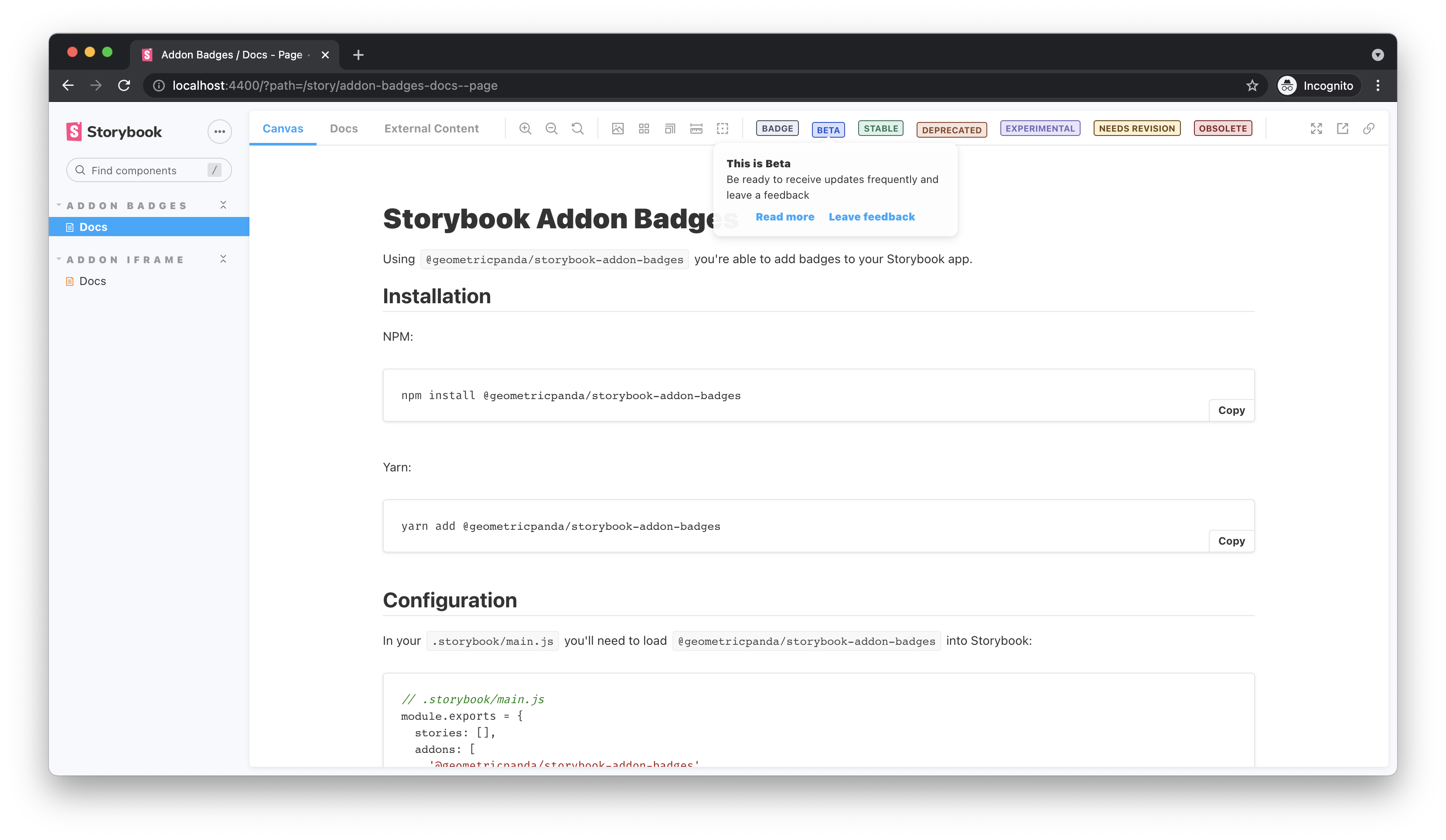
Optionally, you can define more complex tooltips for any of your badges.
// .storybook/preview.ts
import type { Preview } from "@storybook/react";
import { BADGE, BadgesConfig } from "@geometricpanda/storybook-addon-badges";

const preview: Preview = {
  parameters: {
    badgesConfig: <BadgesConfig>{
      beta: {
        tooltip: {
          title: 'This is Beta',
          desc: 'Be ready to receive updates frequently and leave a feedback',
          links: [
            { title: 'Read more', href: 'http://path/to/your/docs' },
            {
              title: 'Leave feedback',
              onClick: () => {
                alert('thanks for the feedback');
              },
            },
          ],
        },
      },
      deprecated: {
        title: "Deprecated",
        tooltip: 'This component is deprecated, please avoid using it.',
      },
    },
  }
};

export default preview;
The key for each badge will be what's used throughout storybook to invoke that badge.
I tend to define each key as an enum when using TypeScript, or even an Object in plain JavaScript
to avoid using magic strings.
Don't worry if you haven't defined a badge which you use later, any badges which aren't recognised fall back to the default preconfigured grey.
Tip: If you prefer, instead of using the addParameters function, you can also
export const parameters containing a full parameters object.
// .storybook/constants.ts
export enum BADGES {
  STATUS = 'status',
}
// .storybook/preview.ts
import type { Preview } from "@storybook/react";
import { BADGE, BadgesConfig } from "@geometricpanda/storybook-addon-badges";

const preview: Preview = {
  parameters: {
    badgesConfig: <BadgesConfig>{
      [BADGE.STATUS]: {
        styles: {
          backgroundColor: '#FFF',
          borderColor: '#018786',
          color: '#018786',
        },
        title: 'Status',
      },
    },
  }
};

export default preview;
You can import a collection of preconfigured badges using the following import:
import { BADGE } from '@geometricpanda/storybook-addon-badges';
You can then use these badges by passing in the following enum values:
BADGE.DEFAULTBADGE.BETABADGE.STABLEBADGE.DEPRECATEDBADGE.EXPERIMENTALBADGE.NEEDS_REVISIONBADGE.OBSOLETEShould you wish to override these styles you can do by configuring a badge with the same key:
// .storybook/preview.ts
import type { Preview } from "@storybook/react";
import { BADGE, BadgesConfig } from "@geometricpanda/storybook-addon-badges";

const preview: Preview = {
  parameters: {
    badgesConfig: <BadgeConfig>{
      [BADGE.STATUS]: {
        styles: {
          backgroundColor: '#FFF',
          borderColor: '#018786',
          color: '#018786',
        },
        title: 'Status',
      },
    },
  }
}

export default preview;
Valid options for the styles configuration are:
backgroundColorborderColorborderRadiusborderStyleborderWidthcolorfontSizefontFamilyfontWeightlineHeighttextTransformpaddingInlinepaddingBlockThe previous color and contrast properties have been deprecated and have now been removed.
Please migrate to the styles property.
The following will apply the badges to all components within your Story:
import { BADGE } from '@geometricpanda/storybook-addon-badges';

export default {
  title: 'Path/To/MyComponent',
  parameters: {
    badges: [
      BADGE.DEPRECATED,
      BADGE.OBSOLETE
    ],
  },
};

const Template = () => <h1>Hello World</h1>;

export const FirstComponent = Template.bind({});
export const SecondComponent = Template.bind({});
export const ThirdComponent = Template.bind({});
You can also selectively add badges to each Story:
import { BADGE } from '@geometricpanda/storybook-addon-badges';

export default {
  title: 'Path/To/MyComponent',
};

const Template = () => <h1>Hello World</h1>;

export const FirstComponent = Template.bind({});
FirstComponent.parameters = {
  badges: [BADGE.DEPRECATED],
};

export const SecondComponent = Template.bind({});
SecondComponent.parameters = {
  badges: [BADGE.STABLE],
};

export const ThirdComponent = Template.bind({});
ThirdComponent.parameters = {
  badges: [BADGE.OBSOLETE],
};
When applying Badges to all Stories you can selectively remove them too:
import { BADGE } from '@geometricpanda/storybook-addon-badges';

export default {
  title: 'Path/To/MyComponent',
  parameters: {
    badges: [BADGE.BETA],
  },
};

const Template = () => <h1>Hello World</h1>;

export const FirstComponent = Template.bind({});
export const SecondComponent = Template.bind({});

export const ThirdComponent = Template.bind({});
ThirdComponent.parameters = {
  badges: [],
};
FAQs
A Storybook addon which allows you to add badges to your stories
We found that @geometricpanda/storybook-addon-badges demonstrated a not healthy version release cadence and project activity because the last version was released a year ago. It has 1 open source maintainer collaborating on the project.
Did you know?

Socket for GitHub automatically highlights issues in each pull request and monitors the health of all your open source dependencies. Discover the contents of your packages and block harmful activity before you install or update your dependencies.
Security News
Learn the essential steps every developer should take to stay secure on npm and reduce exposure to supply chain attacks.

Security News
Experts push back on new claims about AI-driven ransomware, warning that hype and sponsored research are distorting how the threat is understood.

Security News
Ruby's creator Matz assumes control of RubyGems and Bundler repositories while former maintainers agree to step back and transfer all rights to end the dispute.