Product
Introducing Rust Support in Socket
Socket now supports Rust and Cargo, offering package search for all users and experimental SBOM generation for enterprise projects.
@guillotinaweb/pastanaga-angular
Advanced tools
Provides Pastanaga UI elements as Angular components
Pastanaga Angular is an Angular implementation of Pastanaga design system offering a set of re-usable UI components which are covering typical needs of any web application. It is maintained by Plone and Guillotina communities. It aims to remain simple, and pays particular attention to:
See https://plone.github.io/pastanaga-angular for usage examples and developer guide.
You can install Pastanaga-angular using its npm package:
npm install @guillotinaweb/pastanaga-angular
yarn add @guillotinaweb/pastanaga-angular
But if you want to build your own demo application using pastanaga demo components, you need to install it using mrs-developer:
mrs-developer if you don't already have it:yarn add mrs-developer
mrs.developer.json configuration (you can choose a specific tag as below, or a branch):{
"pastanaga-angular": {
"url": "git@github.com:plone/pastanaga-angular.git",
"https": "https://github.com/plone/pastanaga-angular.git",
"path": "/projects/pastanaga-angular/src",
"package": "@guillotinaweb/pastanaga-angular",
"tag": "2.68.2"
}
}
missdev:missdev
Note:
By default, missdev will install the dependencies in src/dev folder.
If you're in a workspace with a mono-repository structure (using nx for instance), then you probably want to install pastanaga-angular in your libs folder.
You can do so by using missdev --output option:
missdev --output=../libs
Pastanaga-angular requires two files (pastanaga-core-overrides.scss and pastanaga-component-overrides.scss) to be in the src folder of any project using it.
In order for those files to be found during the compilation, you have to add src folder in style preprocessing options of angular.json:
    "stylePreprocessorOptions": {
        "includePaths": [
            "src"
        ]
    }
Pastanaga-angular is using Poppins fonts and Quanta glyphs.
If you want to use the same fonts and glyphs sprite, declare Pastanaga assets in angular.json:
{
  "assets": [
    "src/favicon.ico",
    "src/assets",
    {
      "glob": "**/*",
      "input": "./node_modules/@guillotinaweb/pastanaga-angular/assets",
      "output": "assets"
    }
  ]
}
{
  "assets": [
    "src/favicon.ico",
    "src/assets",
    {
      "glob": "**/*",
      "input": "./src/develop/pastanaga-angular/projects/pastanaga-angular/assets",
      "output": "assets"
    }
  ]
}
Import Pastanaga core style in your application style (usually src/styles.scss):
@use '~@guillotinaweb/pastanaga-angular/lib/styles/core';
@use './develop/pastanaga-angular/projects/pastanaga-angular/lib/styles/core';
If you want to use Pastanaga fonts in your application, you need to and import Pastanaga fonts in your application style as well:
@use '~@guillotinaweb/pastanaga-angular/lib/styles/theme/fonts';
mrs-developer@use './develop/pastanaga-angular/projects/pastanaga-angular/lib/styles/theme/fonts';
Pastanaga theme is defined in src/lib/styles/theme folder. Any variable with !default suffix can be overwritten.
Pastanaga theme is built around token. For example, _palette.token.scss contains all the colors used in Pastanaga with general token names (e.g. $color-neutral-regular, $color-primary-stronger).
See the full list in https://plone.github.io/pastanaga-angular/palette.
Then, some components have a second layer of tokens. For example buttons have a list of tokens for each aspect and kind (e.g. $color-text-button-primary-solid, $color-background-button-primary-solid,…).
So you can have your own theme by overwriting the whole color palette or just by changing some aspects of some components.
If you have your own theme, you can override Pastanaga theme by creating a file _overrides.scss forwarding all the Pastanaga token files and overriding the ones you need, and loading it before loading Pastanaga cores in your main style.
In the following example, we have a monorepo with a lib containing our theme next to Pastanaga library. In our theme library we have a file _overrides.scss as follow:
// core
@forward '../theme/fonts';
@forward '../theme/tokens/palette.tokens';
@forward '../theme/tokens/spacing.tokens';
@forward '../theme/tokens/typography.tokens';
@forward '../theme/tokens/scrollbar.tokens';
@forward '../../pastanaga-angular/projects/pastanaga-angular/src/styles/theme/shadows.tokens';
@forward '../../pastanaga-angular/projects/pastanaga-angular/src/styles/theme/transitions.tokens';
@forward '../../pastanaga-angular/projects/pastanaga-angular/src/styles/theme/z-index.tokens';
@forward '../../pastanaga-angular/projects/pastanaga-angular/src/styles/theme/layout.tokens';

// components
@forward '../../pastanaga-angular/projects/pastanaga-angular/src/styles/theme/avatar.tokens';
@forward '../theme/tokens/body.tokens';
@forward '../theme/tokens/buttons.tokens';
@forward '../theme/tokens/card.tokens';
@forward '../theme/tokens/chips.tokens';
@forward '../../pastanaga-angular/projects/pastanaga-angular/src/styles/theme/icon.tokens';
@forward '../theme/tokens/expander.tokens';
@forward '../theme/tokens/menu.tokens';
@forward '../theme/tokens/modal.tokens';
@forward '../theme/tokens/popover.tokens';
@forward '../theme/tokens/table.tokens';
@forward '../theme/tokens/tabs.tokens';
@forward '../theme/tokens/textfield.tokens';
@forward '../theme/tokens/toasts.tokens';
@forward '../theme/tokens/toggle.tokens';
@forward '../../pastanaga-angular/projects/pastanaga-angular/src/styles/theme/tooltip.tokens';

// Utility scss functions and mixin
@forward '../../pastanaga-angular/projects/pastanaga-angular/src/styles/utils';
Then in each of our theme file, we can override the token we want by using Sass @forward with syntax. In our example above, _body.tokens.scss is as followed:
@use '../tokens/palette.tokens' as palette;
@use '../tokens/typography.tokens' as typography;
@forward '../../../pastanaga-angular/projects/pastanaga-angular/src/styles/theme/body.tokens'
  with(
    $color-text-link-regular: inherit,
    $color-text-link-regular-hover: inherit,
    $color-text-disabled: palette.$color-neutral-regular,
    $font-weight-label: typography.$font-weight-regular
  );
Overriding the palette is possible but a bit different as Pastanaga palette is defining Sass variables using pure CSS variable like
$color-neutral-regular: var(--color-neutral-regular, hsl(207, 17%, 58%)) !default;
Overriding them is done by defining CSS variables, like for example:
@forward '../../../pastanaga-angular/projects/pastanaga-angular/src/styles/theme/palette.tokens';
:root {
  --color-dark-stronger: #000;
  --color-light-stronger: #fff;

  --color-neutral-regular: hsl(0, 0%, 44%);
  --color-neutral-light: hsl(0, 0%, 77%);
  --color-neutral-lighter: hsl(0, 0%, 90%);
  --color-neutral-lightest: hsl(240, 7%, 97%);

  --color-primary-stronger: hsl(249, 100%, 24%);
  --color-primary-strong: hsl(249, 100%, 40%);
  --color-primary-regular: hsl(249, 100%, 50%);
  --color-primary-light: hsl(249, 100%, 65%);
  --color-primary-lighter: hsl(249, 100%, 92%);
  --color-primary-lightest: hsl(249, 100%, 96%);

  --color-secondary-stronger: hsl(336, 100%, 24%);
  --color-secondary-strong: hsl(336, 100%, 36%);
  --color-secondary-regular: hsl(336, 100%, 50%);
  --color-secondary-light: hsl(336, 100%, 73%);
  --color-secondary-lighter: hsl(336, 100%, 90%);
  --color-secondary-lightest: hsl(336, 100%, 96%);
}
In Pastanaga 2+, we prefix all modules with Pa: ButtonModule becomes PaButtonModule.
Pastanaga now contains some useful types for properties configuring several components:
Kind: primary | secondary | destructive | invertedSize: tee-shirt size going from small to xxlarge. Not all sizes are available for all componentsWe changed the way to configure buttons:
color is now managed by kind propertysize is now expecting to be one of the values of Size typeborder property is replaced by aspect which can be solid or basicSee https://plone.github.io/pastanaga-angular/button for full documentation.
pa-icon is now using a svg sprites to display icons by name. You can still provide a full path to display any other image though.
See https://plone.github.io/pastanaga-angular/icon for full documentation.
We changed form elements hierarchy: now they are all in the same place under controls folder.
They still belong to two distinct modules (PaTextFieldModule and PaTogglesModule).
All controls are sharing some properties:
PaFormControlDirective is the base class containing common properties (like id, name, disabled…) for all form elements componentsNativeTextFieldDirective is extending PaFormControlDirective and contains common properties for all text field elements (like placeholder, value, readonly,…)2.69.4 (2025-06-19)
FAQs
Provides Pastanaga UI elements as Angular components
The npm package @guillotinaweb/pastanaga-angular receives a total of 27 weekly downloads. As such, @guillotinaweb/pastanaga-angular popularity was classified as not popular.
We found that @guillotinaweb/pastanaga-angular demonstrated a healthy version release cadence and project activity because the last version was released less than a year ago. It has 7 open source maintainers collaborating on the project.
Did you know?

Socket for GitHub automatically highlights issues in each pull request and monitors the health of all your open source dependencies. Discover the contents of your packages and block harmful activity before you install or update your dependencies.

Product
Socket now supports Rust and Cargo, offering package search for all users and experimental SBOM generation for enterprise projects.

Product
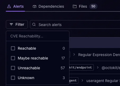
Socket’s precomputed reachability slashes false positives by flagging up to 80% of vulnerabilities as irrelevant, with no setup and instant results.

Product
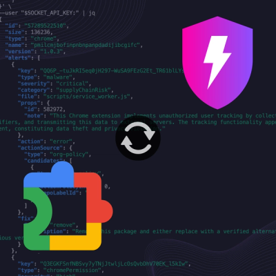
Socket is launching experimental protection for Chrome extensions, scanning for malware and risky permissions to prevent silent supply chain attacks.