Research
Malicious NuGet Packages Typosquat Nethereum to Exfiltrate Wallet Keys
The Socket Threat Research Team uncovered malicious NuGet packages typosquatting the popular Nethereum project to steal wallet keys.
@hreimer/angular-image-viewer
Advanced tools
A configurable Angular image viewer component, compatible with Angular 11.x+
A configurable Angular image viewer component, compatible with Angular 11.x+
npm install @hreimer/angular-image-viewer
Note: Refer to the official links how to set-up your app if you want to use FontAwesome Icons (https://github.com/FortAwesome/angular-fontawesome) or Material Icons (https://material.angular.io/guide/getting-started).
To use default configuration, simply import the ImageViewerModule into your module, like so:
import { AngularImageViewerModule } from "@hreimer/angular-image-viewer";

@NgModule({
  //...
  imports: [
    //...
    AngularImageViewerModule
  ],
  //...
})
Then, add the component to your template, providing an array of image URLs. You can also optionally add an index, to indicate which image should be shown first. The default will be the first item in the array.
<angular-image-viewer [src]="images" [(index)]="imageIndex"></angular-image-viewer>
By default, the image viewer will fill its container. If you wish to restrict the size, simply place it within a div, and set the size constraints on the div.
Configuration can be provided at the module level (by passing the object as an argument to forRoot(), or at the component level, by passing it as the config input. Any configuration provided at the component level will override that which is set at the module level.
The configuration object is structured as below. All values are optional, and if omitted, the default value shown below will be used.
{
  btnContainerClass: '',            // The CSS class(es) to be applied to the button container
  btnClass: 'default',              // The CSS class(es) that will be applied to the buttons e.g. default is needed for FontAwesome icons, while not needed for Material Icons
  btnSubClass: 'material-icons',    // The CSS class(es) that will be applied to span elements inside material buttons (a Elements)
  zoomFactor: 0.1,                  // The amount that the scale will be increased by
  containerBackgroundColor: '#ccc', // The color to use for the background. This can provided in hex, or rgb(a).
  wheelZoom: true,                  // If true, the mouse wheel can be used to zoom in
  allowFullscreen: true,            // If true, the fullscreen button will be shown, allowing the user to enter fullscreen mode
  allowKeyboardNavigation: true,    // If true, the left / right arrow keys can be used for navigation
  btnShow: {                        // Control which icons should be visible
    zoomIn: true,
    zoomOut: true,
    rotateClockwise: true,
    rotateCounterClockwise: true,
    next: true,
    prev: true,
    reset: true
  },
  btnIcons: {                       // The icon classes that will apply to the buttons. By default, font-awesome is used.
    zoomIn: {
      classes: 'fas fa-plus',        // this property will be used for FontAwesome and other libraries to set the icons via the classes - choose one: classes or text
      text: 'zoom_in'               // this property will be used for Material-Icons and similar libraries to set the icons via the text
    },
    zoomOut: {
      classes: 'fas fa-minus',
      text: 'zoom_out'
    },
    rotateClockwise:  {
      classes: 'fas fa-repeat',
      text: 'rotate_right'
    },
    rotateCounterClockwise:  {
      classes: 'fas fa-undo',
      text: 'rotate_left'
    },
    next:  {
      classes: 'fas fa-arrow-right',
      text: 'arrow_right'
    },
    prev:  {
      classes: 'fas fa-arrow-left',
      text: 'arrow_left'
    },
    fullscreen:  {
      classes: 'fas fa-arrows-alt',
      text: 'fullscreen'
    },
    reset:  {
      classes: 'fas fa-undo',
      text: 'restore'
    }
  }
};
To add additional buttons use the following
<angular-image-viewer [src]="images"
                  [config]="{
                    customBtns: [
                      {
                        name: 'link',
                        icon: {
                          classes: 'fas fa-paperclip',
                          text: 'link'
                        }
                      }
                    ]
                  }"
                  (customImageEvent)="handleEvent($event)">
</angular-image-viewer>
handleEvent(event: customImageEvent) {
    console.log(`${event.name} has been clicked on img ${event.imageIndex + 1}`);

    switch (event.name) {
      case 'print':
        console.log('run print logic');
        break;
    }
}
Note: This package builts on the idea from angular-x-image-viewer (https://github.com/deepakgonda/angular-image-viewer) and adds support for Material Icons as well as introduces a Reset Button and structures the buttons horizontally in another customisable container.
FAQs
A configurable Angular image viewer component, compatible with Angular 11.x+
We found that @hreimer/angular-image-viewer demonstrated a not healthy version release cadence and project activity because the last version was released a year ago. It has 1 open source maintainer collaborating on the project.
Did you know?

Socket for GitHub automatically highlights issues in each pull request and monitors the health of all your open source dependencies. Discover the contents of your packages and block harmful activity before you install or update your dependencies.

Research
The Socket Threat Research Team uncovered malicious NuGet packages typosquatting the popular Nethereum project to steal wallet keys.

Product
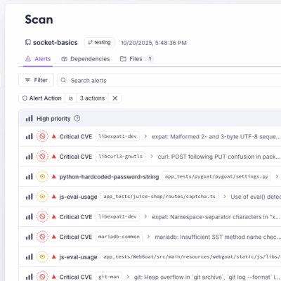
A single platform for static analysis, secrets detection, container scanning, and CVE checks—built on trusted open source tools, ready to run out of the box.

Product
Socket is launching experimental protection for the Hugging Face ecosystem, scanning for malware and malicious payload injections inside model files to prevent silent AI supply chain attacks.