Product
Announcing Precomputed Reachability Analysis in Socket
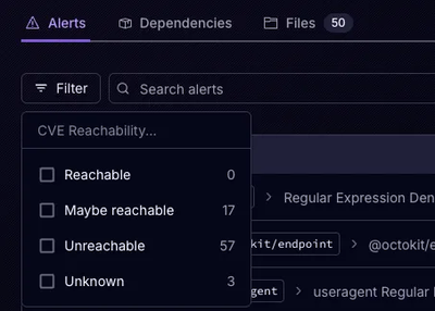
Socket’s precomputed reachability slashes false positives by flagging up to 80% of vulnerabilities as irrelevant, with no setup and instant results.
@icons-pack/react-simple-icons
Advanced tools
This package provides the Simple Icons packaged as a set of React components.
This package provides the Simple Icons 15.7.0 packaged as a set of React components.
Install the package in your project directory with:
# with yarn
yarn add @icons-pack/react-simple-icons
# with npm
npm add @icons-pack/react-simple-icons
# with pnpm
pnpm add @icons-pack/react-simple-icons
# with bun
bun add @icons-pack/react-simple-icons
TypeScript Support
You can use simpleicons.org to find a specific icon. When importing an icon, keep in mind that the names of the icons are upperCamelCase , for instance:
Material Design is exposed as
{ SiMaterialdesign } from @icons-pack/react-simple-iconsazure devOps is exposed as
{ SiAzuredevops } from @icons-pack/react-simple-iconsimport { SiReact } from '@icons-pack/react-simple-icons';
function BasicExample() {
return <SiReact color='#61DAFB' size={24} />;
}
@icons-pack/react-simple-icons provides a default title referring to the component name
The
<title>element provides an accessible, short-text description of any SVG container element or graphics element.
import { SiReact } from '@icons-pack/react-simple-icons';

// title default "React"
function ChangeTitle() {
  return <SiReact title='My title' color='#61DAFB' size={24} />;
}
Set color as default to use the default color for each icon
import { SiReact } from '@icons-pack/react-simple-icons';

function DefaultColorExample() {
  return <SiReact color='default' size={24} />;
}
Append Hex to the icon name to use the default color as hex string
import { SiReact, SiReactHex } from '@icons-pack/react-simple-icons';

function DefaultColorExample() {
  return <SiReact color={SiReactHex} size={24} />;
}
import { SiReact } from '@icons-pack/react-simple-icons';

function CustomStyles() {
  return <SiReact className='myStyle' />;
}
.myStyle {
  width: 35px;
  height: 35px;
}
FAQs
This package provides the Simple Icons packaged as a set of React components.
We found that @icons-pack/react-simple-icons demonstrated a healthy version release cadence and project activity because the last version was released less than a year ago. It has 0 open source maintainers collaborating on the project.
Did you know?

Socket for GitHub automatically highlights issues in each pull request and monitors the health of all your open source dependencies. Discover the contents of your packages and block harmful activity before you install or update your dependencies.

Product
Socket’s precomputed reachability slashes false positives by flagging up to 80% of vulnerabilities as irrelevant, with no setup and instant results.

Product
Socket is launching experimental protection for Chrome extensions, scanning for malware and risky permissions to prevent silent supply chain attacks.

Product
Add secure dependency scanning to Claude Desktop with Socket MCP, a one-click extension that keeps your coding conversations safe from malicious packages.