
Product
Introducing Webhook Events for Alert Changes
Add real-time Socket webhook events to your workflows to automatically receive software supply chain alert changes in real time.
By Phil Gates-Idem - Nov 21, 2025
@innovatrics/dot-auto-capture-ui
Advanced tools
Innovatrics Auto Capture UI Component. Does not work as a standalone component. Recommended to be used with:
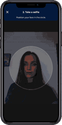
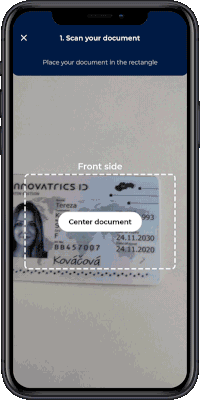
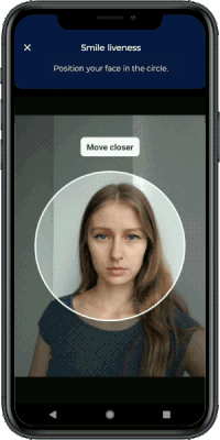
Innovatrics Auto Capture UI Component is a web component that renders an overlay over the video stream. The overlay includes a placeholder, camera control buttons and instructions to guide the user to position their face, their palm or their ID document correctly.
The Auto Capture UI Component can be used alongside other components to develop remote identity verification or digital onboarding solutions, as demonstrated in this demo application.
You can also check out the integration samples in various technologies (React, Vue, Angular, jQuery).
IMPORTANT: For this component to work, it is highly recommended to be used along with Face Auto Capture Component, Document Auto Capture Component, Multi-Range Liveness Component, MagnifEye Liveness Component, Smile Liveness Component or Palm Capture Component installed in your project. You can learn more about why this is important on our developers portal.
Integration with Face Auto Capture Component:
Both components must be wrapped in parent div with position: relative.
<div style={{position: "relative"}}>
  <FaceCamera
    onPhotoTaken={handlePhotoTaken}
    onError={onError}
  />
  <FaceUi />
</div>
Or you can see an example in documentation
Integration with Document Auto Capture Component:
Both components must be wrapped in parent div with position: relative.
<div style={{position: "relative"}}>
  <DocumentCamera
    onPhotoTaken={handlePhotoTaken}
    onError={onError}
  />
  <DocumentUi />
</div>
Or you can see an example in documentation
Integration with Multi-Range Liveness Component:
Both components must be wrapped in parent div with position: relative and overflow: hidden.
<div style={{position: "relative", overflow: "hidden"}}>
  <MultiRangeLiveness
      onComplete={handleOnComplete}
      onError={handleError}
      challengeSequence={["ONE", "THREE", "FIVE", "ZERO"]} // Challenge needs to be obtained from the API call to the Digital Identity Service
      transactionCountingToken="provide-the-token-here"
  />
  <MultiRangeLivenessUi showCameraButtons/>
</div>
Or you can see an example in documentation
Integration with MagnifEye Liveness Component:
Both components must be wrapped in parent div with position: relative and overflow: hidden.
<div style={{position: "relative", overflow: "hidden"}}>
   <MagnifEyeLiveness
      onComplete={handleOnComplete}
      onError={handleOnError}
    />
  <MagnifEyeLivenessUi showCameraButtons/>
</div>
Or you can see an example in documentation
Integration with Smile Liveness Component:
Both components must be wrapped in parent div with position: relative and overflow: hidden.
<div style={{position: 'relative', overflow: 'hidden'}}>
   <SmileLiveness
      onComplete={handleOnComplete}
      onError={handleOnError}
    />
  <SmileLivenessUi showCameraButtons/>
</div>
Or you can see an example in documentation
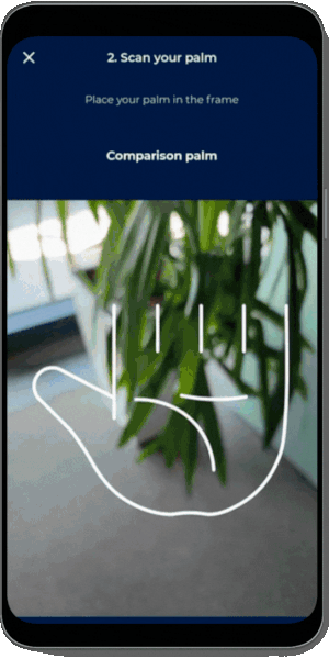
Integration with Palm Capture Component:
Both components must be wrapped in parent div with position: relative.
<div style={{position: 'relative'}}>
   <PalmCapture
      onPhotoTaken={handlePhotoTaken}
      onError={handleOnError}
    />
  <PalmUi showCameraButtons/>
</div>
Or you can see an example in documentation
Installation of the package is available via NPM, PNPM or Yarn:
Using NPM:
$ npm install @innovatrics/dot-auto-capture-ui
Using PNPM:
$ pnpm add @innovatrics/dot-auto-capture-ui
Using Yarn:
$ yarn add @innovatrics/dot-auto-capture-ui
The Auto Capture UI Component is a web component which uses custom HTML tag. Properties need to be passed into the component after the tag was rendered.
Head to our developers portal to learn more about:
Face Auto Capture Component changelog here.
Document Auto Capture Component changelog here.
Multi-Range Liveness Component changelog here.
MagnifEye Liveness Component changelog here.
Smile Liveness Component changelog here.
Palm Capture Component changelog here.
The Auto Capture UI Component is available under Innovatrics proprietary license.
The component can be used in a freemium mode without a license agreement. However, please note that the free version includes a watermark overlay in the component.
To obtain a license agreement and use the component without the overlay, please contact us at support@innovatrics.com.
FAQs
Digital onboarding UI
The npm package @innovatrics/dot-auto-capture-ui receives a total of 3,481 weekly downloads. As such, @innovatrics/dot-auto-capture-ui popularity was classified as popular.
We found that @innovatrics/dot-auto-capture-ui demonstrated a healthy version release cadence and project activity because the last version was released less than a year ago. It has 8 open source maintainers collaborating on the project.
Did you know?

Socket for GitHub automatically highlights issues in each pull request and monitors the health of all your open source dependencies. Discover the contents of your packages and block harmful activity before you install or update your dependencies.
Product
Add real-time Socket webhook events to your workflows to automatically receive software supply chain alert changes in real time.

Security News
ENISA has become a CVE Program Root, giving the EU a central authority for coordinating vulnerability reporting, disclosure, and cross-border response.

Product
Socket now scans OpenVSX extensions, giving teams early detection of risky behaviors, hidden capabilities, and supply chain threats in developer tools.