Product
Introducing License Enforcement in Socket
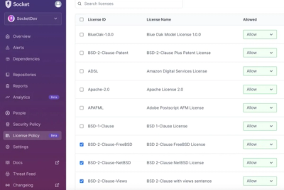
Ensure open-source compliance with Socket’s License Enforcement Beta. Set up your License Policy and secure your software!
@locaop/icon-picker
Advanced tools

@locaop/icon-picker is a strongly typed React Icons picker for font-awesome icons. It contains both a picker component and an icon renderer.
Includes all icons: Font Awesome 5
Mainly includes social icons: Phosphor Icons
I feel like an icon picker is a pretty common requirement so I was surprised to find a lack of sufficient icon pickers in the React Ecosystem. The existing ones I found were not that great. As a result, I decided to roll my own.
Install via npm
npm i @locaop/icon-picker
or yarn
yarn add @locaop/icon-picker
The IconPicker component is just like any other picker component. The value prop is the icon that is displayed on the picker. When a new icon is selected, the onChange handler is fired.
import * as React from 'react'
import { IconPicker } from '@locaop/icon-picker'

export default () => {
  const [value, setValue] = useState("")
  return (
    <IconPicker value={value} onChange={(v) => setValue(v)} />
  )
}
You can also use the IconPickerItem component to render the icon. This uses react-icons under the hood.
import * as React from 'react'
import { IconPickerItem } from '@locaop/icon-picker'

export default () => (
  <IconPickerItem icon="FaAdobe" size={24} color="#000" />
  )
IconPicker
| Prop | Type | Required | Description |
|---|---|---|---|
| value | string | true | The current font awesome icon displayed on the picker. |
| onChange | (v: string) => void | true | A change handler that is executed when a new icon is selected. |
| hideSearch | boolean | false | If true, the search input is not displayed. Default is false. |
| containerStyles | StyleType | false | Styles for the picker container |
| pickerContainerStyles | StyleType | false | Styles for the picker button |
IconPickerItem
| Prop | Type | Required | Description |
|---|---|---|---|
| icon | string | true | The name of the icon to render. Example: "FaAdobe" |
| size | number | false | The size of the icon. Default: 24 |
| color | string | false | The color of the icon. Default: "#3a3a3a" |
| onClick | (v: string) => void | false | An onClick handler for the icon. |
If you are interested in contributing, please submit a PR.
This project is licensed under the ISC License. See the LICENSE file for details.
This library is a fork of DATechnologies/react-fa-icon-picker.
FAQs
This is an icon picker for react-icons.
We found that @locaop/icon-picker demonstrated a healthy version release cadence and project activity because the last version was released less than a year ago. It has 0 open source maintainers collaborating on the project.
Did you know?

Socket for GitHub automatically highlights issues in each pull request and monitors the health of all your open source dependencies. Discover the contents of your packages and block harmful activity before you install or update your dependencies.

Product
Ensure open-source compliance with Socket’s License Enforcement Beta. Set up your License Policy and secure your software!

Product
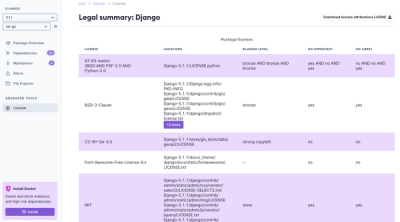
We're launching a new set of license analysis and compliance features for analyzing, managing, and complying with licenses across a range of supported languages and ecosystems.

Product
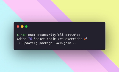
We're excited to introduce Socket Optimize, a powerful CLI command to secure open source dependencies with tested, optimized package overrides.