

Security News
Deno Goes the Way of the Dinosaur
Cloudflare is acquiring Deno’s team, which will provide another year of bug fixes and security updates before ending support for the runtime.
By Sarah Gooding - Oct 16, 2026
@maple-kit/ui
Advanced tools
Maple's composed reviewer parts: the marks and the ring, the island, and the composer. The surface a person actually touches on a preview deployment.
Pre-release. Every package here is 0.x and makes no compatibility promise.
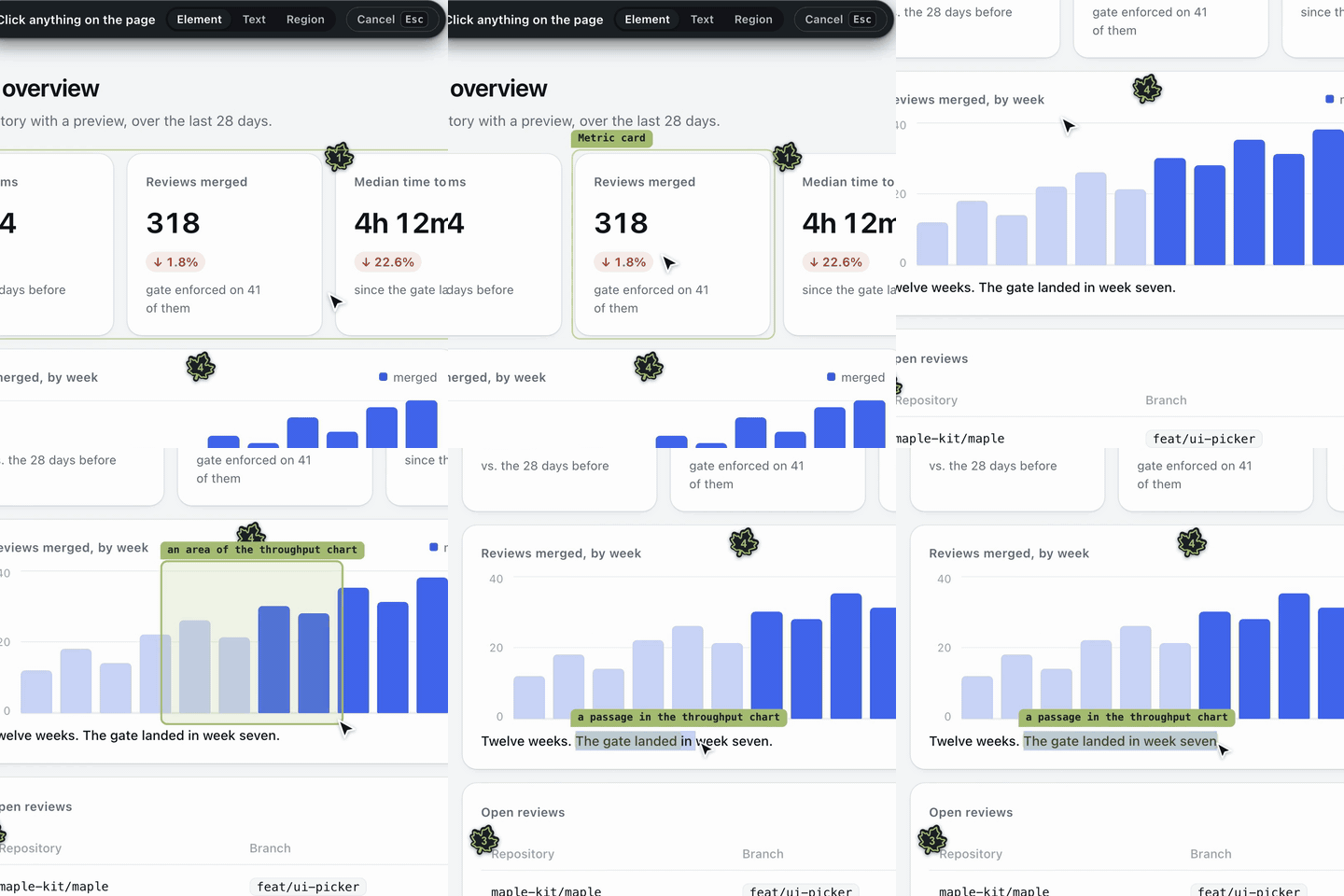 An element, an area, or a passage. Pick a component, drag a box over part of the page, or select the words that are wrong. | 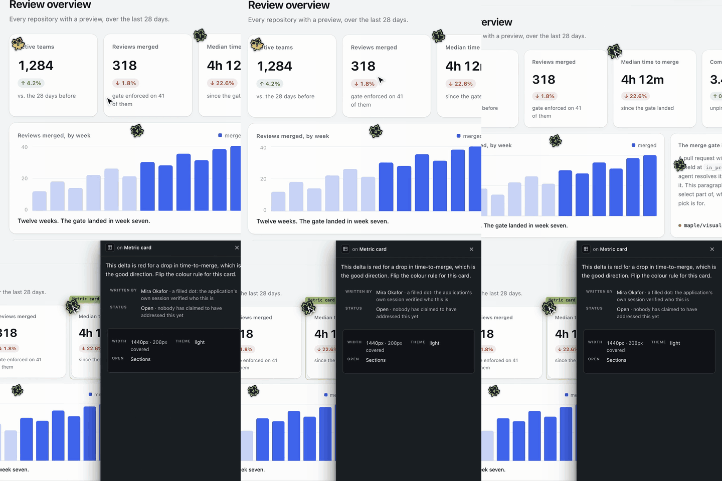 Every comment carries its context. The width, the colour scheme, a screenshot taken at the pick, and who wrote it. |
npm install @maple-kit/ui
react and react-dom are peer dependencies. @maple-kit/core and
@maple-kit/react come with it.
import { Maple } from "@maple-kit/ui/maple";

<Maple branch={import.meta.env.VITE_MAPLE_BRANCH} />;
branch is optional. Without it the overlay asks the route's GET /context
which preview this is, once, and mounts nothing on a 404, or when that first read keeps failing after retries at 1 s, 3 s and 10 s (there is no key to review under); a failed read after linking keeps what is showing; a prop you do pass wins
over the answer.
It talks to the route @maple-kit/core mounts at /api/maple.
Render it on preview builds only; ?maple=off turns it off without a rebuild.
@maple-kit/ui/maple is the whole overlay as one component. The parts are also
exported on their own, for a host that wants to compose them differently:
| Entry | What it is |
|---|---|
@maple-kit/ui/maple | <Maple />: everything below, composed. |
@maple-kit/ui/marks | The leaf on each commented element, and the ring around its target. |
@maple-kit/ui/island | The corner pill that opens into the list of comments. |
@maple-kit/ui/composer | The sheet a comment is written in, with its screenshot and score. |
@maple-kit/ui/picker | Element, text and region picks. |
@maple-kit/ui/notice | Failures the overlay reports in its own voice. |
@maple-kit/ui/mock | <MapleMock />, Maple Mock's box, for a page that mocks alone. |
@maple-kit/ui/icons | The icons, one module each. |
Inside <Maple /> the mock box is already mounted. @maple-kit/mock
shows what it does.
Everything renders inside one shadow root, styled only through
new CSSStyleSheet() and adoptedStyleSheets, with positions set by
style.setProperty(). That is what lets Maple mount under
script-src 'nonce' 'strict-dynamic' without asking for a policy change — and
it stays checkable by reading one function.
Every part carries a size budget, held in CI by scripts/size.js. Raising one
is a decision recorded in a commit, not a number that drifts.
An application that would rather draw review comments in its own design
system uses the hooks in @maple-kit/react and none of this
package.
Apache-2.0. See LICENSE and NOTICE.
FAQs
Maple's composed reviewer parts: the marks, the island and the composer
The npm package @maple-kit/ui receives a total of 0 weekly downloads. As such, @maple-kit/ui popularity was classified as not popular.
We found that @maple-kit/ui demonstrated a healthy version release cadence and project activity because the last version was released less than a year ago. It has 1 open source maintainer collaborating on the project.
Security News
Cloudflare is acquiring Deno’s team, which will provide another year of bug fixes and security updates before ending support for the runtime.

Security News
Anthropic’s free OSS Scanner uses Mythos and other Claude models to find open source vulnerabilities and send maintainers reports with proposed fixes.

Security News
On Front Lines’ Early Adopters: CISO podcast, Andrew Becherer shares lessons from Datadog, weighs the long-term costs of AI-built tools, and explains how founders can actually gain a CISO’s trust.