@mccsoft/react-native-qtoast
Toast component for React Native
Features:
- Simultaneous display: specify, how many toasts you want to show on screen at once
- Queueing: add toasts to a queue so that they will be shown sequentially
- Typed with Typescript
- Fully customizable
- Out-of-the-box support of animations an toast swipes
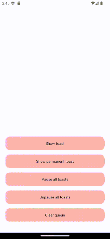
Demo
Installation
npm install @mccsoft/react-native-qtoast
Usage
Wrap your app in ToastProvider component:
import { ToastProvider } from '@mccsoft/react-native-qtoast';

export default function App() {
  return (
    <ToastProvider>
      <RootComponent />
    </ToastProvider>
  );
}
Then use 'useToast' hook inside any of your components:
import { useToast } from '@mccsoft/react-native-qtoast';

const Component = () => {
  const { show } = useToast();

  useEffect(() => show(
    {
      renderToast: () => <Text>Hello, World!</Text>,
      timeout: 1000
    }
  ), []);
}
If you want to access toast API from functions that are not components, you can use ToastAccessor:
import { ToastAccessor } from '@mccsoft/react-native-qtoast';

const ShowToastWithTimeout = (timeout: number | undefined) => {
  ToastAccessor.show({
    renderToast: () => <Text>Hello, World!</Text>,
    timeout: timeout
  });
}
Methods
All of the methods that come from useToast() hook
show()
Adds new toast to the queue and shows it immediately. Adding new toast when there are amountOfShownToast of toasts on the screen won't show it until one of the shown toast is dismissed.
Returns the id of created toast.
show({
  renderToast: (options: ToastOptions) => JSX.Element,
  timeout: number | undefined,
  onShow: () => Promise<void> | undefined,
  onHide: () => Promise<void> | undefined,
  animated: boolean | undefined,
}): string
renderToast: a function that returns the view of your toast. Can accept ToastOptions for use inside toast view. If undefined, nothing will show.
timeout: specifies how long (in ms) the toast will be on the screen. If undefined, stays forever, until hide is called.
onShow: a callback that fires after the toast is rendered
onHide: a callback that fires before the toast is removed from queue
animated: value that specifies, whether or not you want to use default animations for your toasts. If true, wraps your element from renderToast in specific 'interactive' view, which has onShow and onHide animations alongside w/ support of swipe close-actions
hide()
Removes toast with specified id from queue
hide(
  id: string | undefined
)
id: the id of the toast from queue. If undefined, clears the queue, calling onHide for each shown toast beforehand
pause()
Pauses toast, so that it won't dismiss after its timeout is over. Remembers how much time of timeout is left (see unpause for more details).
pause(
  id: string | undefined
)
id: the id of the toast from queue. If undefined, pauses all toasts on screen.
unpause()
Unpauses toast, making it live for the rest of the timeout it has left.
unpause(
  id: string | undefined
)
id: the id of the toast from queue. If undefined, unpauses all toasts on screen.
ToastProvider props
<ToastProvider
  amountOfShownToasts={2}
  wrapperStyle={{ zIndex: 2 }}
  containerStyle={{ gap: 2 }}
  position={"top"}
  inverted={false}
/>
amountOfShownToasts: number
Determines how many toasts can be rendered on the screen on the same time. If undefined, sets to 3.
wrapperStyle: ViewStyle
The style of View that wraps the container with all of the toast. Usually used for setting zIndex.
containerStyle: ViewStyle
The style of the container that wraps all toasts.
position: 'bottom' | 'top'
Determines the position where toasts will be shown. If bottom, toasts will appear at the bottom at the screen. Defaults to top.
inverted: boolean
Determines how new toasts should be shown: below or above old ones. If true, new toasts will appear below old. Defaults to false
ToastOptions
An object that provides functions for use inside your toast component
type ToastOptions = {
  id: string;
  hide: () => Promise<void>;
}
hide()
Hides current toast (by current means the toast in which function was called)
id
Id of the current toast
License
MIT


