
Mintlify Components
Open-source library of UI components made with React and TailwindCSS.


Built with 💚 by
Mintlify
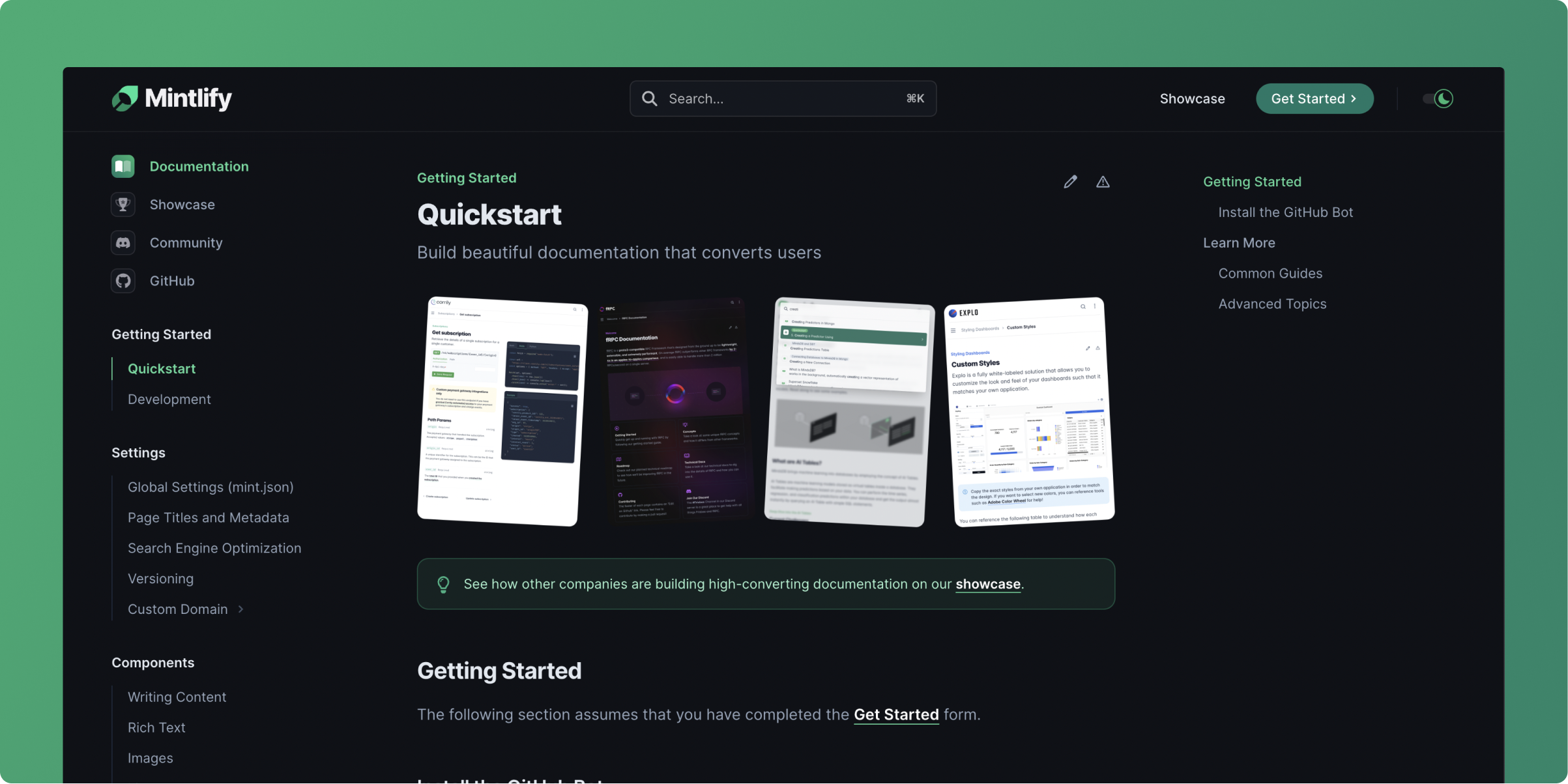
This repo contains the components Mintlify uses in our open-source documentation framework: mint. Checkout mintlify.com/docs to see the components in action. Feel free to use the components on your own websites!
Installation
npm install @mintlify/components
Add the following at the start of your main.css file:
@import '@mintlify/components';
Usage
Import components like so:
import { Accordion, Card } from "@mintlify/components"
Designed for Next.js
The project is designed for use with static side rendering where we don't have access to document or window. Thus, our webpack config has to use mini-css-extract-plugin instead of style-loader.
Documentation
The repo wiki explains how to contribute to the repo.
Storybook has interactive demos.
Go to mintlify.com/docs/components for how to use the components in Mintlify's documentation platform.
Long Term Vision
The first version of this library only includes documentation components. In the long run, Mintlify will include layout components you could use to build an entire site.
Join our Discord community if you have questions or just want to chat:

License
MIT


