Mobiscroll
What is Mobiscroll?
Mobiscroll is a UI library of components for progressive webapps and hybrid development. Created with a lot of attention to usability and performance. Mobiscroll Forms ships with 15 customizable controls that you can use for free that are included in this repository. Use Forms with the premium products that can be found on the Mobiscroll website.
Where can I use Mobiscroll?
You can use the controls in web and hybrid/native cross-platform apps. At it's core Mobiscroll is framework agnostic, but API variants for jQuery/jQuery Mobile, Angular/Ionic and React are available.
Installation
Mobiscroll Forms for Angular is available as an npm package.
npm install @mobiscroll/angular-lite --save
Usage
A simple usage example:
app/app.module.ts
import { BrowserModule } from '@angular/platform-browser';
import { NgModule } from '@angular/core';
import { FormsModule } from '@angular/forms';
import { MbscModule } from '@mobiscroll/angular-lite';

import { AppComponent } from './app.component';

@NgModule({
    declarations: [
        AppComponent
    ],
    imports: [
        BrowserModule,
        FormsModule,
        MbscModule
    ],
    providers: [],
    bootstrap: [AppComponent]
})
export class AppModule { }
app/app.component.html
<mbsc-form [options]="formSettings">
    <mbsc-input name="username">Username</mbsc-input>
    <mbsc-input name="password" type="password">Password</mbsc-input>
    <mbsc-button type="submit">Sign In</mbsc-button>
</mbsc-form>
app/app.component.ts
import { Component } from '@angular/core';

@Component({
    selector: 'demo-app',
    templateUrl: './app.component.html',
    moduleId: module.id
})
export class AppComponent {
    formSettings = {
        theme: 'mobiscroll'
    };
}
Make sure to load the styles as well. The method of loading css styles may vary depending on the project type and module bundler you use.
A typical setup is using webpack's css-loader, optionally combined with the
ExtractTextWebpackPlugin. With this configuration you can simply import the css
as well in the js file, where Mobiscroll components are used:
import '@mobiscroll/angular-lite/dist/css/mobiscroll.min.css';
Alternatively, if the project was created using angular-cli, you can configure what styles needs to be loaded inside .angular-cli.json:
{
    ...
    "apps": [
        {
            ...
            "styles": [
                "styles.css",
                "../node_modules/@mobiscroll/angular-lite/dist/css/mobiscroll.min.css"
            ],
            ...
        }
    ]
    ...
}
Elements
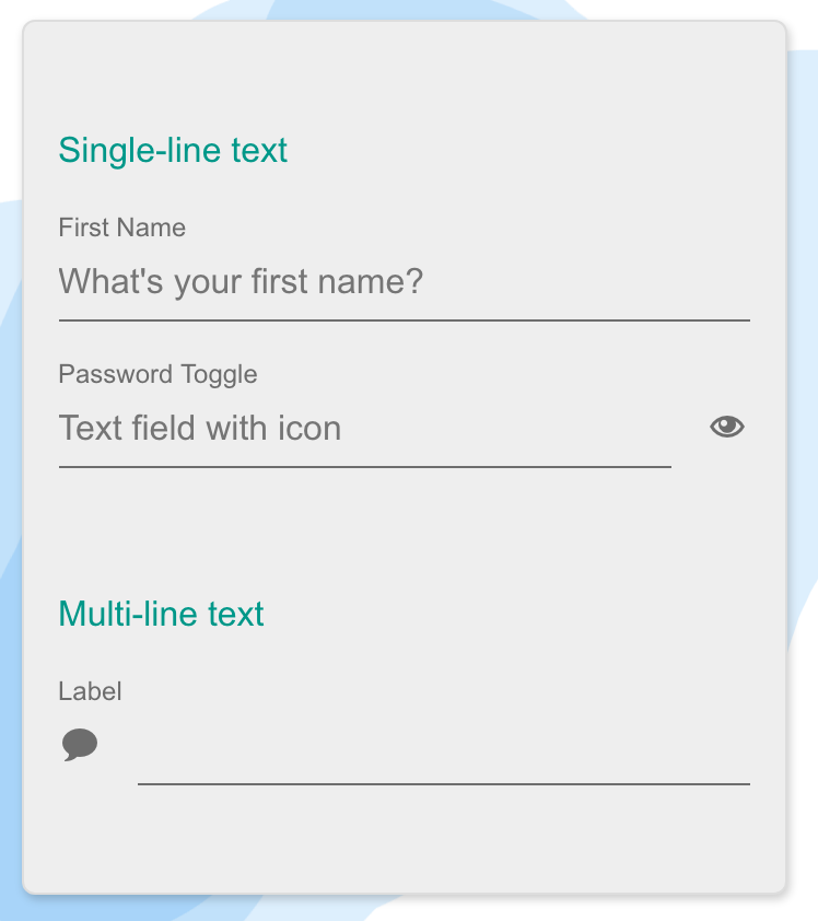
Single and multiline text
Text fields are the backbone of every form. Use it to capture a wide range of properties from plain text to passwords.
Use labels, icons, placeholders or a combination of them to help users get meaning at a glance. Show/hide functionality built in for password fields.
Select styling
Similar to the single line input styling, it features a chevron/dropdown arrow to clearly signal the difference between select and text input.

Buttons
Buttons with different states, styles and alignments. Inline or raised, left aligned, right aligned, centered or justified. Full-width buttons supported as well.
Use it with or without icons.

Segmented control
Easily lay out two to five options for single and multiple select. Making all options instantly visible lets users make selections with a single interaction instead of at least 3 (tap to open select, do the select, hit set - like for the traditional dropdown).

Checkbox and checklist
Similar to the native checkbox in functionality but a look and feel that fits with the overall user experience and theme. Features description text, checkbox list and disabled styling.
Excellent choice for inline multi-select lists.

Radio button list
Single select for a list of options. Use it instead of the segmented control if there are more items that would fit in a single line.
Usually a good choice for five options and above. Features disabled styling and optional description.

Switch
Just like the checkbox, the switch lets users turn options on/off. Can be rendered as a list of fields, like the checkbox list or as a stand-alone control.
Features optional description and disabled styling.

Stepper
When users need to make small adjustments to values by increasing or decreasing it avoid free-form input and dropdowns. Steppers help in minimizing mistakes, and reduce the number of taps for getting the values right.

Page and typography
Takes care of setting the background colors, spacing and typographic styling. It makes sure that the content you add shows up nicely on any screen-size.

Slider
Work your way from a monotone, dropdown heavy form to an easily scannable page by switching controls. Consider using sliders for selecting one or multiple values from a range.
Continuous ranges, steps, floating value display, disabled styling and usage with icons is supported out of the box.

Progress
Provide visual feedback to the user. Reduce anxiety and help people understand progress with the control. You can also use it as a completness meter to show how the user does on completing a purchase.
With a powerful API control the state, value programtically and restart, pause it if you need to.

Alert, confirm and prompt
Show alert messages, confirmation dialogs and prompt for focused value entry. Supporting platform specific look & feel, make your users feel at home and communicate what they actually need to see.
These controls cannot be dismissed by pressing the overlay, avoiding closing it by mistake.

Toast and snackbar
Keep your users up to date with notifications. Either in form of a toast or a snackbar.
Choose to provide an action with the message, like UNDO or RETRY, something that helps the user make progress faster towards their desired goal.

Documentation
For the complete documentation of Mobiscroll Forms and all products, please visit https://docs.mobiscroll.com
Demos and examples
Getting help
The Mobiscroll team does not provide technical support for Mobiscroll Forms. To get support please purchase a license from our website.
Release notes
For the complete release history and changelog visit https://mobiscroll.com/releases
Get in touch
Contact https://mobiscroll.com/contact
Twitter http://twitter.com/mobiscroll
Facebook https://www.facebook.com/mobiscroll
Google+ https://plus.google.com/+MobiscrollUI
License Information
This project has been released under the Apache License, version 2.0, the text of which is included below. This license applies ONLY to the source of this repository and does not extend to any other Mobiscroll distribution or variant, or any other 3rd party libraries used in a repository. For licensing information about Mobiscroll, see the License Agreements page at mobiscroll.com.
Copyright © 2018 Mobiscroll
Licensed under the Apache License, Version 2.0 (the "License"); you may not use this file except in compliance with the License. You may obtain a copy of the License at
http://www.apache.org/licenses/LICENSE-2.0
Unless required by applicable law or agreed to in writing, software distributed under the License is distributed on an "AS IS" BASIS, WITHOUT WARRANTIES OR CONDITIONS OF ANY KIND, either express or implied. See the License for the specific language governing permissions and limitations under the License.


