Research
Security News
Malicious npm Package Typosquats react-login-page to Deploy Keylogger
Socket researchers unpack a typosquatting package with malicious code that logs keystrokes and exfiltrates sensitive data to a remote server.
@mui/x-data-grid-pro
Advanced tools
Changelog
7.0.0-alpha.9
Jan 19, 2024
We'd like to offer a big thanks to the 11 contributors who made this release possible. Here are some highlights ✨:
SimpleTreeView customization examples (#11424) @noraleonte@mui/material peer dependency for all packages (#11692) @LukasTy
The minimum required version of @mui/material is now 5.15.0.The ariaV7 experimental flag has been removed and the Data Grid now uses the improved accessibility implementation by default.
If you were using the ariaV7 flag, you can remove it from the experimentalFeatures prop:
-<DataGrid experimentalFeatures={{ ariaV7: true }} />
+<DataGrid />
The most notable changes that might affect your application or tests are:
The role="grid" attribute along with related ARIA attributes are now applied to the inner div element instead of the root div element:
-<div class="MuiDataGrid-root" role="grid" aria-colcount="5" aria-rowcount="101" aria-multiselectable="false">
+<div class="MuiDataGrid-root">
   <div class="MuiDataGrid-toolbarContainer"></div>
-    <div class="MuiDataGrid-main"></div>
+    <div class="MuiDataGrid-main" role="grid" aria-colcount="5" aria-rowcount="101" aria-multiselectable="false"></div>
   <div class="MuiDataGrid-footerContainer"></div>
 </div>
When the Tree data feature is used, the grid role is now role="treegrid" instead of role="grid".
The Data Grid cells now have role="gridcell" instead of role="cell".
The buttons in toolbar composable components GridToolbarColumnsButton, GridToolbarFilterButton, GridToolbarDensity, and GridToolbarExport are now wrapped with a tooltip component and have a consistent interface. To override some props corresponding to the toolbar buttons or their corresponding tooltips, you can use the slotProps prop. Following is an example diff. See Toolbar section for more details.
  function CustomToolbar() {
    return (
      <GridToolbarContainer>
      <GridToolbarColumnsButton />
      <GridToolbarFilterButton
  -     title="Custom filter" // 🛑 This was previously forwarded to the tooltip component
  +     slotProps={{ tooltip: { title: 'Custom filter' } }} // ✅ This is the correct way now
      />
      <GridToolbarDensitySelector
  -     variant="outlined"    // 🛑 This was previously forwarded to the button component
  +     slotProps={{ button: { variant: 'outlined' } }} // ✅ This is the correct way now
      />
      </GridToolbarContainer>
    );
  }
Column grouping is now enabled by default. The flag columnGrouping is no longer needed to be passed to the experimentalFeatures prop to enable it.
-<DataGrid experimentalFeatures={{ columnGrouping: true }} />
+<DataGrid />
The column grouping API methods getColumnGroupPath and getAllGroupDetails are no longer prefixed with unstable_.
The column grouping selectors gridFocusColumnGroupHeaderSelector and gridTabIndexColumnGroupHeaderSelector are no longer prefixed with unstable_.
The disabled column specific features like hiding, sorting, filtering, pinning, row grouping, etc could now be controlled programmatically using initialState, respective controlled models, or the API object. See the related docs section.
Readme
This package is the Pro plan edition of the data grid component. It's part of MUI X, an open-core extension of MUI Core, with advanced components.
Install the package in your project directory with:
npm install @mui/x-data-grid-pro
This component has the following peer dependencies that you will need to install as well.
"peerDependencies": {
  "@mui/material": "^5.15.0",
  "react": "^17.0.0 || ^18.0.0",
  "react-dom": "^17.0.0 || ^18.0.0"
},
Visit https://mui.com/x/react-data-grid/ to view the full documentation.
FAQs
Unknown package
The npm package @mui/x-data-grid-pro receives a total of 324,027 weekly downloads. As such, @mui/x-data-grid-pro popularity was classified as popular.
We found that @mui/x-data-grid-pro demonstrated a healthy version release cadence and project activity because the last version was released less than a year ago. It has 0 open source maintainers collaborating on the project.
Did you know?

Socket for GitHub automatically highlights issues in each pull request and monitors the health of all your open source dependencies. Discover the contents of your packages and block harmful activity before you install or update your dependencies.

Research
Security News
Socket researchers unpack a typosquatting package with malicious code that logs keystrokes and exfiltrates sensitive data to a remote server.

Security News
The JavaScript community has launched the e18e initiative to improve ecosystem performance by cleaning up dependency trees, speeding up critical parts of the ecosystem, and documenting lighter alternatives to established tools.

Product
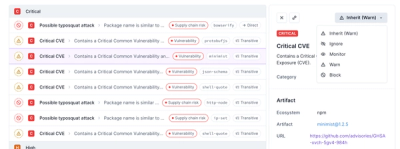
Socket now supports four distinct alert actions instead of the previous two, and alert triaging allows users to override the actions taken for all individual alerts.