Product
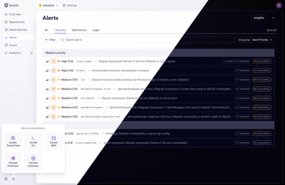
A Fresh Look for the Socket Dashboard
We’ve redesigned the Socket dashboard with simpler navigation, less visual clutter, and a cleaner UI that highlights what really matters.
By André Staltz, Jeppe Hasseriis, Nolan Lawson - Jun 23, 2025
@progress/kendo-react-common
Advanced tools
React Common package delivers common utilities that can be used with the KendoReact UI components. KendoReact Common Utilities package
@progress/kendo-react-common is a utility package that provides common functionalities and utilities used across various KendoReact components. It includes helper functions, constants, and other shared resources that facilitate the development of KendoReact applications.
ClassNames Utility
The classNames utility helps in conditionally joining class names together. This is particularly useful for dynamically applying styles based on component state.
import { classNames } from '@progress/kendo-react-common';
const buttonClass = classNames('k-button', { 'k-primary': isPrimary, 'k-disabled': isDisabled });
console.log(buttonClass); // Outputs: 'k-button k-primary' or 'k-button k-disabled' based on the stateGuid Utility
The guid utility generates a unique identifier, which can be used for elements that require unique IDs, such as form elements or dynamically created components.
import { guid } from '@progress/kendo-react-common';

const uniqueId = guid();
console.log(uniqueId); // Outputs a unique GUID string
Draggable Component
The Draggable component provides drag-and-drop functionality. It can be used to make any element draggable and handle drag events.
import { Draggable } from '@progress/kendo-react-common';

const DraggableComponent = () => (
  <Draggable onDrag={(e) => console.log('Dragging', e)}>
    <div>Drag me!</div>
  </Draggable>
);The 'classnames' package is a popular utility for conditionally joining class names together. It is similar to the classNames utility in @progress/kendo-react-common but is more widely used and can be integrated into any React project.
The 'uuid' package is a robust solution for generating unique identifiers (UUIDs). It offers more options and configurations compared to the guid utility in @progress/kendo-react-common.
The 'react-draggable' package provides comprehensive drag-and-drop functionality for React components. It offers more features and customization options compared to the Draggable component in @progress/kendo-react-common.

Important
- This package is а part of KendoReact—an enterprise-grade UI library with 120+ free and premium components.
- It contains both free and premium KendoReact components and tools. To use the premium components, you will need to purchase a license or register for a free trial. You can use the free components without having to sign up or get a license key.
- If you're looking for free React components, check out Get Started with KendoReact Free.
- If you have an active license, visit the KendoReact My License page to learn how to configure your KendoReact licensing.
- Installing and working with this package indicates that you accept the KendoReact License Agreement.
- The 30-day free trial gives you access to all KendoReact components and their full functionality. Additionally, for the period of your trial, you can use our legendary technical support provided directly by the KendoReact dev team!
Start using KendoReact and speed up your development process!
The React Common package, part of KendoReact, delivers common utilities that can be used with the KendoReact UI components to enhance their performance and functionality.
How to start:
npm i @progress/kendo-react-common
What's in this package:
Additional information:
This is a KendoReact premium component and requires a commercial license or an active trial license.
The KendoReact Draggable component enables the drag-and-drop functionality with which the user can drag and drop component elements.
How to use the Draggable component in your apps:
import { DragAndDrop, useDroppable, NormalizedDragEvent } from '@progress/kendo-react-common';
...
<DragAndDrop>
    /**
    * Handle drag-and-drop logic and containers.
    */
</DragAndDrop>
This is a free React component—no sign-up or license required.
The KendoReact Icon component is used to display font icons to ensure React developers can use icons in any scenario. All Kendo UI Icons are supported.
How to use the Icon component in your apps:
import { Icon } from '@progress/kendo-react-common';
...
<link rel="stylesheet" href="https://unpkg.com/@progress/kendo-font-icons/dist/index.css" />
<Icon name="home"/>
This is a free React component—no sign-up or license required.
The KendoReact SvgIcon component is used to display SVG icons. KendoReact delivers more than 500 SVG icons. The size, color and orientation of the KendoReact SvgIcon component can be easily customized through the available properties.
How to use the SvgIcon component in your apps:
import { SvgIcon } from '@progress/kendo-react-common';
import { homeIcon } from '@progress/kendo-svg-icons'; // This dependency is not automatically installed.
...
<SvgIcon icon={homeIcon} />
This is a free React component—no sign-up or license required.
The KendoReact Typography component is a reusable component that helps presenting text in a React application. It could trim down a lot of time as the application grows. You can quickly add additional Typography styles by choosing from the predefined options.
How to use the SvgIcon component in your apps:
import { Typography } from '@progress/kendo-react-common';
...
<Typography.p>
    Lorem ipsum dolor sit amet, consectetur adipiscing elit. Donec semper.
</Typography.p>
This is a free React utility—no sign-up or license required.
The KendoReact AdaptiveModeContext utility is a React context that provides a global configuration for adaptive rendering across various components. It lets you define breakpoints for small and medium screen sizes. This context is essential for implementing responsive layouts, where UI components such as DatePicker, DropDownList, ComboBox, and others may need to adapt.
How to use AdaptiveModeContext in your apps:
import { AdaptiveModeContext } from '@progress/kendo-react-common';
...
<AdaptiveModeContext.Provider value={{ small: 320, medium: 1024 }}>
    /**
    * Place the UI component that needs to be adaptive here.
    */
</AdaptiveModeContext.Provider>
For any issues you might encounter while working with the KendoReact Common package, use any of the available support channels:
General resources:
High-level component overview pages:
Copyright © 2025 Progress Software Corporation and/or its subsidiaries or affiliates. All Rights Reserved.
Progress, Telerik, and certain product names used herein are trademarks or registered trademarks of Progress Software Corporation and/or one of its subsidiaries or affiliates in the U.S. and/or other countries.
FAQs
React Common package delivers common utilities that can be used with the KendoReact UI components. KendoReact Common Utilities package
The npm package @progress/kendo-react-common receives a total of 270,522 weekly downloads. As such, @progress/kendo-react-common popularity was classified as popular.
We found that @progress/kendo-react-common demonstrated a healthy version release cadence and project activity because the last version was released less than a year ago. It has 1 open source maintainer collaborating on the project.
Did you know?

Socket for GitHub automatically highlights issues in each pull request and monitors the health of all your open source dependencies. Discover the contents of your packages and block harmful activity before you install or update your dependencies.
Product
We’ve redesigned the Socket dashboard with simpler navigation, less visual clutter, and a cleaner UI that highlights what really matters.

Industry Insights
Terry O’Daniel, Head of Security at Amplitude, shares insights on building high-impact security teams, aligning with engineering, and why AI gives defenders a fighting chance.

Security News
MCP spec updated with structured tool output, stronger OAuth 2.1 security, resource indicators, and protocol cleanups for safer, more reliable AI workflows.