Product
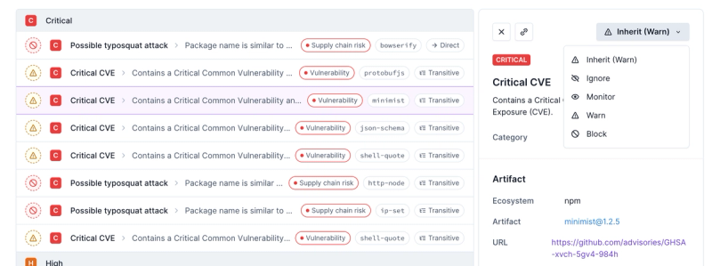
Introducing Enhanced Alert Actions and Triage Functionality
Socket now supports four distinct alert actions instead of the previous two, and alert triaging allows users to override the actions taken for all individual alerts.
@reach/dialog
Advanced tools
Package description
@reach/dialog is a React component library that provides accessible modal dialogs. It ensures that dialogs are properly announced to screen readers and that focus is managed correctly, making it easier to build accessible web applications.
Basic Dialog
This code demonstrates a basic usage of the @reach/dialog package. It shows how to open and close a dialog with a button click.
import { Dialog } from '@reach/dialog';
import '@reach/dialog/styles.css';
function BasicDialogExample() {
const [showDialog, setShowDialog] = React.useState(false);
return (
<div>
<button onClick={() => setShowDialog(true)}>Open Dialog</button>
{showDialog && (
<Dialog onDismiss={() => setShowDialog(false)}>
<p>This is a basic dialog.</p>
<button onClick={() => setShowDialog(false)}>Close</button>
</Dialog>
)}
</div>
);
}Dialog with Custom Styling
This example shows how to apply custom styles to the dialog component.
import { Dialog } from '@reach/dialog';
import '@reach/dialog/styles.css';

function CustomStyledDialog() {
  const [showDialog, setShowDialog] = React.useState(false);
  return (
    <div>
      <button onClick={() => setShowDialog(true)}>Open Custom Dialog</button>
      {showDialog && (
        <Dialog
          onDismiss={() => setShowDialog(false)}
          style={{ background: 'lightblue', padding: '20px' }}
        >
          <p>This is a custom styled dialog.</p>
          <button onClick={() => setShowDialog(false)}>Close</button>
        </Dialog>
      )}
    </div>
  );
}
Dialog with Focus Management
This example demonstrates how to manage focus within the dialog, ensuring accessibility for keyboard and screen reader users.
import { Dialog } from '@reach/dialog';
import '@reach/dialog/styles.css';

function FocusManagedDialog() {
  const [showDialog, setShowDialog] = React.useState(false);
  return (
    <div>
      <button onClick={() => setShowDialog(true)}>Open Focus Managed Dialog</button>
      {showDialog && (
        <Dialog
          onDismiss={() => setShowDialog(false)}
          initialFocusRef={React.useRef(null)}
        >
          <p>This dialog manages focus correctly.</p>
          <button onClick={() => setShowDialog(false)}>Close</button>
        </Dialog>
      )}
    </div>
  );
}react-modal is a widely-used package for creating accessible modal dialogs in React. It provides a flexible API and supports various customization options. Compared to @reach/dialog, react-modal offers more extensive customization capabilities but may require more effort to ensure accessibility.
react-aria-modal is another package focused on accessibility, providing a modal dialog component that adheres to WAI-ARIA guidelines. It is similar to @reach/dialog in its emphasis on accessibility, but it may have a steeper learning curve due to its more complex API.
react-bootstrap is a popular UI library that includes a Modal component. While it offers a wide range of UI components and is easy to use, it may not be as focused on accessibility as @reach/dialog. However, it is a good choice if you are already using Bootstrap in your project.
Readme
An accessible dialog or modal window.
import { Dialog } from "@reach/dialog";
import "@reach/dialog/styles.css";

function Example(props) {
  const [showDialog, setShowDialog] = React.useState(false);
  const open = () => setShowDialog(true);
  const close = () => setShowDialog(false);

  return (
    <div>
      <button onClick={open}>Open Dialog</button>
      <Dialog isOpen={showDialog} onDismiss={close}>
        <button className="close-button" onClick={close}>
          <VisuallyHidden>Close</VisuallyHidden>
          <span aria-hidden>×</span>
        </button>
        <p>Hello there. I am a dialog</p>
      </Dialog>
    </div>
  );
}
FAQs
Accessible React Modal Dialog.
The npm package @reach/dialog receives a total of 222,965 weekly downloads. As such, @reach/dialog popularity was classified as popular.
We found that @reach/dialog demonstrated a not healthy version release cadence and project activity because the last version was released a year ago. It has 4 open source maintainers collaborating on the project.
Did you know?

Socket for GitHub automatically highlights issues in each pull request and monitors the health of all your open source dependencies. Discover the contents of your packages and block harmful activity before you install or update your dependencies.

Product
Socket now supports four distinct alert actions instead of the previous two, and alert triaging allows users to override the actions taken for all individual alerts.

Security News
Polyfill.io has been serving malware for months via its CDN, after the project's open source maintainer sold the service to a company based in China.

Security News
OpenSSF is warning open source maintainers to stay vigilant against reputation farming on GitHub, where users artificially inflate their status by manipulating interactions on closed issues and PRs.