Product
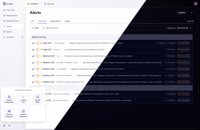
A Fresh Look for the Socket Dashboard
We’ve redesigned the Socket dashboard with simpler navigation, less visual clutter, and a cleaner UI that highlights what really matters.
By André Staltz, Jeppe Hasseriis, Nolan Lawson - Jun 23, 2025
@react-email/code-block
Advanced tools
Display code with a selected theme and regex highlighting using Prism.js
Install component from your command line.
yarn add @react-email/code-block -E
npm install @react-email/code-block -E
Add the component into your email component as follows.
import { CodeBlock, dracula } from "@react-email/code-block";

const Email = () => {
  const code = `export default async (req, res) => {
  try {
    const html = await renderAsync(
      EmailTemplate({ firstName: 'John' })
    );
    return NextResponse.json({ html });
  } catch (error) {
    return NextResponse.json({ error });
  }
}`;

  return (
    <CodeBlock
      code={code}
      lineNumbers // add this so that there are line numbers beside each code line
      theme={dracula}
      language="javascript"
    />
  );
};
This should render a code-block with the desired theme.
Themes for this component are basically a set of styles for each kind of token that can result from prismjs's tokenization. See here for more information on the tokens available.
An example of a theme would be this:
{
  "base": {
    "color": "#f8f8f2",
    "background": "#282a36",
    "textShadow": "0 1px rgba(0, 0, 0, 0.3)",
    "fontFamily": "Consolas, Monaco, 'Andale Mono', 'Ubuntu Mono', monospace",
    "textAlign": "left",
    "whiteSpace": "pre",
    "wordSpacing": "normal",
    "wordBreak": "normal",
    "wordWrap": "normal",
    "lineHeight": "1.5",
    "MozTabSize": "4",
    "OTabSize": "4",
    "tabSize": "4",
    "WebkitHyphens": "none",
    "MozHyphens": "none",
    "MsHyphens": "none",
    "hyphens": "none",
    "padding": "1em",
    "margin": ".5em 0",
    "overflow": "auto",
    "borderRadius": "0.3em"
  },
  "comment": {
    "color": "#6272a4"
  },
  "prolog": {
    "color": "#6272a4"
  },
  "doctype": {
    "color": "#6272a4"
  },
  "cdata": {
    "color": "#6272a4"
  },
  "punctuation": {
    "color": "#f8f8f2"
  },
  "property": {
    "color": "#ff79c6"
  }
  // ...
}
Each token type can have their own defined styles and for each one of there can be any styles that can be applied directly to React elements.
As you can see from the example dracula theme though, there is a defined property called base which is the styling for the pre element that wraps the HTML being rendered.
For you to not need to defined a theme without any basis, or to not define one that already has been defined, we have many default themes exported from @react-email/code-block.
These themes were generated by a bit of code that converts a CSS file for a prismjs theme into a object theme of these.
If you want to generate a theme from another existing prismjs theme you can do so by looking into this.
This component was tested using the most popular email clients.
 |  |  |  |  |  |
|---|---|---|---|---|---|
| Gmail ✔ | Apple Mail ✔ | Outlook ✔ | Yahoo! Mail ✔ | HEY ✔ | Superhuman ✔ |
MIT License
FAQs
Display code with a selected theme and regex highlighting using Prism.js
The npm package @react-email/code-block receives a total of 597,766 weekly downloads. As such, @react-email/code-block popularity was classified as popular.
We found that @react-email/code-block demonstrated a healthy version release cadence and project activity because the last version was released less than a year ago. It has 3 open source maintainers collaborating on the project.
Did you know?

Socket for GitHub automatically highlights issues in each pull request and monitors the health of all your open source dependencies. Discover the contents of your packages and block harmful activity before you install or update your dependencies.
Product
We’ve redesigned the Socket dashboard with simpler navigation, less visual clutter, and a cleaner UI that highlights what really matters.

Industry Insights
Terry O’Daniel, Head of Security at Amplitude, shares insights on building high-impact security teams, aligning with engineering, and why AI gives defenders a fighting chance.

Security News
MCP spec updated with structured tool output, stronger OAuth 2.1 security, resource indicators, and protocol cleanups for safer, more reliable AI workflows.