Product
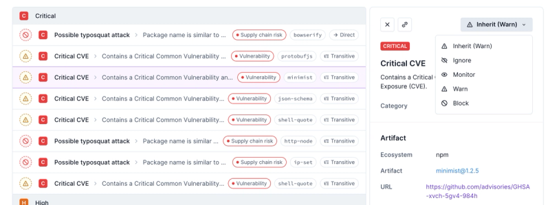
Introducing Enhanced Alert Actions and Triage Functionality
Socket now supports four distinct alert actions instead of the previous two, and alert triaging allows users to override the actions taken for all individual alerts.
@react-md/transition
Advanced tools
Changelog
3.1.0 (2021-09-10)
DialogFooter align prop applies correct classes (644971d)TooManyFilesError is only used if all the other validation has passed (6ed3f54)useFileUpload extensions (9238140)useDropzone fix around onDragLeave behavior (fdff9f2)isValidFileName option to useFileUpload (dbd0375)sassdoc for new module system (4746d26)yarn format to include new files (48d3d7f)next (b50d745)sassdoc hot-reloading (9d58e09)sassdoc examples to be linkable (9ed096e)Readme
Create simple CSS transitions using the provided transition hooks and components utilizing the default transition timing functions. This package also provides a collapse transition, scaling transition, vertical only scaling transition, and a new page transition named cross fade.
Provided components and hooks:
Collapse or useCollapse - transition an element in and out of view based
on the height of the elementCrossFade or useCrossFade - a transition generally used for a full page
transition that fades and slightly moves a child component into viewScaleTransition - transition an element in and out of view with a scale
transform that can be updated to just be scaleYuseTransition - a hook implementation of the Transition component from
react-transition-groupuseCSSTransition -a hook implementation of the CSSTransition component
from react-transition-groupuseFixedPositioning - hooks into the CSSTransition component from
react-transition-group to fix an element to another element within the
viewportThe rmd-transition-shadow-transition mixin allows you to "performantly"
transition between two box shadow values using the
opacity trick. This
mixin automatically creates a pseudo ::before or ::after element with the
final box shadow and animates the opacity once one of the $active-selectors
are triggered. The code below will help explain this part a bit more.
npm install --save @react-md/transition
It is also recommended to install the following packages as they work hand-in-hand with this package:
npm install --save @react-md/theme \
  @react-md/utils
You should check out the full documentation for live examples and more customization information, but an example usage is shown below.
import React, { useState } from "react";
import { render } from "react-dom";
import { Button } from "@react-md/button";
import { Collapse } from "@react-md/transition";

const App = () => {
  const [collapsed, setCollapsed] = useState(true);

  return (
    <>
      <Button onClick={() => setCollapsed(!collapsed)}>Toggle</Button>
      <Collapse collapsed={collapsed}>
        <div>This is my collapsible content!</div>
      </Collapse>
    </>
  );
};

render(<App />, document.getElementById("root"));
FAQs
A package for working with react-md to use some simple transitions.
The npm package @react-md/transition receives a total of 1,173 weekly downloads. As such, @react-md/transition popularity was classified as popular.
We found that @react-md/transition demonstrated a healthy version release cadence and project activity because the last version was released less than a year ago. It has 1 open source maintainer collaborating on the project.
Did you know?

Socket for GitHub automatically highlights issues in each pull request and monitors the health of all your open source dependencies. Discover the contents of your packages and block harmful activity before you install or update your dependencies.

Product
Socket now supports four distinct alert actions instead of the previous two, and alert triaging allows users to override the actions taken for all individual alerts.

Security News
Polyfill.io has been serving malware for months via its CDN, after the project's open source maintainer sold the service to a company based in China.

Security News
OpenSSF is warning open source maintainers to stay vigilant against reputation farming on GitHub, where users artificially inflate their status by manipulating interactions on closed issues and PRs.