Product
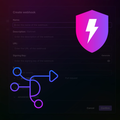
Introducing Webhook Events for Pull Request Scans
Add real-time Socket webhook events to your workflows to automatically receive pull request scan results and security alerts in real time.
@rmwc/dialog
Advanced tools
Dialogs inform users about a specific task and may contain critical information, require decisions, or involve multiple tasks.
function Example() {
const [open, setOpen] = React.useState(false);
return (
<>
<Dialog
open={open}
onClose={(evt) => {
console.log(evt.detail.action);
setOpen(false);
}}
onClosed={(evt) => console.log(evt.detail.action)}
>
<DialogTitle>Dialog Title</DialogTitle>
<DialogContent>This is a standard dialog.</DialogContent>
<DialogActions>
<DialogButton action="close">Cancel</DialogButton>
<DialogButton action="accept" isDefaultAction>
Sweet!
</DialogButton>
</DialogActions>
</Dialog>
<Button raised onClick={() => setOpen(true)}>
Open standard Dialog
</Button>
</>
);
}
Material Dialogs are a complex component. RMWC contains an additional SimpleDialog component for ease of use that internally contains the default structure already built out. Illustrated below is both the standard and simple dialog usage.
function Example() {
  const [open, setOpen] = React.useState(false);
  return (
    <>
      <SimpleDialog
        title="This is a simple dialog"
        body="You can pass the body prop or children."
        open={open}
        onClose={(evt) => {
          console.log(evt.detail.action);
          setOpen(false);
        }}
      />

      <Button raised onClick={() => setOpen(true)}>
        Open Simple Dialog
      </Button>
    </>
  );
}
Some dialog interactions are complex, but a lot of the time you just need a simple alert or confirm dialog. DialogQueue allows you to open dialogs from anywhere in your app and emulates the browsers built in alert, confirm and prompt dialogs. If you've used the SnackbarQueue, the DialogQueue is very similar.
Setup is nice and easy, create a queue object you can pass around in your code base, pass the queues dialogs to the DialogQueuecomponent, and then use the alert, prompt or confirm api to open dialogs.
  `
// Create a file that exports your queue
// myQueue.js
import { createDialogQueue } from '@rmwc/dialog';

export const queue = createDialogQueue();
  `
// Somewhere at the top level of your app
// Render the DialogQueue
import React from 'react';
import { queue } from './myQueue';

export default function App() {
  return (
    <div>
      ...
      <DialogQueue
        dialogs={queue.dialogs}
        // You can also pass default options to pass to your dialogs
        // ie, prevent all dialogs from dismissing from a click on the background scrim
        preventOutsideDismiss
      />
    </div>
  )
}
The alert, confirm, and prompt functions were designed to mimic the the built-in browser methods with a couple of small difference. First, they all return a promise. The promise will always resolve successfully with the response indicating the appropriate action. alert the response will be accept for clicking the ok button, or close. confirm will resolve true or false, and prompt will resolve with the value entered into the input, or null if the closed the dialog. Second, all methods the methods accept any valid prop for SimpleDialog.
  `
// Somewhere else in your app
// Could be a view, your redux store, anywhere you want...
import { queue } from './myQueue';

queue.alert({
  title: 'Hi there',
  body: 'Whats going on?'
});

queue.confirm({
  title: <b>Are you positive?</b>,
  body: 'You have selected pizza instead icecream!',
  acceptLabel: 'CONFIRM'
});

queue.prompt({
  title: 'Whats your name?',
  body: 'Anything will do',
  acceptLabel: 'Submit',
  cancelLabel: 'Skip',
  // For prompts only, you can pass props to the input
  inputProps: {
    outlined: true
  }
});
() => {
  const { dialogs, alert, confirm, prompt } = createDialogQueue();

  function App() {
    const [response, setResponse] = React.useState('____________');

    const fireAlert = () =>
      alert({ title: 'Hello!' }).then((res) => setResponse(res));

    const fireConfirm = () =>
      confirm({}).then((res) => setResponse(res));

    const firePrompt = () =>
      prompt({ inputProps: { outlined: true } }).then((res) =>
        setResponse(res)
      );

    return (
      <div>
        <Button label="Alert" onClick={fireAlert} />
        <Button label="Confirm" onClick={fireConfirm} />
        <Button label="Prompt" onClick={firePrompt} />
        <Button
          label="In Sequence"
          onClick={() => {
            fireAlert();
            fireConfirm();
            firePrompt();
          }}
        />

        <p>
          Response: <b>{String(response)}</b>
        </p>
        <DialogQueue dialogs={dialogs} />
      </div>
    );
  }
  return <App />;
}
Occasionally, you may find your dialog being cut off from being inside a container that is styled to be overflow:hidden. RMWC provides a renderToPortal prop that lets you use React's portal functionality to render the menu dropdown in a different container.
You can specify any element or selector you want, but the simplest method is to pass true and use RMWC's built in Portal component.
  `
  // Somewhere at the top level of your app
  // Render the RMWC Portal
  // You only have to do this once
  import React from 'react';
  import { Portal } from '@rmwc/base';

  export default function App() {
    return (
      <div>
        ...
        <Portal />
      </div>
    )
  }
`
Now you can use the renderToPortal prop. Below is a contrived example of a dialog being cut off due to overflow: hidden.
function Example() {
  const [renderToPortal, setRenderToPortal] = React.useState(true);
  const [open, setOpen] = React.useState(false);
  return (
    <div
      id="dialog-portal-example"
      style={{
        transform: 'translateZ(0)',
        height: '20rem',
        overflow: 'hidden'
      }}
    >
      <SimpleDialog
        title={`This is a ${renderToPortal ? 'working!' : 'broken :/'}`}
        renderToPortal={renderToPortal}
        body="Use `renderToPortal` to get around `overflow:hidden` and layout issues."
        open={open}
        onClose={(evt) => {
          console.log(evt.detail.action);
          setOpen(false);
        }}
      />

      <Button
        raised
        onClick={() => {
          setRenderToPortal(false);
          setOpen(true);
        }}
      >
        Open Broken :/
      </Button>

      <Button
        raised
        onClick={() => {
          setRenderToPortal(true);
          setOpen(true);
        }}
      >
        Open in Portal
      </Button>
    </div>
  );
}
A Dialog component.
| Name | Type | Description |
|---|---|---|
foundationRef | Ref<MDCDialogFoundation<>> | Advanced: A reference to the MDCFoundation. |
onClose | (evt: DialogOnCloseEventT) => void | Callback for when the Dialog beings to close. evt.detail = { action?: string } |
onClosed | (evt: DialogOnCloseEventT) => void | Callback for when the Dialog finishes closing. evt.detail = { action?: string } |
onOpen | (evt: DialogOnOpenEventT) => void | Callback for when the Dialog opens. |
onOpened | (evt: DialogOnOpenedEventT) => void | Callback for when the Dialog finishes opening |
open | boolean | Whether or not the Dialog is showing. |
preventOutsideDismiss | boolean | Prevent the dialog from closing when the scrim is clicked or escape key is pressed. |
renderToPortal | PortalPropT | Renders the dialog to a portal. Useful for situations where the dialog might be cutoff by an overflow: hidden container. You can pass "true" to render to the default RMWC portal. |
The Dialog title.
The Dialog content.
Actions container for the Dialog.
Action buttons for the Dialog.
| Name | Type | Description |
|---|---|---|
action | string | An action returned in evt.detail.action to the onClose handler. |
children | ReactNode | Content specified as children. |
danger | boolean | Used to indicate a dangerous action. |
dense | boolean | Make the Button dense. |
disabled | boolean | Make the button disabled |
icon | IconPropT | An Icon for the Button |
isDefaultAction | boolean | Indicates this is the default selected action when pressing enter |
label | any | Content specified as a label prop. |
outlined | boolean | Make the button outlined. |
raised | boolean | Make the Button raised. |
ripple | RipplePropT | Adds a ripple effect to the component |
touch | boolean | Makes the button more touch friendly. This will automatically be set true if used inside of TouchTargetWrapper. |
trailingIcon | IconPropT | A trailing icon for the Button |
unelevated | boolean | Make the button unelevated. |
A SimpleDialog component for ease of use.
| Name | Type | Description |
|---|---|---|
acceptLabel | ReactNode | Creates an accept button for the default Dialog template with a given label. You can pass |
null | ||
| to remove the button. | ||
body | ReactNode | Body content for the default Dialog template, rendered before children. |
cancelLabel | ReactNode | Creates an cancel button for the default Dialog with a given label. You can pass |
null | ||
| to remove the button. | ||
children | ReactNode | Any children will be rendered in the body of the default Dialog template. |
footer | ReactNode | Additional footer content for the default Dialog template, rendered before any buttons. |
foundationRef | Ref<MDCDialogFoundation<>> | Advanced: A reference to the MDCFoundation. |
header | ReactNode | Additional Dialog header content for the default Dialog template. |
onClose | (evt: DialogOnCloseEventT) => void | Callback for when the Dialog beings to close. evt.detail = { action?: string } |
onClosed | (evt: DialogOnCloseEventT) => void | Callback for when the Dialog finishes closing. evt.detail = { action?: string } |
onOpen | (evt: DialogOnOpenEventT) => void | Callback for when the Dialog opens. |
onOpened | (evt: DialogOnOpenedEventT) => void | Callback for when the Dialog finishes opening |
open | boolean | Whether or not the Dialog is showing. |
preventOutsideDismiss | boolean | Prevent the dialog from closing when the scrim is clicked or escape key is pressed. |
renderToPortal | PortalPropT | Renders the dialog to a portal. Useful for situations where the dialog might be cutoff by an overflow: hidden container. You can pass "true" to render to the default RMWC portal. |
title | ReactNode | A title for the default Dialog template. |
FAQs
RMWC Dialog component
The npm package @rmwc/dialog receives a total of 9,474 weekly downloads. As such, @rmwc/dialog popularity was classified as popular.
We found that @rmwc/dialog demonstrated a healthy version release cadence and project activity because the last version was released less than a year ago. It has 1 open source maintainer collaborating on the project.
Did you know?

Socket for GitHub automatically highlights issues in each pull request and monitors the health of all your open source dependencies. Discover the contents of your packages and block harmful activity before you install or update your dependencies.

Product
Add real-time Socket webhook events to your workflows to automatically receive pull request scan results and security alerts in real time.

Research
The Socket Threat Research Team uncovered malicious NuGet packages typosquatting the popular Nethereum project to steal wallet keys.

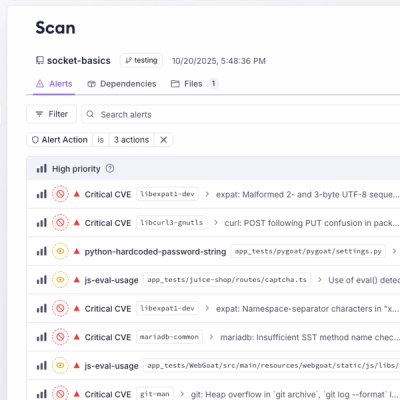
Product
A single platform for static analysis, secrets detection, container scanning, and CVE checks—built on trusted open source tools, ready to run out of the box.