@sl-codeblaster/react-3d-animated-card
3D Animated card component for ReactJs.


Install
with npm
npm install --save @sl-codeblaster/react-3d-animated-card
with yarn
yarn add @sl-codeblaster/react-3d-animated-card
You should need to import css file to your css file.
@import "~@sl-codeblaster/react-3d-animated-card/dist/index.css";
###Live Demo
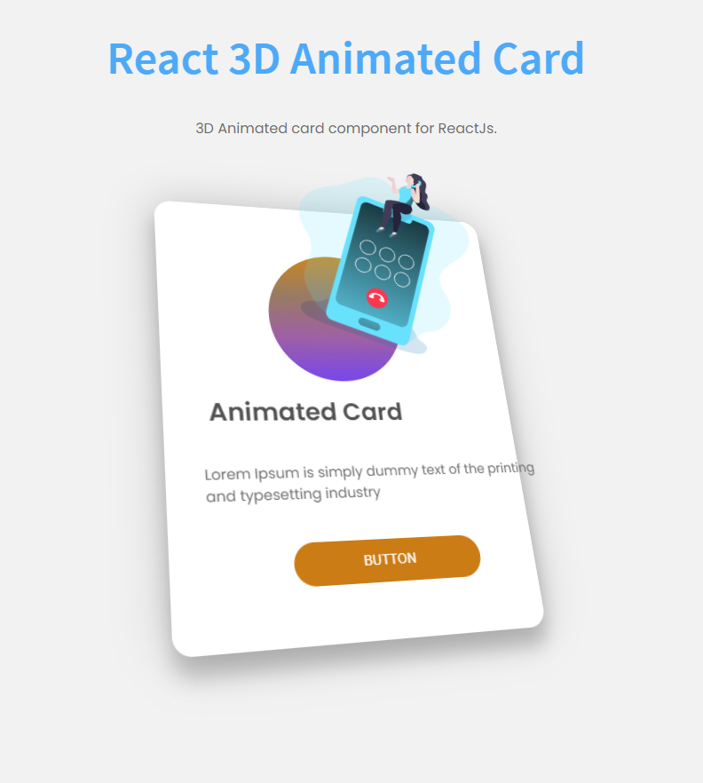
##Usage
<AnimatedCard
    config={{
        rotation: 15, // this value for the divide (window.innerWidth / 2 - e.pageX) / rotation && (window.innerWidth / 2 - e.pageY) / rotation
        transition:{
            duration:0.5,
            timingMode: "ease"
        },
        transform:{
            figureIcon: {
                rotation: 20,
                translateZ: 160
            },
            titleTranslateZ: 140,
            bodyTextTranslateZ: 100,
            buttonTranslateZ: 80
        }
    }}
    style={{
        width:560 //container style (you can use className as well)
    }}
>

    <div className="card">
        <div className="figure">
            <div className="figure_bg"/> // not required, just used for design
            <img src={require('./images/image.png').default} alt=""/>
        </div>
        <div className="content">
            <h2 className="title">Animated Card</h2>
            <p className={"body"}>Lorem Ipsum is simply dummy text of the
                printing and typesetting industry</p>
        </div>
        <div className="footer">
            <button className={"footer_btn"}>BUTTON</button>
        </div>
    </div>

</AnimatedCard>
##Configuration
use config prop to pass configuration object to the component.
| Property | Value |
|---|
| rotation | number |
| transition | object |
| transform | object |
| style | react default style object |
| className | string |
transition object
| Property | Value |
|---|
| duration | number |
| timingMode | 'ease','ease-out','ease-in','ease-in-out' use one of these |
transform object
| Property | Value |
|---|
| figureIcon | object |
| titleTranslateZ | number |
| bodyTextTranslateZ | number |
| buttonTranslateZ | number |
figureIcon object
| Property | Value |
|---|
| rotation | number |
| translateZ | number |
License
MIT © SL-CodeBlaster


