Product
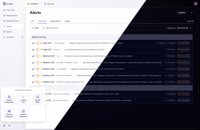
A Fresh Look for the Socket Dashboard
We’ve redesigned the Socket dashboard with simpler navigation, less visual clutter, and a cleaner UI that highlights what really matters.
By André Staltz, Jeppe Hasseriis, Nolan Lawson - Jun 23, 2025
@spectrum-web-components/asset
Advanced tools
Use an `<sp-asset>` element to visually represent a file, folder or image in your application. File and folder representations will center themselves horizontally and vertically in the space provided to the element. Images will be contained to the element
Use an <sp-asset> element to visually represent a file, folder or image in your application. File and folder representations will center themselves horizontally and vertically in the space provided to the element. Images will be contained to the element, growing to the element's full height while centering itself within the width provided.
yarn add @spectrum-web-components/asset
Import the side effectful registration of <sp-asset> via:
import '@spectrum-web-components/asset/sp-asset.js';
When looking to leverage the Asset base class as a type and/or for extension purposes, do so via:
import { Asset } from '@spectrum-web-components/asset';
<sp-asset style="height: 128px">
    <img src="https://picsum.photos/500/500" alt="Demo Image" />
</sp-asset>
<div class="flex">
    <sp-asset variant="file"></sp-asset>
    <sp-asset variant="file" label="Named File Asset"></sp-asset>
</div>
<div class="flex">
    <sp-asset variant="folder"></sp-asset>
    <sp-asset variant="folder" label="Named Folder Asset"></sp-asset>
</div>
1.7.0 (2025-06-11)
sp-overlay: Fixed : Overlays (like pickers and action menus) were incorrectly closing when scrolling occurred within components. The fix ensures the handleScroll method in OverlayStack only responds to document/body scrolling events and ignores component-level scrolling events, which was the original intention.
sp-card: Fixed: On mobile Chrome (both Android and iOS), scrolling on sp-card components would inadvertently trigger click events. This was caused by the timing-based click detection (200ms threshold) in the pointer event handling, which could misinterpret quick scrolls as clicks. This issue did not affect Safari on mobile devices.
sp-action-button: - Fixed : Action buttons with href attributes now properly detects modifier keys and skips the proxy click, allowing only native browser behavior to proceed.
sp-styles: Remove unnecessary system theme references to reduce complexity for components that don't need the additional mapping layer.
sp-card: - Fixed: sp-card component relies on sp-popover for certain toggle interactive behaviors, but this dependency was missing from its dependency tree.
sp-menu: Fixes: Icons in menu stories weren't properly responding to theme changes when used in functional story components. Switching to class-based LitElement components ensures proper component lifecycle hooks and shadow DOM context for icon initialization and theme integration.
sp-tabs: Added @spectrum-web-components/action-button as a dependency for Tabs as its used in the direction button.
sp-split-view: Added @spectrum-web-components/shared dependency in splitview since it uses ranDomId from the shared package
sp-textfield: Replace deprecated word-break: break-word with overflow-wrap: break-word to align with modern CSS standards and improve cross-browser compatibility. This property was deprecated in Chrome 44 (July 2015) in favor of the standardized overflow-wrap property.
FAQs
Use an `<sp-asset>` element to visually represent a file, folder or image in your application. File and folder representations will center themselves horizontally and vertically in the space provided to the element. Images will be contained to the element
The npm package @spectrum-web-components/asset receives a total of 2,731 weekly downloads. As such, @spectrum-web-components/asset popularity was classified as popular.
We found that @spectrum-web-components/asset demonstrated a healthy version release cadence and project activity because the last version was released less than a year ago. It has 7 open source maintainers collaborating on the project.
Did you know?

Socket for GitHub automatically highlights issues in each pull request and monitors the health of all your open source dependencies. Discover the contents of your packages and block harmful activity before you install or update your dependencies.
Product
We’ve redesigned the Socket dashboard with simpler navigation, less visual clutter, and a cleaner UI that highlights what really matters.

Industry Insights
Terry O’Daniel, Head of Security at Amplitude, shares insights on building high-impact security teams, aligning with engineering, and why AI gives defenders a fighting chance.

Security News
MCP spec updated with structured tool output, stronger OAuth 2.1 security, resource indicators, and protocol cleanups for safer, more reliable AI workflows.