Product
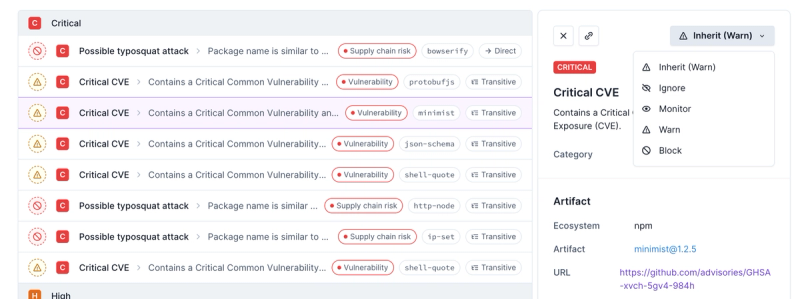
Introducing Enhanced Alert Actions and Triage Functionality
Socket now supports four distinct alert actions instead of the previous two, and alert triaging allows users to override the actions taken for all individual alerts.
@spectrum-web-components/button
Advanced tools
An `<sp-button>` represents an action a user can take. sp-buttons can be clicked or tapped to perform an action or to navigate to another page. sp-buttons in Spectrum have several variations for different uses and multiple levels of loudness for various a
Changelog
0.33.2 (2023-06-14)
Note: Version bump only for package @adobe/spectrum-web-components
Readme
An <sp-button> represents an action a user can take. sp-buttons can be clicked
or tapped to perform an action or to navigate to another page. sp-buttons in
Spectrum have several variations for different uses and multiple levels of
loudness for various attention-getting needs.
yarn add @spectrum-web-components/button
Import the side effectful registration of <sp-button> or <sp-clear-button> as follows:
import '@spectrum-web-components/button/sp-button.js';
import '@spectrum-web-components/button/sp-clear-button.js';
import '@spectrum-web-components/button/sp-close-button.js';
When looking to leverage the Button, ClearButton, or CloseButton base classes as a type and/or for extension purposes, do so via:
import { Button, ClearButton, CloseButton } from '@spectrum-web-components/button';
<sp-button size="s">Small</sp-button>
<sp-button size="m">Medium</sp-button>
<sp-button size="l">Large</sp-button>
<sp-button size="xl">Extra Large</sp-button>
<sp-button> elements can be provided a visible label, a label with an icon, or just an icon (a non-visible label can be prived via the label attribute on an <sp-button> or on an <sp-icon*> element child to appropriately fulfill the accessibility contract of the button). An icon is provided by
placing an icon element to the icon slot.
<sp-button-group>
    <sp-button variant="primary">Label only</sp-button>
    <sp-button variant="primary">
        <sp-icon-help slot="icon"></sp-icon-help>
        Icon + Label
    </sp-button>
    <sp-button variant="primary">
        <svg
            slot="icon"
            viewBox="0 0 36 36"
            focusable="false"
            aria-hidden="true"
            role="img"
        >
            <path
                d="M16 36a4.407 4.407 0 0 0 4-4h-8a4.407 4.407 0 0 0 4 4zm9.143-24.615c0-3.437-3.206-4.891-7.143-5.268V3a1.079 1.079 0 0 0-1.143-1h-1.714A1.079 1.079 0 0 0 14 3v3.117c-3.937.377-7.143 1.831-7.143 5.268C6.857 26.8 2 26.111 2 28.154V30h28v-1.846C30 26 25.143 26.8 25.143 11.385z"
            ></path>
        </svg>
        SVG Icon + Label
    </sp-button>
    <sp-button variant="primary" label="Icon only">
        <sp-icon-help slot="icon"></sp-icon-help>
    </sp-button>
</sp-button-group>
There are many button variants to choose from in Spectrum. The variant
attribute defaults to accent but also accepts the following value: accent, primary, secondary, negative, white, and black. They display as follows:
<sp-button-group style="min-width: max-content">
    <sp-button variant="accent">Label only</sp-button>
    <sp-button variant="accent">
        <sp-icon-help slot="icon"></sp-icon-help>
        Icon + Label
    </sp-button>
    <sp-button variant="accent" label="Icon only">
        <sp-icon-help slot="icon"></sp-icon-help>
    </sp-button>
</sp-button-group>
<sp-button-group style="min-width: max-content">
    <sp-button variant="primary">Label only</sp-button>
    <sp-button variant="primary">
        <sp-icon-help slot="icon"></sp-icon-help>
        Icon + Label
    </sp-button>
    <sp-button variant="primary" label="Icon only">
        <sp-icon-help slot="icon"></sp-icon-help>
    </sp-button>
</sp-button-group>
<sp-button-group style="min-width: max-content">
    <sp-button variant="secondary">Label only</sp-button>
    <sp-button variant="secondary">
        <sp-icon-help slot="icon"></sp-icon-help>
        Icon + Label
    </sp-button>
    <sp-button variant="secondary" label="Icon only">
        <sp-icon-help slot="icon"></sp-icon-help>
    </sp-button>
</sp-button-group>
<sp-button-group style="min-width: max-content">
    <sp-button variant="negative">Label only</sp-button>
    <sp-button variant="negative">
        <sp-icon-help slot="icon"></sp-icon-help>
        Icon + Label
    </sp-button>
    <sp-button variant="negative" label="Icon only">
        <sp-icon-help slot="icon"></sp-icon-help>
    </sp-button>
</sp-button-group>
<sp-button-group style="min-width: max-content">
    <sp-button static="black">Label only</sp-button>
    <sp-button static="black">
        <sp-icon-help slot="icon"></sp-icon-help>
        Icon + Label
    </sp-button>
    <sp-button static="black" label="Icon only">
        <sp-icon-help slot="icon"></sp-icon-help>
    </sp-button>
</sp-button-group>
<sp-button-group style="min-width: max-content">
    <sp-button static="white">Label only</sp-button>
    <sp-button static="white">
        <sp-icon-help slot="icon"></sp-icon-help>
        Icon + Label
    </sp-button>
    <sp-button static="white" label="Icon only">
        <sp-icon-help slot="icon"></sp-icon-help>
    </sp-button>
</sp-button-group>
The treatment attribute accepts fill and outline as values, and defaults to fill. These display as follows:
<sp-button-group style="min-width: max-content">
    <sp-button treatment="fill" variant="primary">Primary, Fill</sp-button>
    <sp-button treatment="fill" variant="secondary">Secondary, Fill</sp-button>
    <sp-button treatment="fill" variant="negative">Negative, Fill</sp-button>
</sp-button-group>
<sp-button-group style="min-width: max-content">
    <sp-button treatment="outline" variant="primary">
        Primary, Outline
    </sp-button>
    <sp-button treatment="outline" variant="secondary">
        Secondary, Outline
    </sp-button>
    <sp-button treatment="outline" variant="negative">
        Negative, Outline
    </sp-button>
</sp-button-group>
<sp-button-group
    style="background: var(--spectrum-seafoam-600); padding: 0.5em; min-width: max-content"
>
    <sp-button treatment="outline" static="black">Label only</sp-button>
    <sp-button treatment="outline" static="black">
        <sp-icon-help slot="icon"></sp-icon-help>
        Icon + Label
    </sp-button>
    <sp-button treatment="outline" static="black" label="Icon only">
        <sp-icon-help slot="icon"></sp-icon-help>
    </sp-button>
</sp-button-group>
<sp-button-group
    style="background: var(--spectrum-seafoam-600); padding: 0.5em; min-width: max-content"
>
    <sp-button treatment="outline" static="white">Label only</sp-button>
    <sp-button treatment="outline" static="white">
        <sp-icon-help slot="icon"></sp-icon-help>
        Icon + Label
    </sp-button>
    <sp-button treatment="outline" static="white" label="Icon only">
        <sp-icon-help slot="icon"></sp-icon-help>
    </sp-button>
</sp-button-group>
In addition to the variant, <sp-button> elements have a disabled state visual state
which can be applied by adding the attribute disabled. All <sp-button>
variants support this. In addition to affectng the visual state, the disabled
attribute prevents focus and disallows click events.
<sp-button-group>
    <sp-button variant="primary">Normal</sp-button>
    <sp-button variant="primary" disabled>Disabled</sp-button>
</sp-button-group>
Events handlers for clicks and other user actions can be registered on a
<sp-button> as on a standard HTML <button> element.
<sp-button onclick="spAlert(this, '<sp-button> clicked!')">Click me</sp-button>
The autofocus attribute sets focus to the <sp-button> when the component
mounts. This is useful for setting focus to a specific sp-button when a
popover or dialog opens.
<sp-button autofocus>Confirm</sp-button>
FAQs
An `<sp-button>` represents an action a user can take. sp-buttons can be clicked or tapped to perform an action or to navigate to another page. sp-buttons in Spectrum have several variations for different uses and multiple levels of loudness for various a
The npm package @spectrum-web-components/button receives a total of 4,172 weekly downloads. As such, @spectrum-web-components/button popularity was classified as popular.
We found that @spectrum-web-components/button demonstrated a healthy version release cadence and project activity because the last version was released less than a year ago. It has 10 open source maintainers collaborating on the project.
Did you know?

Socket for GitHub automatically highlights issues in each pull request and monitors the health of all your open source dependencies. Discover the contents of your packages and block harmful activity before you install or update your dependencies.

Product
Socket now supports four distinct alert actions instead of the previous two, and alert triaging allows users to override the actions taken for all individual alerts.

Security News
Polyfill.io has been serving malware for months via its CDN, after the project's open source maintainer sold the service to a company based in China.

Security News
OpenSSF is warning open source maintainers to stay vigilant against reputation farming on GitHub, where users artificially inflate their status by manipulating interactions on closed issues and PRs.