Product
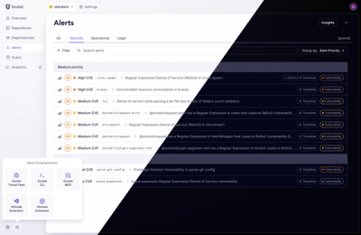
A Fresh Look for the Socket Dashboard
We’ve redesigned the Socket dashboard with simpler navigation, less visual clutter, and a cleaner UI that highlights what really matters.
By André Staltz, Jeppe Hasseriis, Nolan Lawson - Jun 23, 2025
@spectrum-web-components/checkbox
Advanced tools
`<sp-checkbox>` allow users to select multiple items from a list of independent options, or to mark an individual option as selected.
<sp-checkbox> allow users to select multiple items from a list of independent
options, or to mark an individual option as selected.
Should I use a checkbox or a switch? Use a switch when activating something instead of selecting.
yarn add @spectrum-web-components/checkbox
Import the side effectful registration of <sp-checkbox> via:
import '@spectrum-web-components/checkbox/sp-checkbox.js';
When looking to leverage the Checkbox base class as a type and/or for extension purposes, do so via:
import { Checkbox } from '@spectrum-web-components/checkbox';
<sp-field-group>
    <sp-checkbox size="s">Small</sp-checkbox>
    <sp-checkbox size="s" checked>Small Checked</sp-checkbox>
    <sp-checkbox size="s" indeterminate>Small Indeterminate</sp-checkbox>
</sp-field-group>
<sp-field-group>
    <sp-checkbox size="m">Medium</sp-checkbox>
    <sp-checkbox size="m" checked>Medium Checked</sp-checkbox>
    <sp-checkbox size="m" indeterminate>Medium Indeterminate</sp-checkbox>
</sp-field-group>
<sp-field-group>
    <sp-checkbox size="l">Large</sp-checkbox>
    <sp-checkbox size="l" checked>Large Checked</sp-checkbox>
    <sp-checkbox size="l" indeterminate>Large Indeterminate</sp-checkbox>
</sp-field-group>
<sp-field-group>
    <sp-checkbox size="xl">Extra Large</sp-checkbox>
    <sp-checkbox size="xl" checked>Extra Large Checked</sp-checkbox>
    <sp-checkbox size="xl" indeterminate>Extra Large Indeterminate</sp-checkbox>
</sp-field-group>
Standard checkboxes are the default style for checkboxes. They are optimal for application panels where all visual elements are monochrome in order to direct focus to the content.
<div style="display: flex; justify-content: space-between;">
    <div style="display: flex; flex-direction: column;">
        <h4 class="spectrum-Heading--subtitle1">Default</h4>
        <sp-checkbox>Web component</sp-checkbox>
        <sp-checkbox checked>Web component</sp-checkbox>
        <sp-checkbox indeterminate>Web component</sp-checkbox>
    </div>

    <div style="display: flex; flex-direction: column;">
        <h4 class="spectrum-Heading--subtitle1">Invalid</h4>
        <sp-checkbox invalid>Web component</sp-checkbox>
        <sp-checkbox checked invalid>Web component</sp-checkbox>
        <sp-checkbox indeterminate invalid>Web component</sp-checkbox>
    </div>

    <div style="display: flex; flex-direction: column;">
        <h4 class="spectrum-Heading--subtitle1">Disabled</h4>
        <sp-checkbox disabled>Web component</sp-checkbox>
        <sp-checkbox checked disabled>Web component</sp-checkbox>
        <sp-checkbox indeterminate disabled>Web component</sp-checkbox>
    </div>
</div>
Emphasized checkboxes are a secondary style for checkboxes. The blue color provides a visual prominence that is optimal for forms, settings, lists or grids of assets, etc. where the checkboxes need to be noticed.
<div style="display: flex; justify-content: space-between;">
    <div style="display: flex; flex-direction: column; justify-content: space-between;">
        <h4 class="spectrum-Heading--subtitle1">Default</h4>
        <sp-checkbox emphasized>Web component</sp-checkbox>
        <sp-checkbox emphasized checked>Web component</sp-checkbox>
        <sp-checkbox emphasized indeterminate>Web component</sp-checkbox>
    </div>

    <div style="display: flex; flex-direction: column;">
        <h4 class="spectrum-Heading--subtitle1">Invalid</h4>
        <sp-checkbox emphasized invalid>Web component</sp-checkbox>
        <sp-checkbox emphasized checked invalid>Web component</sp-checkbox>
        <sp-checkbox emphasized indeterminate invalid>Web component</sp-checkbox>
    </div>

    <div style="display: flex; flex-direction: column;">
        <h4 class="spectrum-Heading--subtitle1">Disabled</h4>
        <sp-checkbox emphasized disabled>Web component</sp-checkbox>
        <sp-checkbox emphasized checked disabled>Web component</sp-checkbox>
        <sp-checkbox emphasized indeterminate disabled>Web component</sp-checkbox>
    </div>
</div>
Event handlers for clicks and other user actions can be registered on an <sp-checkbox> as they would a standard <input type="checkbox"> element.
<sp-checkbox
    id="checkbox-example"
    onclick="spAlert(this, '<sp-radio> clicked!')"
>
    Web component
</sp-checkbox>
Checkboxes are accessible by default, rendered in HTML using the <input type="checkbox"> element. When the checkbox is set as indeterminate or
invalid, the appropriate ARIA state attribute will automatically be applied.
1.5.0 (2025-04-15)
c7efe314c5)e19e55f6f1)86bcd12200)a69accb8b4)4c2f908a92)8f8735c9ec)5a3bc6d24e)FAQs
`<sp-checkbox>` allow users to select multiple items from a list of independent options, or to mark an individual option as selected.
The npm package @spectrum-web-components/checkbox receives a total of 3,251 weekly downloads. As such, @spectrum-web-components/checkbox popularity was classified as popular.
We found that @spectrum-web-components/checkbox demonstrated a healthy version release cadence and project activity because the last version was released less than a year ago. It has 7 open source maintainers collaborating on the project.
Did you know?

Socket for GitHub automatically highlights issues in each pull request and monitors the health of all your open source dependencies. Discover the contents of your packages and block harmful activity before you install or update your dependencies.
Product
We’ve redesigned the Socket dashboard with simpler navigation, less visual clutter, and a cleaner UI that highlights what really matters.

Industry Insights
Terry O’Daniel, Head of Security at Amplitude, shares insights on building high-impact security teams, aligning with engineering, and why AI gives defenders a fighting chance.

Security News
MCP spec updated with structured tool output, stronger OAuth 2.1 security, resource indicators, and protocol cleanups for safer, more reliable AI workflows.