Product
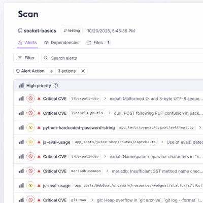
Unify Your Security Stack with Socket Basics
A single platform for static analysis, secrets detection, container scanning, and CVE checks—built on trusted open source tools, ready to run out of the box.
@spectrum-web-components/infield-button
Advanced tools
Web component implementation of a Spectrum design InfieldButton
When composing complex form fields, an <sp-infield-button> can visually associate button functionality with other form fields to delivery enhanced capabilities to your visitors.
yarn add @spectrum-web-components/infield-button
Import the side effectful registration of <sp-infield-button> via:
import '@spectrum-web-components/infield-button/sp-infield-button.js';
When looking to leverage the InfieldButton base class as a type and/or for extension purposes, do so via:
import { InfieldButton } from '@spectrum-web-components/infield-button';
<sp-infield-button label="Add" size="s">
    <sp-icon-add></sp-icon-add>
</sp-infield-button>
<sp-infield-button label="Add" size="m">
    <sp-icon-add></sp-icon-add>
</sp-infield-button>
<sp-infield-button label="Add" size="l">
    <sp-icon-add></sp-icon-add>
</sp-infield-button>
<sp-infield-button label="Add" size="xl">
    <sp-icon-add></sp-icon-add>
</sp-infield-button>
Use the inline attribute to describe whether the <sp-infield-button> should be visually at the start or end of the field is associated to:
<sp-infield-button inline="start" label="Add">
    <sp-icon-add></sp-icon-add>
</sp-infield-button>
<sp-infield-button inline="end" label="Add">
    <sp-icon-add></sp-icon-add>
</sp-infield-button>
The block attribute can be used to create a vertial stack of buttons. You can place buttons visually on the stack with the start or end values:
<sp-infield-button block="start" label="Increment">
    <sp-icon-add size="xxs"></sp-icon-add>
</sp-infield-button>
<sp-infield-button block="end" label="Decrement">
    <sp-icon-remove size="xxs"></sp-icon-remove>
</sp-infield-button>
An <sp-infield-button> with the disabled attribute will become non-interactive and dimmed:
<sp-infield-button disabled inline="start" label="Add">
    <sp-icon-add></sp-icon-add>
</sp-infield-button>
An <sp-infield-button> with the quiet attribute will feature a diminished visual presence:
<sp-infield-button inline="start" label="Add" quiet>
    <sp-icon-add></sp-icon-add>
</sp-infield-button>
FAQs
Did you know?

Socket for GitHub automatically highlights issues in each pull request and monitors the health of all your open source dependencies. Discover the contents of your packages and block harmful activity before you install or update your dependencies.

Product
A single platform for static analysis, secrets detection, container scanning, and CVE checks—built on trusted open source tools, ready to run out of the box.

Product
Socket is launching experimental protection for the Hugging Face ecosystem, scanning for malware and malicious payload injections inside model files to prevent silent AI supply chain attacks.

Research
/Security News
The Socket Threat Research Team uncovered a coordinated campaign that floods the Chrome Web Store with 131 rebranded clones of a WhatsApp Web automation extension to spam Brazilian users.