What is @storybook/addon-a11y?
The @storybook/addon-a11y package is an addon for Storybook that helps you improve the accessibility of your UI components. It integrates with Storybook to provide automated checks and manual testing tools for accessibility issues, allowing developers to ensure their components are accessible to as many users as possible.
What are @storybook/addon-a11y's main functionalities?
Automated accessibility checks
Automatically run accessibility checks on your components within the Storybook UI. It uses the axe-core library to test each component for accessibility issues and provides a report.
import { withA11y } from '@storybook/addon-a11y';

export default {
  title: 'Button',
  decorators: [withA11y],
};

export const AccessibleButton = () => <button>Click me</button>;
export const InAccessibleButton = () => <button style={{ color: 'white', backgroundColor: 'white' }}>Can't see me</button>;
Manual accessibility testing tools
Provides tools for manual accessibility testing, such as color contrast checkers and keyboard event simulation, to complement the automated checks.
N/A
Customizable rules
Allows customization of the accessibility rules used for testing, enabling or disabling specific rules to tailor the checks to your project's needs.
import { withA11y } from '@storybook/addon-a11y';

export default {
  title: 'Button',
  decorators: [withA11y],
  parameters: {
    a11y: {
      config: {
        rules: [{ id: 'color-contrast', enabled: false }]
      }
    }
  }
};
Other packages similar to @storybook/addon-a11y
axe-core
A core library for accessibility testing used by many tools and services, including @storybook/addon-a11y. It can be integrated directly into testing workflows or used as part of other tools.
eslint-plugin-jsx-a11y
An ESLint plugin that enforces accessibility rules in JSX elements. Unlike @storybook/addon-a11y, which is used within Storybook, this plugin integrates with the ESLint static code analysis tool to catch accessibility issues during code linting.
react-axe
A library that can be used in React applications to audit accessibility in real-time during development. It also uses axe-core under the hood but is used directly in the app rather than in Storybook.
pa11y
An automated accessibility testing tool that runs in the command line or as part of your build process. It provides a different approach to accessibility testing compared to the Storybook addon, as it can be used for testing entire pages and is not specific to a component development environment.
storybook-addon-a11y
This Storybook addon can be helpful to make your UI components more accessible.
Framework Support
Getting started
First, install the addon.
$ yarn add @storybook/addon-a11y --dev
Add this line to your main.js file (create this file inside your Storybook config directory if needed).
export default {
  addons: ['@storybook/addon-a11y'],
};
And here's a sample story file to test the addon:
import React from 'react';

export default {
  title: 'button',
};

export const Accessible = () => <button>Accessible button</button>;

export const Inaccessible = () => (
  <button style={{ backgroundColor: 'red', color: 'darkRed' }}>Inaccessible button</button>
);
Handling failing rules
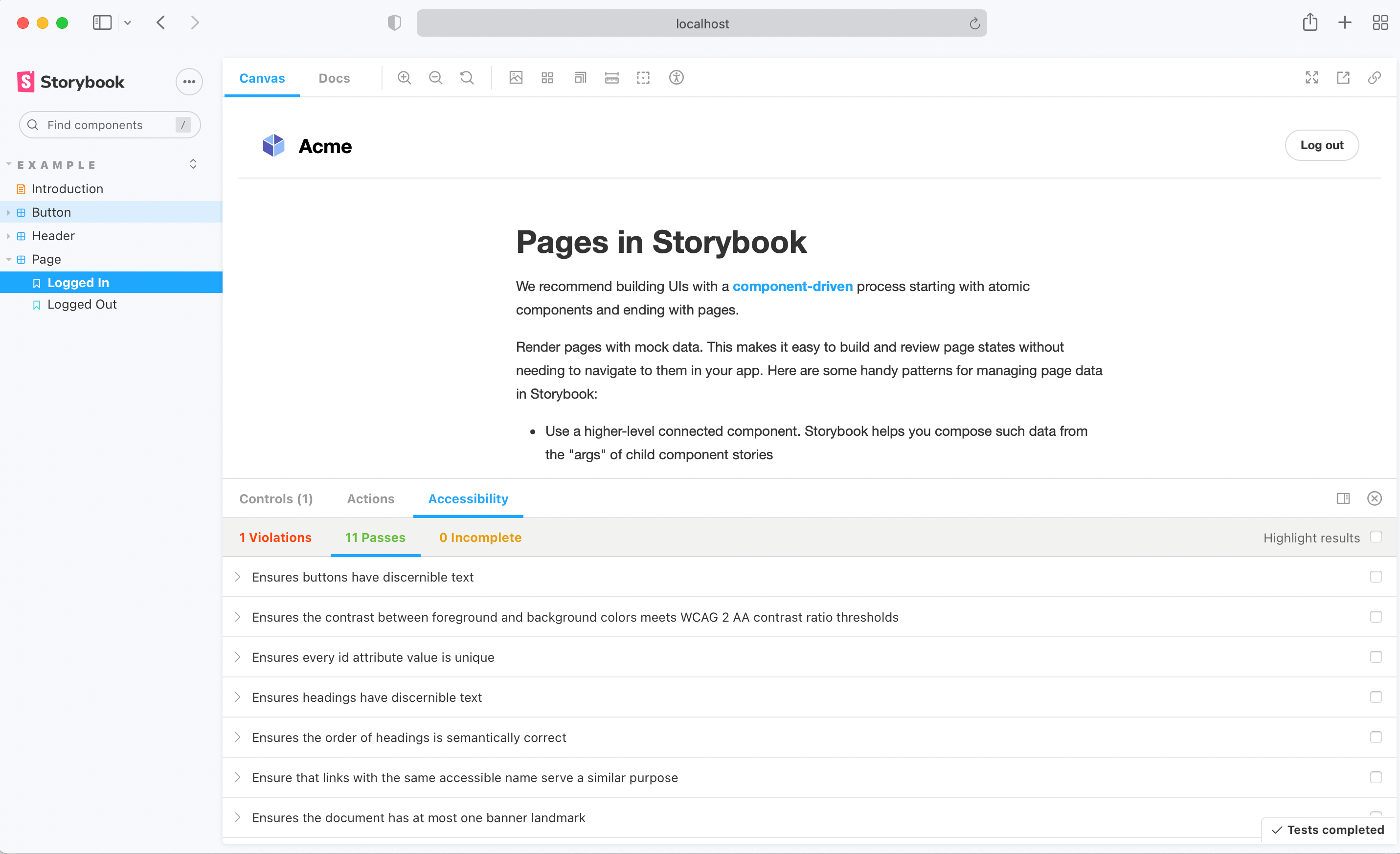
When Axe reports accessibility violations in stories, there are multiple ways to handle these failures depending on your needs.
Story-level overrides
At the Story level, override rules using parameters.a11y.config.rules.
export const InputWithoutAutofill = () => <input type="text" autocomplete="nope" />;
InputWithoutAutofill.parameters = {
a11y: {
disable: true,
config: {
rules: [
{
id: 'autocomplete-valid',
selector: '*:not([autocomplete="nope"])',
},
{
id: 'landmark-complementary-is-top-level',
reviewOnFail: true,
},
],
},
},
};
Alternatively, you can disable specific rules in a Story:
export const Inaccessible = () => (
  <button style={{ backgroundColor: 'red', color: 'darkRed' }}>Inaccessible button</button>
);
Inaccessible.parameters = {
  a11y: {
    config: {
      rules: [{ id: 'color-contrast', enabled: false }],
    },
  },
};
Tip: clearly explain in a comment why a rule was overridden, it’ll help you and your team trace back why certain violations aren’t being reported or need to be addressed. For example:
MyStory.parameters = {
a11y: {
config: {
rules: [
{
id: 'autocomplete-valid',
selector: '*:not([autocomplete="nope"])',
},
{
id: 'color-contrast',
reviewOnFail: true,
},
],
},
},
};
Global overrides
When you want to ignore an accessibility rule or change its settings across all stories, set parameters.a11y.config.rules in your Storybook’s preview.ts file. This can be particularly useful for ignoring false positives commonly reported by Axe.
export const parameters = {
a11y: {
config: {
rules: [
{
id: 'autocomplete-valid',
selector: '*:not([autocomplete="nope"])',
},
{
id: 'autocomplete-valid',
enabled: false,
},
],
},
},
};
Disabling checks
If you wish to entirely disable a11y checks for a subset of stories, you can control this with story parameters:
export const MyNonCheckedStory = () => <SomeComponent />;
MyNonCheckedStory.parameters = {
a11y: { disable: true },
};
Parameters
For more customizability use parameters to configure aXe options.
You can override these options at story level too.
import React from 'react';
import { storiesOf, addDecorator, addParameters } from '@storybook/react';
export default {
title: 'button',
parameters: {
a11y: {
element: '#storybook-root',
config: {},
options: {},
manual: true,
},
},
};
export const accessible = () => <button>Accessible button</button>;
export const inaccessible = () => (
<button style={{ backgroundColor: 'red', color: 'darkRed' }}>Inaccessible button</button>
);
Roadmap
- Make UI accessible
- Show in story where violations are.
- Add more example tests
- Add tests
- Make CI integration possible