Product
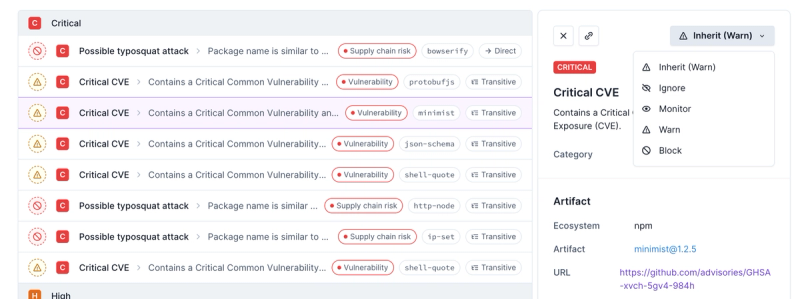
Introducing Enhanced Alert Actions and Triage Functionality
Socket now supports four distinct alert actions instead of the previous two, and alert triaging allows users to override the actions taken for all individual alerts.
@storybook/addon-measure
Advanced tools
Package description
The @storybook/addon-measure npm package is a Storybook addon used for measuring and inspecting elements in a Storybook UI. This tool is particularly useful for developers and designers to ensure precise visual consistency directly within the Storybook environment. It allows users to measure dimensions, spacing, and alignment of components during the development process.
Element Measurement
This feature allows users to measure the dimensions and spacing of components. By adding the withMeasure decorator, users can toggle measurement tools in the Storybook UI to inspect the component presented in the story.
import { withMeasure } from '@storybook/addon-measure';
export default {
title: 'Your Component',
decorators: [withMeasure]
};
export const YourStory = () => <YourComponent />;Alignment Inspection
This feature enables users to check the alignment of elements within components. The decorator adds visual guides that help in aligning text, icons, or other elements accurately within the component.
import { withMeasure } from '@storybook/addon-measure';

export default {
  title: 'Another Component',
  decorators: [withMeasure]
};

export const AnotherStory = () => <AnotherComponent />;Similar to @storybook/addon-measure, @storybook/addon-outline provides visual tools to enhance UI development in Storybook. While @storybook/addon-measure focuses on measuring and spacing, @storybook/addon-outline helps by drawing outlines around components, which is useful for visual debugging of layout and container boundaries.
This addon is used to embed Figma or Sketch designs next to your Storybook stories, facilitating a side-by-side comparison between design files and implemented components. Unlike @storybook/addon-measure, which is more focused on in-story measurements, storybook-addon-designs bridges the gap between design and development by directly integrating design visuals.
Readme

Storybook addon for inspecting layouts and visualizing the box model.
Hover over a DOM node
Storybook will display the dimensions of the selected element—margin, padding, border, width and height—in pixels.

This addon requires Storybook 6.3 or later. Install the latest with npx sb upgrade --prerelease
Install the addon:
npm i -D @storybook/addon-measure
"@storybook/addon-measure" to the addons array in your .storybook/main.js:module.exports = {
addons: ["@storybook/addon-measure"],
};
Clone the repository and install dependencies.
yarn
yarn start runs babel in watch mode and starts Storybookyarn build build and package your addon codeThis project is configured to use auto for release management. It generates a changelog and pushes it to both GitHub and npm. Therefore, you need to configure access to both:
NPM_TOKEN Create a token with both Read and Publish permissions.GH_TOKEN Create a token with the repo scope.Add them to the .env file at the root of your project:
GH_TOKEN=<value you just got from GitHub>
NPM_TOKEN=<value you just got from npm>
To create a release locally you can run the following command, otherwise the GitHub action will make the release for you.
yarn release
That will:
FAQs
Inspect layouts by visualizing the box model
The npm package @storybook/addon-measure receives a total of 3,723,209 weekly downloads. As such, @storybook/addon-measure popularity was classified as popular.
We found that @storybook/addon-measure demonstrated a healthy version release cadence and project activity because the last version was released less than a year ago. It has 0 open source maintainers collaborating on the project.
Did you know?

Socket for GitHub automatically highlights issues in each pull request and monitors the health of all your open source dependencies. Discover the contents of your packages and block harmful activity before you install or update your dependencies.

Product
Socket now supports four distinct alert actions instead of the previous two, and alert triaging allows users to override the actions taken for all individual alerts.

Security News
Polyfill.io has been serving malware for months via its CDN, after the project's open source maintainer sold the service to a company based in China.

Security News
OpenSSF is warning open source maintainers to stay vigilant against reputation farming on GitHub, where users artificially inflate their status by manipulating interactions on closed issues and PRs.