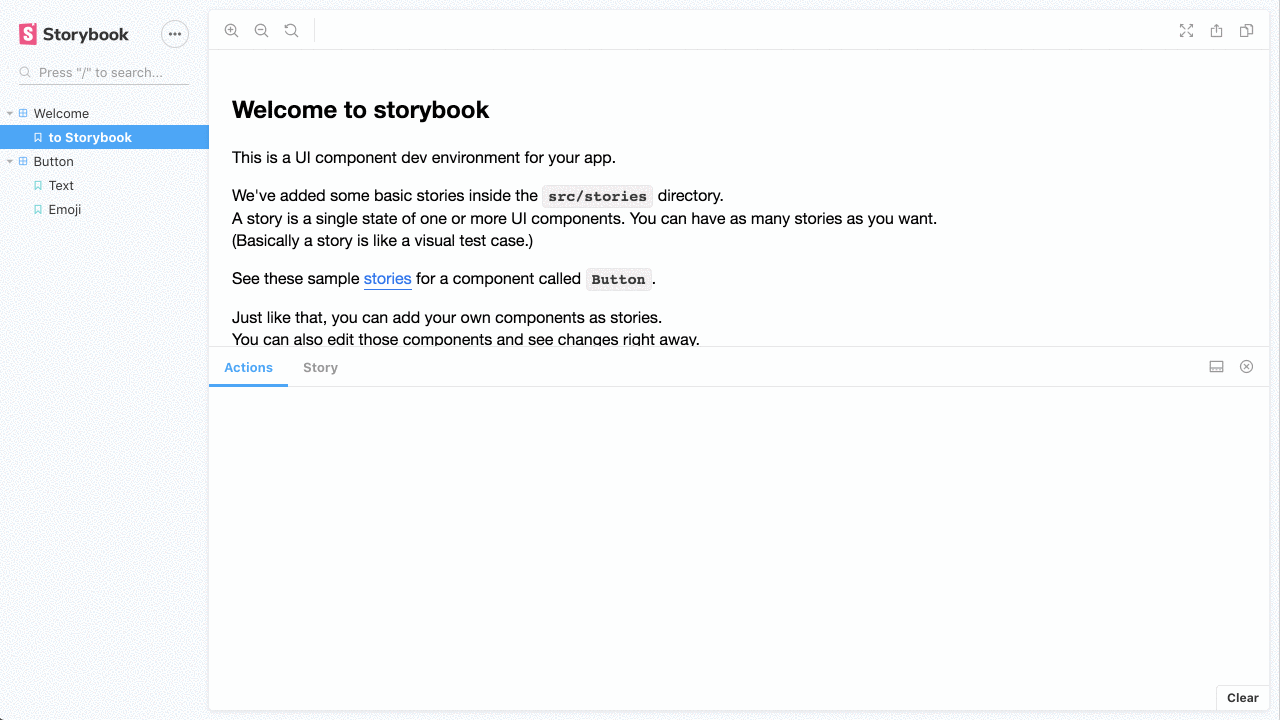
Research
Malicious npm Package Brand-Squats TanStack to Exfiltrate Environment Variables
A brand-squatted TanStack npm package used postinstall scripts to steal .env files and exfiltrate developer secrets to an attacker-controlled endpoint.
@storybook/addon-storysource
Advanced tools
View a story’s source code to see how it works and paste into your app
This addon is used to show stories source in the addon panel.

First, install the addon
yarn add @storybook/addon-storysource --dev
You can add configuration for this addon by using a preset or by using the addon config with webpack
Add the following to your .storybook/main.js exports:
export default {
addons: ['@storybook/addon-storysource'],
};
You can pass configurations into the addon-storysource loader in your .storybook/main.js file, e.g.:
export default {
addons: [
{
name: '@storybook/addon-storysource',
options: {
rule: {
// test: [/\.stories\.jsx?$/], This is default
include: [path.resolve(__dirname, '../src')], // You can specify directories
},
loaderOptions: {
prettierConfig: { printWidth: 80, singleQuote: false },
},
},
},
],
};
To customize the source-loader, pass loaderOptions. Valid configurations are documented in the source-loader README.
Storysource will automatically use the light or dark syntax theme based on your storybook theme. See Theming Storybook for more information.
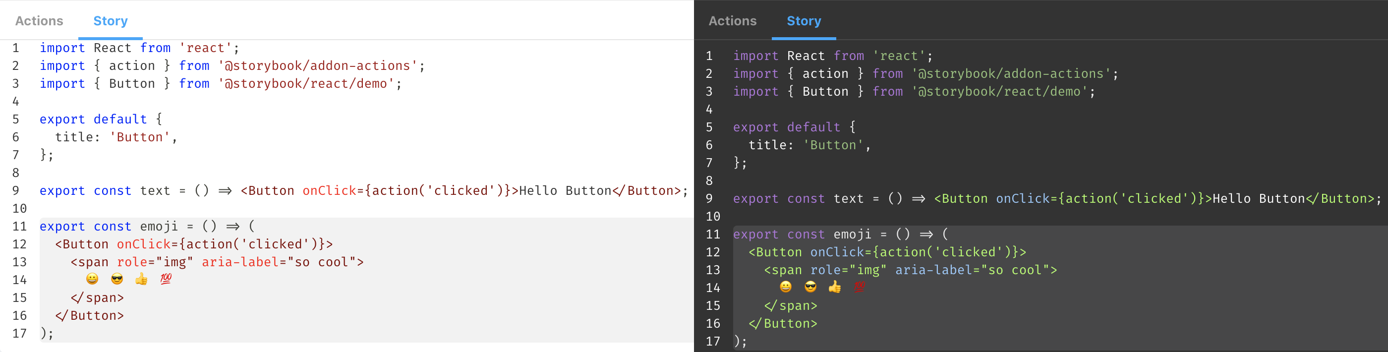
Storybook 6.0 introduced an unintentional change to source-loader, in which only the source of the selected story is shown in the addon. To restore the old behavior, pass theinjectStoryParameters: false option.
If you're using addon-docs:
export default {
addons: [
{
name: '@storybook/addon-docs',
options: {
sourceLoaderOptions: {
injectStoryParameters: false,
},
},
},
],
};
If not:
export default {
addons: [
{
name: '@storybook/addon-storysource',
options: {
loaderOptions: {
injectStoryParameters: false,
},
},
},
],
};
This bug will be resolved in a future version of the addon.
@storybook/addon-docs provides a comprehensive documentation addon for Storybook. It allows you to write and view documentation alongside your stories, including the ability to view source code, props tables, and more. Compared to @storybook/addon-storysource, @storybook/addon-docs offers a more extensive set of documentation features.
react-docgen is a CLI and library for extracting information from React component files. It can be used to generate documentation for your components, including prop types and default values. While it does not integrate directly with Storybook, it can be used in conjunction with other tools to provide similar functionality to @storybook/addon-storysource.
FAQs
View a story’s source code to see how it works and paste into your app
The npm package @storybook/addon-storysource receives a total of 279,588 weekly downloads. As such, @storybook/addon-storysource popularity was classified as popular.
We found that @storybook/addon-storysource demonstrated a healthy version release cadence and project activity because the last version was released less than a year ago. It has 12 open source maintainers collaborating on the project.
Did you know?

Socket for GitHub automatically highlights issues in each pull request and monitors the health of all your open source dependencies. Discover the contents of your packages and block harmful activity before you install or update your dependencies.

Research
A brand-squatted TanStack npm package used postinstall scripts to steal .env files and exfiltrate developer secrets to an attacker-controlled endpoint.

Research
Compromised SAP CAP npm packages download and execute unverified binaries, creating urgent supply chain risk for affected developers and CI/CD environments.

Company News
Socket has acquired Secure Annex to expand extension security across browsers, IDEs, and AI tools.