Research
/Security News
DuckDB npm Account Compromised in Continuing Supply Chain Attack
Ongoing npm supply chain attack spreads to DuckDB: multiple packages compromised with the same wallet-drainer malware.
@sv-keg/keg-components
Advanced tools
* Base UI Components for the Keg Core and Tap extensions a # Dev setup * `yarn install` * `yarn sb` - local storybook * `yarn sb:native` - native local storybook * `yarn sb:web` - web local storybook * `yarn format` - formats your code based on the config
yarn installyarn sb - local storybookyarn sb:native - native local storybookyarn sb:web - web local storybookyarn format - formats your code based on the config set in configs/eslint.config.js && configs/prettier.config.jsyarn eslint:watch - watches any code change for any lint errorsKeg Components leverages re-theme for dynamic theming across platforms and viewport sizes
src/theme/componentsUse the useThemePath hook:
import { useThemePath } from '../../hooks'

const FooBar = (props) => {
  // theme from `src/theme/components/fooBar.js`
  const fooBarTheme = useThemePath('fooBar')
  return (
    <View style={fooBarTheme.main}>
      ...
    </View>
  )
}
Every component implemented in keg-components that has a theme should define main and content styles:
/* src/theme/components/sampleButton.js */
export const sampleButton = {
  main: { ... },
  content: { ... }
}
main style would theme its root View component, whereas the content style themes its inner Text component:
/* src/components/button/sampleButton.js */
export const SampleButton = (props) => {
  const buttonTheme = useThemePath('sampleButton', props.style)
  return (
    <View style={buttonTheme.main}>
      <Text style={buttonTheme.content}>
        { props.text }
      </Text>
    </View>
  )
}
Components sometimes import/consume other keg-components and then need to style those imported components within their styling context. These styles should be defined in the consumer's theme object
/* src/theme/components/iconButton.js */
export const iconButton= {
  main: { ... },
  content: { ... },
  icon: {
    main: { ... },
    content: { ... }
  }
}
Use size keys (e.g. $small, $medium, etc.) and platform keys (e.g. $native, $web, $all, etc.) to wrap style properties only. This ensures that the shape of the theme object remains constant across all platforms and viewport sizes.
export const button = {
  $web: {
    main: {
      backgroundColor: 'coral'
    },
  },
  $native: {
    main: {
      backgroundColor: 'green'
    },
    content: {
      margin: 15
    }
  }
}
export const button = {
  main: {
    $native: {
      backgroundColor: 'green'
    },
    $web: {
      backgroundColor: 'coral'
    }
  },
  content: {
    $native:  {
      margin: 15
    }
  }
}
content styles on the $web platform, making it inconsistent with $nativeFAQs
* Base UI Components for the Keg Core and Tap extensions a # Dev setup * `yarn install` * `yarn sb` - local storybook * `yarn sb:native` - native local storybook * `yarn sb:web` - web local storybook * `yarn format` - formats your code based on the config
The npm package @sv-keg/keg-components receives a total of 0 weekly downloads. As such, @sv-keg/keg-components popularity was classified as not popular.
We found that @sv-keg/keg-components demonstrated a not healthy version release cadence and project activity because the last version was released a year ago. It has 6 open source maintainers collaborating on the project.
Did you know?

Socket for GitHub automatically highlights issues in each pull request and monitors the health of all your open source dependencies. Discover the contents of your packages and block harmful activity before you install or update your dependencies.

Research
/Security News
Ongoing npm supply chain attack spreads to DuckDB: multiple packages compromised with the same wallet-drainer malware.

Security News
The MCP Steering Committee has launched the official MCP Registry in preview, a central hub for discovering and publishing MCP servers.

Product
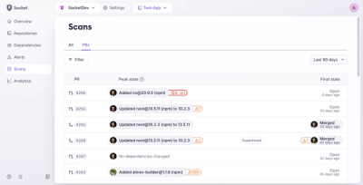
Socket’s new Pull Request Stories give security teams clear visibility into dependency risks and outcomes across scanned pull requests.