
Research
2025 Report: Destructive Malware in Open Source Packages
Destructive malware is rising across open source registries, using delays and kill switches to wipe code, break builds, and disrupt CI/CD.
By Kush Pandya - Dec 24, 2025
@syncfusion/ej2-dropdowns
Advanced tools
Superset of HTML select box contains specific features such as data binding, grouping, sorting, filtering, and templates.
The JavaScript DropDown package includes the following list of components.
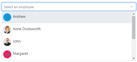
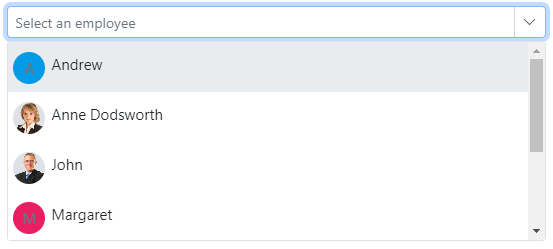
The JavaScript DropdownList control is a quick replacement of the HTML select tags. It has a rich appearance and allows users to select a single value that is non-editable from a list of predefined values.
Getting Started . Online demos . Learn more
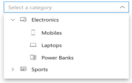
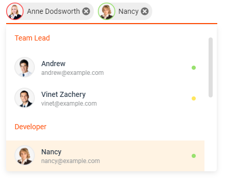
The JavaScript DropdownTree control is a textbox control that allows the user to select single or multiple values from hierarchical data in a tree-like structure. It has several out-of-the-box features, such as data binding, check boxes, templates, UI customization, accessibility, and preselected values.
Getting Started . Online demos . Learn more
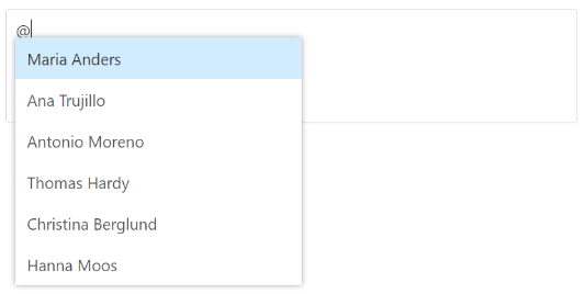
The JavaScript Mention control is an autocomplete-like control to tag or select a user/group from the suggestion list. The control opens the suggestion list when a user starts typing with the character ‘@’ in popular social media sites such as Facebook, Twitter, and more. It supports several out-of-the-box features: Data binding, grouping, UI customization, accessibility, and more.
Getting Started . Online demos . Learn more
The JavaScript ComboBox control is a drop-down list with editable textbox that also allows users to choose an option from a predefined pop-up list.
Getting Started . Online demos . Learn more
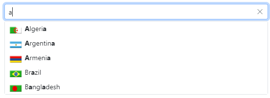
The JavaScript AutoComplete control is a textbox control that provides a list of suggestions to select from as the user types. It has several out-of-the-box features such as data binding, filtering, grouping, UI customization, accessibility, and more.
Getting Started. Online demos. Learn more.
The JavaScript MultiSelect Dropdown control is a quick replacement for the HTML select tag for selecting multiple values. HTML MultiSelect Dropdown is a textbox control that allows the user to type or select multiple values from a list of predefined options.
Getting Started . Online demos . Learn more
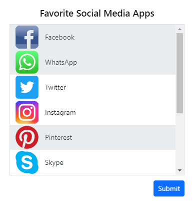
The JavaScript ListBox control is a graphical user interface for displaying a list of items with multi-selection options. It has a rich appearance and allows users to select one or more items from the list using checkboxes or keyboard interactions.
Getting Started . Online demos . Learn more
Trusted by the world's leading companies

To install dropdowns and its dependent packages, use the following command,
npm install @syncfusion/ej2-dropdowns
DropDown controls are also offered to following list of frameworks.
 Angular |  React |  Vue |  ASP.NET Core |  ASP.NET MVC |
|---|
Product support is available through following mediums.
Check the changelog here. Get minor improvements and bug fixes every week to stay up to date with frequent updates.
This is a commercial product and requires a paid license for possession or use. Syncfusion® licensed software, including this component, is subject to the terms and conditions of Syncfusion® EULA. To acquire a license for 140+ JavaScript UI controls, you can purchase or start a free 30-day trial.
A free community license is also available for companies and individuals whose organizations have less than $1 million USD in annual gross revenue and five or fewer developers.
See LICENSE FILE for more info.
© Copyright 2025 Syncfusion® Inc. All Rights Reserved. The Syncfusion® Essential Studio® license and copyright applies to this distribution.
react-select is a flexible and customizable dropdown component for React applications. It supports single and multi-select options, async loading, and custom styling. Compared to @syncfusion/ej2-dropdowns, react-select is more focused on React and offers a more modern and flexible API.
Ant Design (antd) is a comprehensive UI library for React that includes a variety of components, including dropdowns. The dropdown components in antd are highly customizable and come with built-in support for themes and internationalization. Compared to @syncfusion/ej2-dropdowns, antd offers a broader range of UI components and is more tightly integrated with the React ecosystem.
Bootstrap is a popular CSS framework that includes a variety of UI components, including dropdowns. The dropdown components in Bootstrap are easy to use and integrate with any web application. Compared to @syncfusion/ej2-dropdowns, Bootstrap is more focused on providing a consistent design system and is less feature-rich in terms of dropdown functionality.
FAQs
Essential JS 2 DropDown Components
The npm package @syncfusion/ej2-dropdowns receives a total of 117,345 weekly downloads. As such, @syncfusion/ej2-dropdowns popularity was classified as popular.
We found that @syncfusion/ej2-dropdowns demonstrated a healthy version release cadence and project activity because the last version was released less than a year ago. It has 3 open source maintainers collaborating on the project.
Did you know?

Socket for GitHub automatically highlights issues in each pull request and monitors the health of all your open source dependencies. Discover the contents of your packages and block harmful activity before you install or update your dependencies.
Research
Destructive malware is rising across open source registries, using delays and kill switches to wipe code, break builds, and disrupt CI/CD.

Security News
Socket CTO Ahmad Nassri shares practical AI coding techniques, tools, and team workflows, plus what still feels noisy and why shipping remains human-led.

Research
/Security News
A five-month operation turned 27 npm packages into durable hosting for browser-run lures that mimic document-sharing portals and Microsoft sign-in, targeting 25 organizations across manufacturing, industrial automation, plastics, and healthcare for credential theft.