Research
Security News
Malicious npm Package Typosquats react-login-page to Deploy Keylogger
Socket researchers unpack a typosquatting package with malicious code that logs keystrokes and exfiltrates sensitive data to a remote server.
@syncfusion/ej2-inputs
Advanced tools
Package description
@syncfusion/ej2-inputs is a comprehensive package that provides a variety of input controls for building modern web applications. It includes components like TextBox, NumericTextBox, MaskedTextBox, Slider, and more, which are essential for creating interactive and user-friendly forms.
TextBox
The TextBox component allows users to input text. It supports various configurations like placeholder text, floating labels, and more.
import { TextBox } from '@syncfusion/ej2-inputs';
let textBoxObj = new TextBox({
placeholder: 'Enter your name'
});
textBoxObj.appendTo('#textbox');
NumericTextBox
The NumericTextBox component is used for numerical input. It supports features like min/max values, step increments, and custom formatting.
import { NumericTextBox } from '@syncfusion/ej2-inputs';

let numericTextBoxObj = new NumericTextBox({
    value: 10,
    min: 0,
    max: 100,
    format: 'n2'
});
numericTextBoxObj.appendTo('#numerictextbox');
MaskedTextBox
The MaskedTextBox component allows users to input text in a specific format, such as phone numbers or dates, using a mask pattern.
import { MaskedTextBox } from '@syncfusion/ej2-inputs';

let maskedTextBoxObj = new MaskedTextBox({
    mask: '000-000-0000'
});
maskedTextBoxObj.appendTo('#maskedtextbox');
Slider
The Slider component is used for selecting a value from a range. It supports features like min/max values, step increments, and orientation.
import { Slider } from '@syncfusion/ej2-inputs';

let sliderObj = new Slider({
    value: 30,
    min: 0,
    max: 100,
    step: 1
});
sliderObj.appendTo('#slider');
react-inputs-validation is a package that provides a set of input components with built-in validation for React applications. It offers similar functionalities like text input, numeric input, and masked input, but is specifically designed for React.
react-number-format is a React component for formatting and masking numeric inputs. It provides features like custom formatting, masking, and validation, similar to the NumericTextBox and MaskedTextBox components in @syncfusion/ej2-inputs.
rc-slider is a React component for creating sliders. It offers similar functionalities to the Slider component in @syncfusion/ej2-inputs, including support for range selection, step increments, and custom styling.
Readme
NumericTextBox component is used to get the numeric inputs from the user. The input values can be increment or decrement with a predefined step value.
Demo Documentation AngularDemo AngularDocumentation
TextBox is an input element that allows to get input from the user. It allows the user either to edit or display the input values.
icon/element is added as a group.Floating Label.sizing of textbox, namely Small and Normal.validation states,namely Success ,Error and Warning.FAQs
Unknown package
The npm package @syncfusion/ej2-inputs receives a total of 91,341 weekly downloads. As such, @syncfusion/ej2-inputs popularity was classified as popular.
We found that @syncfusion/ej2-inputs demonstrated a healthy version release cadence and project activity because the last version was released less than a year ago. It has 0 open source maintainers collaborating on the project.
Did you know?

Socket for GitHub automatically highlights issues in each pull request and monitors the health of all your open source dependencies. Discover the contents of your packages and block harmful activity before you install or update your dependencies.

Research
Security News
Socket researchers unpack a typosquatting package with malicious code that logs keystrokes and exfiltrates sensitive data to a remote server.

Security News
The JavaScript community has launched the e18e initiative to improve ecosystem performance by cleaning up dependency trees, speeding up critical parts of the ecosystem, and documenting lighter alternatives to established tools.

Product
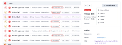
Socket now supports four distinct alert actions instead of the previous two, and alert triaging allows users to override the actions taken for all individual alerts.