Product
Introducing Enhanced Alert Actions and Triage Functionality
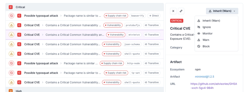
Socket now supports four distinct alert actions instead of the previous two, and alert triaging allows users to override the actions taken for all individual alerts.
@syncfusion/ej2-inputs
Advanced tools
Package description
@syncfusion/ej2-inputs is a comprehensive package that provides a variety of input controls for building modern web applications. It includes components like TextBox, NumericTextBox, MaskedTextBox, Slider, and more, which are essential for creating interactive and user-friendly forms.
TextBox
The TextBox component allows users to input text. It supports various configurations like placeholder text, floating labels, and more.
import { TextBox } from '@syncfusion/ej2-inputs';
let textBoxObj = new TextBox({
placeholder: 'Enter your name'
});
textBoxObj.appendTo('#textbox');
NumericTextBox
The NumericTextBox component is used for numerical input. It supports features like min/max values, step increments, and custom formatting.
import { NumericTextBox } from '@syncfusion/ej2-inputs';

let numericTextBoxObj = new NumericTextBox({
    value: 10,
    min: 0,
    max: 100,
    format: 'n2'
});
numericTextBoxObj.appendTo('#numerictextbox');
MaskedTextBox
The MaskedTextBox component allows users to input text in a specific format, such as phone numbers or dates, using a mask pattern.
import { MaskedTextBox } from '@syncfusion/ej2-inputs';

let maskedTextBoxObj = new MaskedTextBox({
    mask: '000-000-0000'
});
maskedTextBoxObj.appendTo('#maskedtextbox');
Slider
The Slider component is used for selecting a value from a range. It supports features like min/max values, step increments, and orientation.
import { Slider } from '@syncfusion/ej2-inputs';

let sliderObj = new Slider({
    value: 30,
    min: 0,
    max: 100,
    step: 1
});
sliderObj.appendTo('#slider');
react-inputs-validation is a package that provides a set of input components with built-in validation for React applications. It offers similar functionalities like text input, numeric input, and masked input, but is specifically designed for React.
react-number-format is a React component for formatting and masking numeric inputs. It provides features like custom formatting, masking, and validation, similar to the NumericTextBox and MaskedTextBox components in @syncfusion/ej2-inputs.
rc-slider is a React component for creating sliders. It offers similar functionalities to the Slider component in @syncfusion/ej2-inputs, including support for range selection, step increments, and custom styling.
Readme
A package of Essential JS 2 Input textbox components. It comes with a collection of form components which is useful to get different input values from the users such as text, numbers, patterns, color and file inputs.

This is a commercial product and requires a paid license for possession or use. Syncfusion’s licensed software, including this component, is subject to the terms and conditions of Syncfusion's EULA (https://www.syncfusion.com/eula/es/). To acquire a license, you can purchase one at https://www.syncfusion.com/sales/products or start a free 30-day trial here (https://www.syncfusion.com/account/manage-trials/start-trials).
A free community license (https://www.syncfusion.com/products/communitylicense) is also available for companies and individuals whose organizations have less than $1 million USD in annual gross revenue and five or fewer developers.
To install Input and its dependent packages, use the following command
npm install @syncfusion/ej2-inputs
Following list of components are available in the package.
ColorPicker - Color picker is a user interface that is used to select and adjust color values.
FormValidator - The FormValidator is used to validate the form elements before submitting to the server.
TextBox - The text box component is an extended version of the HTML input control which is used to edit or display text input on a form.
MaskedTextBox - MaskedTextBox allows the user to enter the valid input only based on the provided mask.
NumericTextBox - NumericTextBox is used to get the number inputs from the user. The input values can be incremented or decremented by a predefined step value.
Slider - The slider component allows you to select a value or range of values between the min and max range.
Uploader - The uploader component is an extended version of the HTML5 upload control which is used to upload images, documents, and other files to a server.
Input component is also offered in following list of frameworks.
Red Green Blue, Hue Saturation Value and Hex codes.Picker and Palette mode.opacity of the selected color.Product support is available for through following mediums.
syncfusion, ej2.Check the license detail here.
Check the changelog here
© Copyright 2019 Syncfusion, Inc. All Rights Reserved. The Syncfusion Essential Studio license and copyright applies to this distribution.
FAQs
A package of Essential JS 2 input components such as Textbox, Color-picker, Masked-textbox, Numeric-textbox, Slider, Upload, and Form-validator that is used to get input from the users.
The npm package @syncfusion/ej2-inputs receives a total of 145,417 weekly downloads. As such, @syncfusion/ej2-inputs popularity was classified as popular.
We found that @syncfusion/ej2-inputs demonstrated a healthy version release cadence and project activity because the last version was released less than a year ago. It has 0 open source maintainers collaborating on the project.
Did you know?

Socket for GitHub automatically highlights issues in each pull request and monitors the health of all your open source dependencies. Discover the contents of your packages and block harmful activity before you install or update your dependencies.

Product
Socket now supports four distinct alert actions instead of the previous two, and alert triaging allows users to override the actions taken for all individual alerts.

Security News
Polyfill.io has been serving malware for months via its CDN, after the project's open source maintainer sold the service to a company based in China.

Security News
OpenSSF is warning open source maintainers to stay vigilant against reputation farming on GitHub, where users artificially inflate their status by manipulating interactions on closed issues and PRs.