
Security News
JSR Working Group Kicks Off with Ambitious Roadmap and Plans for Open Governance
At its inaugural meeting, the JSR Working Group outlined plans for an open governance model and a roadmap to enhance JavaScript package management.
@syncfusion/ej2-inputs
Advanced tools
A package of Essential JS 2 input components such as Textbox, Color-picker, Masked-textbox, Numeric-textbox, Slider, Upload, and Form-validator that is used to get input from the users.
@syncfusion/ej2-inputs is a comprehensive package that provides a variety of input controls for building modern web applications. It includes components like TextBox, NumericTextBox, MaskedTextBox, Slider, and more, which are essential for creating interactive and user-friendly forms.
TextBox
The TextBox component allows users to input text. It supports various configurations like placeholder text, floating labels, and more.
import { TextBox } from '@syncfusion/ej2-inputs';
let textBoxObj = new TextBox({
placeholder: 'Enter your name'
});
textBoxObj.appendTo('#textbox');
NumericTextBox
The NumericTextBox component is used for numerical input. It supports features like min/max values, step increments, and custom formatting.
import { NumericTextBox } from '@syncfusion/ej2-inputs';

let numericTextBoxObj = new NumericTextBox({
    value: 10,
    min: 0,
    max: 100,
    format: 'n2'
});
numericTextBoxObj.appendTo('#numerictextbox');
MaskedTextBox
The MaskedTextBox component allows users to input text in a specific format, such as phone numbers or dates, using a mask pattern.
import { MaskedTextBox } from '@syncfusion/ej2-inputs';

let maskedTextBoxObj = new MaskedTextBox({
    mask: '000-000-0000'
});
maskedTextBoxObj.appendTo('#maskedtextbox');
Slider
The Slider component is used for selecting a value from a range. It supports features like min/max values, step increments, and orientation.
import { Slider } from '@syncfusion/ej2-inputs';

let sliderObj = new Slider({
    value: 30,
    min: 0,
    max: 100,
    step: 1
});
sliderObj.appendTo('#slider');
react-inputs-validation is a package that provides a set of input components with built-in validation for React applications. It offers similar functionalities like text input, numeric input, and masked input, but is specifically designed for React.
react-number-format is a React component for formatting and masking numeric inputs. It provides features like custom formatting, masking, and validation, similar to the NumericTextBox and MaskedTextBox components in @syncfusion/ej2-inputs.
rc-slider is a React component for creating sliders. It offers similar functionalities to the Slider component in @syncfusion/ej2-inputs, including support for range selection, step increments, and custom styling.
A package of JavaScript Inputs controls. It comes with a collection of form components which is useful to get different input values from the users such as text, numbers, patterns, color and file inputs.
The JavaScript Inputs package includes the following list of components.
The JavaScript ColorPicker control is a user interface that is used to select and adjust color values.
Getting Started . Online demos . Learn more
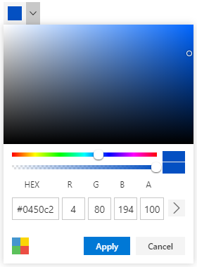
Red Green Blue, Hue Saturation Value and Hex codes.Picker and Palette mode.opacity of the selected color.The JavaScript Form Validator control is used to validate the form elements before submitting to the server.
Getting Started . Online demos . Learn more
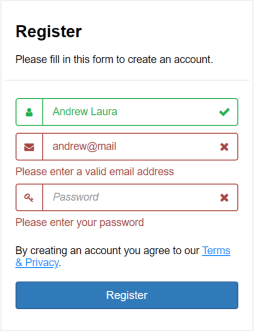
The JavaScript TextBox control is an extended version of the HTML input control which is used to edit or display text input on a form.
Getting Started . Online demos . Learn more
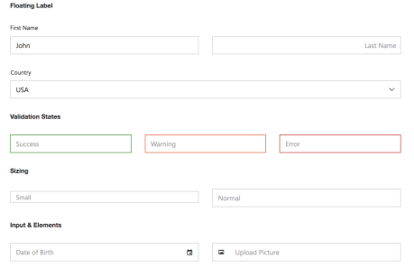
The JavaScript Masked TextBox control allows the user to enter the valid input only based on the provided mask.
Getting Started . Online demos . Learn more
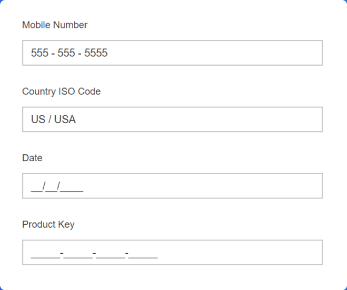
The JavaScript Numeric TextBox control is used to get the number inputs from the user. The input values can be incremented or decremented by a predefined step value.
Getting Started . Online demos . Learn more

The JavaScript Signature control allows user to draw smooth signatures as vector outline of strokes using variable width bezier curve interpolation. It allows to save signature as image.
Getting Started . Online demos . Learn more

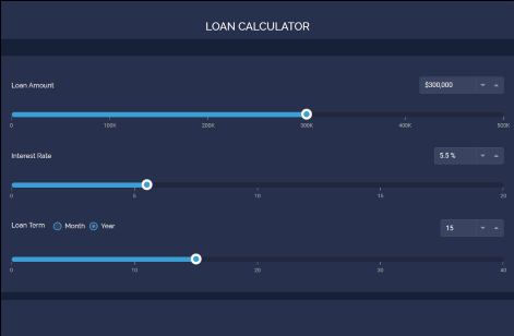
The JavaScript Slider control allows you to select a value or range of values between the min and max range.
Getting Started . Online demos . Learn more
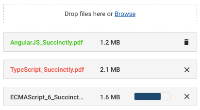
The JavaScript File Upload control is an extended version of the HTML5 upload control which is used to upload images, documents, and other files to a server.
Getting Started . Online demos . Learn more
The JavaScript Rating control is used to provide a star rating or view other people’s ratings on a numeric scale for any service provided, such as for movies, applications, or products. It has several built-in features such as support for precision modes, labels, tooltip, and UI customization.
Getting Started . Online demos . Learn more

The JavaScript OTP Input control is designed to securely enter and verify single-use passwords for multi-factor authentication purposes in various applications, such as banking, e-commerce, or account login processes. It has several built-in features such as support for input types, styling modes, placeholder, seperators, and customization.
Input types - Allow specifying the input type as text, number, or password for the OTP input..Styling modes - Offer built-in styling options such as underline, outline, or fill.Tooltip - Displays additional information of the rating items.Placeholders - Allow setting a hint character for each input field, indicating the expected value.Separators - Specify a character to be placed between input fields.Customization - Allows customizing the default appearance, including input field styling, input length, and more.
Trusted by the world's leading companies

To install inputs and its dependent packages, use the following command,
npm install @syncfusion/ej2-inputs
Input controls are also offered in following list of frameworks.
 Angular |  React |  Vue |  ASP.NET Core |  ASP.NET MVC |
|---|
Product support is available through following mediums.
Check the changelog here. Get minor improvements and bug fixes every week to stay up to date with frequent updates.
This is a commercial product and requires a paid license for possession or use. Syncfusion’s licensed software, including this component, is subject to the terms and conditions of Syncfusion's EULA. To acquire a license for 80+ JavaScript UI controls, you can purchase or start a free 30-day trial.
A free community license is also available for companies and individuals whose organizations have less than $1 million USD in annual gross revenue and five or fewer developers.
See LICENSE FILE for more info.
© Copyright 2024 Syncfusion, Inc. All Rights Reserved. The Syncfusion Essential Studio license and copyright applies to this distribution.
FAQs
A package of Essential JS 2 input components such as Textbox, Color-picker, Masked-textbox, Numeric-textbox, Slider, Upload, and Form-validator that is used to get input from the users.
The npm package @syncfusion/ej2-inputs receives a total of 122,301 weekly downloads. As such, @syncfusion/ej2-inputs popularity was classified as popular.
We found that @syncfusion/ej2-inputs demonstrated a healthy version release cadence and project activity because the last version was released less than a year ago. It has 0 open source maintainers collaborating on the project.
Did you know?

Socket for GitHub automatically highlights issues in each pull request and monitors the health of all your open source dependencies. Discover the contents of your packages and block harmful activity before you install or update your dependencies.

Security News
At its inaugural meeting, the JSR Working Group outlined plans for an open governance model and a roadmap to enhance JavaScript package management.

Security News
Research
An advanced npm supply chain attack is leveraging Ethereum smart contracts for decentralized, persistent malware control, evading traditional defenses.

Security News
Research
Attackers are impersonating Sindre Sorhus on npm with a fake 'chalk-node' package containing a malicious backdoor to compromise developers' projects.