Product
Introducing Enhanced Alert Actions and Triage Functionality
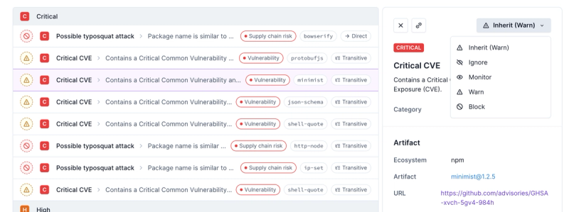
Socket now supports four distinct alert actions instead of the previous two, and alert triaging allows users to override the actions taken for all individual alerts.
@syncfusion/ej2-splitbuttons
Advanced tools
Package description
@syncfusion/ej2-splitbuttons is a package that provides a collection of button components such as Split Button, DropDown Button, Progress Button, and Button Group. These components are designed to enhance the user interface by providing advanced button functionalities.
Split Button
The Split Button component allows you to create a button with a primary action and a secondary action that can be accessed via a dropdown menu.
const splitBtn = new ej.splitbuttons.SplitButton({ content: 'Split Button', items: [{ text: 'Option 1' }, { text: 'Option 2' }] }); splitBtn.appendTo('#splitButton');DropDown Button
The DropDown Button component provides a button that displays a dropdown list of items when clicked.
const dropDownBtn = new ej.splitbuttons.DropDownButton({ content: 'DropDown Button', items: [{ text: 'Item 1' }, { text: 'Item 2' }] }); dropDownBtn.appendTo('#dropDownButton');Progress Button
The Progress Button component is a button that shows a progress indicator when clicked, useful for indicating loading or processing states.
const progressBtn = new ej.splitbuttons.ProgressButton({ content: 'Progress Button', duration: 2000 }); progressBtn.appendTo('#progressButton');Button Group
The Button Group component allows you to group multiple buttons together, providing a cohesive set of actions.
const buttonGroup = new ej.splitbuttons.ButtonGroup({ buttons: [{ content: 'Button 1' }, { content: 'Button 2' }, { content: 'Button 3' }] }); buttonGroup.appendTo('#buttonGroup');React-Bootstrap provides a collection of Bootstrap components built with React, including button components like Split Button and Dropdown Button. It is widely used for its integration with the Bootstrap framework and offers a similar set of functionalities with a focus on React.
Material-UI is a popular React component library that implements Google's Material Design. It includes button components such as Split Button and Dropdown Button, offering a modern and customizable design system. It is known for its extensive customization options and comprehensive documentation.
PrimeReact is a rich set of open-source UI components for React, including advanced button components like SplitButton and DropdownButton. It is known for its wide range of components and themes, making it a versatile choice for building modern web applications.
Readme
A package of Syncfusion JavaScript UI Components (Essential JS 2) DropDownButton, SplitButton, ProgressButton and ButtonGroup.

This is a commercial product and requires a paid license for possession or use. Syncfusion’s licensed software, including this component, is subject to the terms and conditions of Syncfusion's EULA (https://www.syncfusion.com/eula/es/). To acquire a license, you can purchase one at https://www.syncfusion.com/sales/products or start a free 30-day trial here (https://www.syncfusion.com/account/manage-trials/start-trials).
A free community license (https://www.syncfusion.com/products/communitylicense) is also available for companies and individuals whose organizations have less than $1 million USD in annual gross revenue and five or fewer developers.
To install SplitButtons and its dependent packages, use the following command
npm install @syncfusion/ej2-splitbuttons
Following list of components are available in the package.
DropDownButton - DropDownButton is used to toggle contextual overlays for displaying list of action items.
SplitButton - SplitButton has primary and secondary button. Primary button is used to select default action and secondary button is used to toggle contextual overlays for displaying list of action items.
ProgressButton - ProgressButton visualizes the progression of an operation to indicate the user that a process is happening in the background with visual representation.
ButtonGroup - ButtonGroup is a graphical user interface that groups series of buttons horizontally or vertically.
These components are available in following list of frameworks.
Icons and Navigations - Supports text and icon on the DropDownButton and Popup items. URL can be given to Popup items that creates the anchor link to navigate to the URL provided.
Separator - Supports Popup items grouping by using the Separator.
Accessibility - Provided with built-in accessibility support that helps to access all the DropDownButton component features through the keyboard, screen readers, or other assistive technology devices.
Icons and Navigations - Supports text and icon on the SplitButton and Popup items. URL can be given to Popup items that creates the anchor link to navigate to the URL provided.
Separator - Supports Popup items grouping by using the Separator.
Accessibility - Provided with built-in accessibility support that helps to access all the SplitButton component features through the keyboard, screen readers, or other assistive technology devices.
Types, Sizes, and Styles - Provided with different types, sizes and predefined styles of progress button.
Icons and Spinner - Supports icon, spinner and its positioning.
Animation - Provided with predefined animation and progress indicator.
Events - Supports event triggering at specified interval.
Accessibility - Provided with built-in accessibility support that helps to access all the ProgressButton component features through the keyboard, screen readers, or other assistive technology devices.
Types, Sizes, and Styles - Provided with different types, sizes and predefined styles of button.
Selection - Supports single and multiple selection behaviors.
Orientation - Supports horizontal and vertical orientations.
Nesting - Supports nesting with drop-down and split button components.
Accessibility - Built-in accessibility features to access all the button group using the keyboard, screen readers, or other assistive technology devices.
Product support is available for through following mediums.
syncfusion, ej2.Check the license detail here.
Check the changelog here
© Copyright 2018 Syncfusion, Inc. All Rights Reserved. The Syncfusion Essential Studio license and copyright applies to this distribution.
FAQs
A package of feature-rich Essential JS 2 components such as DropDownButton, SplitButton, ProgressButton and ButtonGroup.
The npm package @syncfusion/ej2-splitbuttons receives a total of 134,211 weekly downloads. As such, @syncfusion/ej2-splitbuttons popularity was classified as popular.
We found that @syncfusion/ej2-splitbuttons demonstrated a healthy version release cadence and project activity because the last version was released less than a year ago. It has 3 open source maintainers collaborating on the project.
Did you know?

Socket for GitHub automatically highlights issues in each pull request and monitors the health of all your open source dependencies. Discover the contents of your packages and block harmful activity before you install or update your dependencies.

Product
Socket now supports four distinct alert actions instead of the previous two, and alert triaging allows users to override the actions taken for all individual alerts.

Security News
Polyfill.io has been serving malware for months via its CDN, after the project's open source maintainer sold the service to a company based in China.

Security News
OpenSSF is warning open source maintainers to stay vigilant against reputation farming on GitHub, where users artificially inflate their status by manipulating interactions on closed issues and PRs.