Product
Introducing Rust Support in Socket
Socket now supports Rust and Cargo, offering package search for all users and experimental SBOM generation for enterprise projects.
@szhsin/react-autocomplete
Advanced tools
A modular, lightweight, and headless React autocomplete solution.
A modular, lightweight, and headless solution.
npm install @szhsin/react-autocomplete
Modular: We carefully design the API with a modular approach, providing a no-frills solution that allows you to bundle only the code you need for your website. No more and no less!
Lightweight: At just 1.4 kB2, you get a fully functional and accessible autocomplete solution in React. It's almost negligible in size and likely lighter than creating one from scratch, so you can adopt it without hesitation.
Customizable: Thanks to the modular design, you can easily customize existing features or even create your own feature (a plugin-style module) to enhance the solution.
Here’s a live example of the 1.4 kB accessible React autocomplete: open in CodeSandbox
The API consists of a main React hook and a feature that work together under a defined contract.
useCombobox/useMultiSelect - acts as the primary entry point, utilizing a classic headless React hook style API. It manages state and data, and must connect with a feature to deliver the required functionalities.
A feature implements the desired functionalities (behavior), such as autocomplete or multiSelect. There are two types of features:
One advantage of this architecture is you can easily combine any number of atoms or molecules to create the feature you need, as long as the resulting feature conforms to the same contract.
Visit the site for examples and docs
Referring to traditional solutions such as react-select and downshift. ↩
Using the autocompleteLite feature. ↩
FAQs
A modular, lightweight, and headless React autocomplete solution.
The npm package @szhsin/react-autocomplete receives a total of 268 weekly downloads. As such, @szhsin/react-autocomplete popularity was classified as not popular.
We found that @szhsin/react-autocomplete demonstrated a healthy version release cadence and project activity because the last version was released less than a year ago. It has 1 open source maintainer collaborating on the project.
Did you know?

Socket for GitHub automatically highlights issues in each pull request and monitors the health of all your open source dependencies. Discover the contents of your packages and block harmful activity before you install or update your dependencies.

Product
Socket now supports Rust and Cargo, offering package search for all users and experimental SBOM generation for enterprise projects.

Product
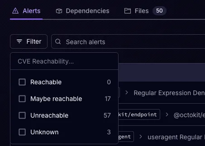
Socket’s precomputed reachability slashes false positives by flagging up to 80% of vulnerabilities as irrelevant, with no setup and instant results.

Product
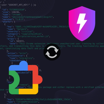
Socket is launching experimental protection for Chrome extensions, scanning for malware and risky permissions to prevent silent supply chain attacks.