Product
Announcing Socket Fix 2.0
Socket Fix 2.0 brings targeted CVE remediation, smarter upgrade planning, and broader ecosystem support to help developers get to zero alerts.
@teikametrics/react-infinite-calendar
Advanced tools
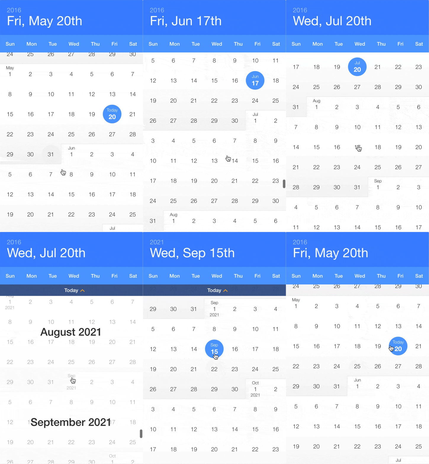
Infinite scrolling date-picker built with React, with localization, themes, keyboard support, and more.


Using npm:
npm install @teikametrics/react-infinite-calendar react-addons-css-transition-group --save
ES6, CommonJS, and UMD builds are available with each distribution. For example:
import InfiniteCalendar from '@teikametrics/react-infinite-calendar';
import '@teikametrics/react-infinite-calendar/styles.css'; // Make sure to import the default stylesheet
You can also use a global-friendly UMD build:
<link rel="stylesheet" href="@teikametrics/react-infinite-calendar/styles.css">
<script src="@teikametrics/react-infinite-calendar/umd/react-infinite-calendar.js"></script>
<script>
var InfiniteCalendar = window.InfiniteCalendar.default;
...
</script>
import React from 'react';
import { render } from 'react-dom';
import InfiniteCalendar from '@teikametrics/react-infinite-calendar';
import '@teikametrics/react-infinite-calendar/styles.css'; // only needs to be imported once

// Render the Calendar
var today = new Date();
var lastWeek = new Date(today.getFullYear(), today.getMonth(), today.getDate() - 7);

render(
  <InfiniteCalendar
    width={400}
    height={600}
    selected={today}
    disabledDays={[0,6]}
    minDate={lastWeek}
  />,
  document.getElementById('root')
);
For more usage examples, see http://teikametrics.github.io/react-infinite-calendar/ or check out some code examples.
| Property | Type | Default | Description |
|---|---|---|---|
| selected | Date or Boolean | new Date() | Value of the date that appears to be selected. Set to false if you don't wish to have a date initially selected. |
| width | Number | 400 | Width of the calendar, in pixels |
| height | Number | 600 | Height of the calendar, in pixels |
| min | Date | new Date(1980, 0, 1) | The minimum month that can be scrolled to. |
| max | Date | new Date(2050, 11, 31) | The maximum month that can be scrolled to. |
| minDate | Date | new Date(1980, 0, 1) | The minimum date that is selectable. |
| maxDate | Date | new Date(2050, 11, 31) | The maximum date that is selectable. |
| disabledDays | Array | Array of days of the week that should be disabled. For example, to disable Monday and Sunday: [0, 6] | |
| disabledDates | Array | Array of dates that should be disabled. For example: [new Date(2017, 1, 8), new Date(), new Date(2017, 5, 17)] | |
| display | String | 'days' | Whether to display the years or days view. |
| displayOptions | Object | See default displayOptions | See display options section for more details. |
| locale | Object | See default locale | By default, React Infinite Calendar comes with the English locale. You can use this to change the language, or change the first day of the week. See date-fns documentation for more details |
| theme | Object | See default theme | Basic customization of the colors |
| className | String | Optional CSS class name to append to the root InfiniteCalendar element. | |
| onSelect | Function | Callback invoked after beforeSelect() returns true, but before the state of the calendar updates | |
| onScroll | Function | Callback invoked when the scroll offset changes. function (scrollTop: number) {} | |
| onScrollEnd | Function | Callback invoked 150ms after the last onScroll event is triggered. function (scrollTop: number) {} | |
| rowHeight | Number | 56 | Height of each row in the calendar (each week is considered a row) |
| autoFocus | Boolean | true | Whether the Calendar root should be auto-focused when it mounts. This is useful when keyboardSupport is enabled (the calendar must be focused to listen for keyboard events) |
| tabIndex | Number | 1 | Tab-index of the calendar |
| Property | Type | Default | Description |
|---|---|---|---|
| layout | String | 'portrait' | Layout of the calendar. Should be one of 'portrait' or 'landscape' |
| showHeader | Boolean | true | Show/hide the header |
| shouldHeaderAnimate | Boolean | true | Enable/Disable the header animation |
| showOverlay | Boolean | true | Show/hide the month overlay when scrolling |
| showTodayHelper | Boolean | true | Show/hide the floating back to Today helper |
| showWeekdays | Boolean | true | Show/hide the weekdays in the header |
| hideYearsOnSelect | Boolean | true | Whether to automatically hide the years view on select. |
| overscanMonthCount | Number | 4 | Number of months to render above/below the visible months. Tweaking this can help reduce flickering during scrolling on certain browers/devices. |
| todayHelperRowOffset | Number | 4 | This controls the number of rows to scroll past before the Today helper appears |
| showLabelsBetweenMonths | Boolean | true | This will show month labels between each month |
Example usage of display options:
<InfiniteCalendar
  displayOptions={{
    layout: 'landscape',
    showOverlay: false,
    shouldHeaderAnimate: false
  }}
/>
React Infinite Calendar has very few dependencies. It relies on react-tiny-virtual-list for virtualization and date-fns for handling date manipulation. It also uses recompose for extending the default functionality. It also has the following peerDependencies: react, and react-addons-css-transition-group.
Yes please! Feature requests / pull requests are welcome. Learn how to contribute
react-infinite-calendar is available under the MIT License.
FAQs
Infinite scrolling date-picker built with React, with localization, themes, keyboard support, and more.
The npm package @teikametrics/react-infinite-calendar receives a total of 0 weekly downloads. As such, @teikametrics/react-infinite-calendar popularity was classified as not popular.
We found that @teikametrics/react-infinite-calendar demonstrated a not healthy version release cadence and project activity because the last version was released a year ago. It has 3 open source maintainers collaborating on the project.
Did you know?

Socket for GitHub automatically highlights issues in each pull request and monitors the health of all your open source dependencies. Discover the contents of your packages and block harmful activity before you install or update your dependencies.

Product
Socket Fix 2.0 brings targeted CVE remediation, smarter upgrade planning, and broader ecosystem support to help developers get to zero alerts.

Security News
Socket CEO Feross Aboukhadijeh joins Risky Business Weekly to unpack recent npm phishing attacks, their limited impact, and the risks if attackers get smarter.

Product
Socket’s new Tier 1 Reachability filters out up to 80% of irrelevant CVEs, so security teams can focus on the vulnerabilities that matter.