@vaadin/dialog
A web component for presenting information and user interface elements in an overlay.
Documentation + Live Demo ↗


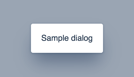
<vaadin-dialog opened></vaadin-dialog>
<script>
const dialog = document.querySelector('vaadin-dialog');
dialog.renderer = function (root, dialog) {
root.textContent = 'Sample dialog';
};
</script>

Installation
Install the component:
npm i @vaadin/dialog
Once installed, import the component in your application:
import '@vaadin/dialog';
Themes
Vaadin components come with two built-in themes, Lumo and Material.
The main entrypoint of the package uses the Lumo theme.
To use the Material theme, import the component from the theme/material folder:
import '@vaadin/dialog/theme/material/vaadin-dialog.js';
You can also import the Lumo version of the component explicitly:
import '@vaadin/dialog/theme/lumo/vaadin-dialog.js';
Finally, you can import the un-themed component from the src folder to get a minimal starting point:
import '@vaadin/dialog/src/vaadin-dialog.js';
Contributing
Read the contributing guide to learn about our development process, how to propose bugfixes and improvements, and how to test your changes to Vaadin components.
License
This program is available under Vaadin Commercial License and Service Terms.
See https://vaadin.com/commercial-license-and-service-terms for the full
license.
Vaadin collects usage statistics at development time to improve this product.
For details and to opt-out, see https://github.com/vaadin/vaadin-usage-statistics.


