<vaadin-dialog>
Live Demo ↗
|
API documentation ↗
<vaadin-dialog> is a Web Component for customized modal dialogs, part of the Vaadin components.
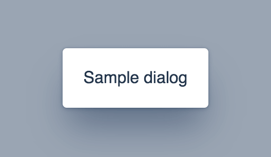
<vaadin-dialog opened>
<template>
Sample dialog
</template>
</vaadin-dialog>
Installation
The Vaadin components are distributed as Bower and npm packages.
Please note that the version range is the same, as the API has not changed.
You should not mix Bower and npm versions in the same application, though.
Unlike the official Polymer Elements, the converted Polymer 3 compatible Vaadin components
are only published on npm, not pushed to GitHub repositories.
Polymer 2 and HTML Imports Compatible Version
Install vaadin-dialog:
bower i vaadin/vaadin-dialog --save
Once installed, import it in your application:
<link rel="import" href="bower_components/vaadin-dialog/vaadin-dialog.html">
Polymer 3 and ES Modules Compatible Version
Install vaadin-dialog:
npm i @vaadin/vaadin-dialog --save
Once installed, import it in your application:
import '@vaadin/vaadin-dialog/vaadin-dialog.js';
Getting started
Vaadin components use the Lumo theme by default.
To use the Material theme, import the correspondent file from the theme/material folder.
Entry points
-
The component with the Lumo theme:
theme/lumo/vaadin-dialog.html
-
The component with the Material theme:
theme/material/vaadin-dialog.html
-
Alias for theme/lumo/vaadin-dialog.html:
vaadin-dialog.html
Running demos and tests in browser
-
Fork the vaadin-dialog repository and clone it locally.
-
Make sure you have npm installed.
-
When in the vaadin-dialog directory, run npm install and then bower install to install dependencies.
-
Run polymer serve --open, browser will automatically open the component API documentation.
-
You can also open demo or in-browser tests by adding demo or test to the URL, for example:
Running tests from the command line
- When in the
vaadin-dialog directory, run polymer test
Following the coding style
We are using ESLint for linting JavaScript code. You can check if your code is following our standards by running gulp lint, which will automatically lint all .js files as well as JavaScript snippets inside .html files.
Contributing
To contribute to the component, please read the guideline first.
License
Apache License 2.0
Vaadin collects development time usage statistics to improve this product. For details and to opt-out, see https://github.com/vaadin/vaadin-usage-statistics.