Product
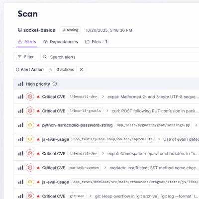
Unify Your Security Stack with Socket Basics
A single platform for static analysis, secrets detection, container scanning, and CVE checks—built on trusted open source tools, ready to run out of the box.
@zendeskgarden/react-modals
Advanced tools
This package includes components relating to modals in the Garden Design System.
npm install @zendeskgarden/react-modals
# Peer Dependencies - Also Required
npm install react react-dom styled-components @zendeskgarden/react-theming
import { ThemeProvider } from '@zendeskgarden/react-theming';
import { Modal } from '@zendeskgarden/react-modals';
import { Button } from '@zendeskgarden/react-buttons';

/**
 * Place a `ThemeProvider` at the root of your React application
 */
<ThemeProvider>
  <Modal onClose={() => alert('modal closing')}>
    <Modal.Header>Example Header</Modal.Header>
    <Modal.Body>Some content</Modal.Body>
    <Modal.Footer>
      <Modal.FooterItem>
        <Button isBasic>Cancel</Button>
      </Modal.FooterItem>
      <Modal.FooterItem>
        <Button isPrimary>Confirm</Button>
      </Modal.FooterItem>
    </Modal.Footer>
    <Modal.Close aria-label="Close modal" />
  </Modal>
</ThemeProvider>;
import { ThemeProvider } from '@zendeskgarden/react-theming';
import { Drawer } from '@zendeskgarden/react-modals';
import { Button } from '@zendeskgarden/react-buttons';

const [isOpen, setIsOpen] = useState(false)

<ThemeProvider>
  <Button onClick={() => setIsOpen(true)}>
    Open
  </Button>
  <Drawer isOpen={state.isOpen} onClose={() => setIsOpen(false)}>
    <Drawer.Header>Example Title</Drawer.Header>
    <Drawer.Body>Some content</Drawer.Body>
    <Drawer.Footer>
      <Drawer.FooterItem>
        <Button>Click</Button>
      </Drawer.FooterItem>
    </Drawer.Footer>
    <Drawer.Close aria-Label="Close" />
  </Drawer>
</ThemeProvider>
import { ThemeProvider } from '@zendeskgarden/react-theming';
import { TooltipDialog } from '@zendeskgarden/react-modals';
import { Button } from '@zendeskgarden/react-buttons';

const [isOpen, setIsOpen] = useState(false);
const buttonRef = useRef(null);

<ThemeProvider>
  <Button ref={buttonRef} onClick={() => setIsOpen(!isOpen)}>
    Open
  </Button>
  <TooltipDialog
    onClose={() => setIsOpen(false)}
    referenceElement={isOpen && buttonRef.current ? buttonRef.current : undefined}
  >
    <TooltipDialog.Title>Example Title</TooltipDialog.Title>
    <TooltipDialog.Body>Some content</TooltipDialog.Body>
    <TooltipDialog.Footer>
      <TooltipDialog.FooterItem>
        <Button>Click</Button>
      </TooltipDialog.FooterItem>
    </TooltipDialog.Footer>
    <TooltipDialog.Close aria-label="Close" />
  </TooltipDialog>
</ThemeProvider>;
FAQs
Components relating to modals in the Garden Design System
The npm package @zendeskgarden/react-modals receives a total of 46,750 weekly downloads. As such, @zendeskgarden/react-modals popularity was classified as popular.
We found that @zendeskgarden/react-modals demonstrated a healthy version release cadence and project activity because the last version was released less than a year ago. It has 1 open source maintainer collaborating on the project.
Did you know?

Socket for GitHub automatically highlights issues in each pull request and monitors the health of all your open source dependencies. Discover the contents of your packages and block harmful activity before you install or update your dependencies.

Product
A single platform for static analysis, secrets detection, container scanning, and CVE checks—built on trusted open source tools, ready to run out of the box.

Product
Socket is launching experimental protection for the Hugging Face ecosystem, scanning for malware and malicious payload injections inside model files to prevent silent AI supply chain attacks.

Research
/Security News
The Socket Threat Research Team uncovered a coordinated campaign that floods the Chrome Web Store with 131 rebranded clones of a WhatsApp Web automation extension to spam Brazilian users.