Alwan


A simple, lightweight, customizable, touch friendly color picker, written in vanilla javascript with zero dependencies.
Features
- Touch friendly.
- Support dark theme.
- Alpha channel (opacity).
- Support 3 color formats hsl, rgb and hex.
- Keyboard accessible.
- Simple easy to use interface (inspired by google chrome's color picker).
- No dependencies.
- Copy color to the clipboard.
- Lightweight.
Note
If you are using React, use react-alwan instead.
Demo
Click here to try it
Getting started
Install using package manager:
npm install alwan
or
yarn add alwan
Import files
import alwan from 'alwan';
import 'alwan/dist/css/alwan.min.css';
CDN
Add it to your page.
<link rel="stylesheet" href="https://cdn.jsdelivr.net/npm/alwan/dist/css/alwan.min.css" />
<script src="https://cdn.jsdelivr.net/npm/alwan/dist/js/alwan.min.js"></script>
<link rel="stylesheet" href="https://unpkg.com/alwan/dist/css/alwan.min.css" />
<script src="https://unpkg.com/alwan/dist/js/alwan.min.js"></script>
Other CDN links
// ES Module
https://cdn.jsdelivr.net/npm/alwan/dist/js/esm/alwan.min.js
https://unpkg.com/alwan/dist/js/esm/alwan.min.js

// IIFE (since v2.0.3)
https://cdn.jsdelivr.net/npm/alwan/dist/js/iife/alwan.min.js
https://unpkg.com/alwan/dist/js/iife/alwan.min.js
Usage
Alwan can take two arguments,
a reference element either a selector or an HTML element (required),
and options object (optional).
const alwan = new Alwan('#reference', {
});
Options
You can try these options in the demo, play around with it
-
id (default '') — Set the container's (widget) id.
-
classname (default '') — Add classes (separated by a white space) to the preset button.
-
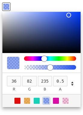
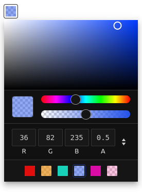
theme (default light) — Choose a theme, 'dark' or 'light'.
-
toggle (default true) — Toggle picker's visibility (Show/Hide), Setting this to false keeps the picker visible.
-
popover (default true) — Display picker as a popover, otherwise display it as a block (embedded in the page content).
-
position (default bottom-start) — Set the position of the popper relative to the reference element. The position has two values separated by a dash (-). The first value is the direction (top, bottom, right, left) and the second value is the alignment (start, center, end), omitting this value will default to center.
Note: If the picker container has no space to be placed, it will auto-position itself based on the available space.
-
margin (default 4) — The gap (in pixels) between the picker container and the reference element.
-
preset (default true) — Replace the reference element with a pre-styled button.
-
color (default #000) — Initial color.
-
default (default #000) — Default color.
-
target (default '') — Target can be a selector or an HTML element, If the option popover is set to true, the picker container will be positioned relative to this element else if popover option is set to false, the picker container will be appended as a child into this element.
-
disabled (default false) — Disable the picker, users won't be able to pick colors.
-
format (default rgb) — Initial color format.
-
singleInput (default false) — For the formats 'hsl' and 'rgb', choose a single input to display the color string, if false, display an input for each color channel.
-
inputs (default { hex: true, rgb: true, hsl: true }) — Choose color formats for the picker inputs.
-
opacity (default true) — Support alpha channel and display opacity slider.
-
preview (default true) — Preview the color.
-
copy (default true) — Add/Remove a copy button.
-
swatches (default []) — Array of colors, invalid colors will default to rgb(0,0,0).
-
toggleSwatches (default false) — Show/Hide swatches container (Make swatches container collapsible).
-
closeOnScroll (default false) — Close color picker when scrolling (only if the color picker is displayed as a popover and can be closed).
Note: In the reference element you can access the css custom property --color (--alwan-color before v2.0.0) to get color value.
Accessibility (since v1.4)
Unlabeled interactive elements has a ARIA label attribute with a default values in english. You can change these labels in the options by modifying the i18n object.
Note:: The title attribute of the copy button and the change format button is the same as the ARIA label. and for the swatch button its title is the color value in the swatches array.
{
...options,
i18n: {
palette: 'Color picker',
buttons: {
copy: 'Copy color to clipboard',
changeFormat: 'Change color format',
swatch: 'Color swatch',
toggleSwatches: 'Toggle Swatches'
},
sliders: {
hue: 'Change hue',
alpha: 'Change opacity'
}
}
}
Events
Use the method on, that has two parameters, event and handler (callback function).
alwan.on('event', (ev) => {
});
| Event | Argument | Description |
|---|
open | event | Fires when the picker get opened |
close | event | Fires when the picker get closed |
change | event | Fires when an alternation to the color is committed by the user, similar to the DOM change event |
color | event | Similar to the input event, fires every time the color changes |
Event object (since v1.3)
type — Event type.source — Event source (color picker instance that is calling the event handler).h: number — Hue.s: number — Saturation.l: number — Lightness.r: number — Red.g: number — Green.b: number — Blue.a: number — alpha.rgb: string — RGB color string.hsl: string — HSL color string.hex: string — Hex color.
alwan.on('change', (ev) => {
ev.type;
ev.source;
ev.h;
ev.s;
ev.l;
ev.r;
ev.g;
ev.b;
ev.a;
ev.rgb;
ev.hsl;
ev.hex;
});
Methods
Static methods:
- version():
string — Returns the version. - setDefaults(defaults:
alwanOptions) — Change default values for all instances (doesn't effect already instantiated instances).
Instance methods:
- setColor(color:
Color) : object — Sets a color from a string or a color object, this method doesn't trigger change or color events.
If you want to trigger events add .trigger(change | color | open | close) to it
picker.setColor('purple').trigger('change');
-
getColor() : alwanValue — Returns the color object.
-
open() — Open/Show picker.
-
isOpen() : boolean — Returns the state of the picker opened true or closed false.
-
toggle() — Toggle picker, if its hidden show it else hide it.
-
setOptions(options: alwanOptions) — Sets one or more options for the picker.
-
trigger(event: string) — Triggers an event.
-
on(event: string, handler: callback) — Attaches an event handler function.
-
off(event: string, handler: callback) — Removes an event handler, if the handler argument is omitted then all handlers attach to this event will be removed, calling this method without arguments will remove all handlers of all events.
-
disable() — Disables picker (users won't be able to pick a color).
-
enable() — Enables picker.
-
reposition() — Updates picker position only if it's a popover.
-
addSwatches(...swatches: Array<Color>) — Adds one or many color swatches.
-
removeSwatches(...items: Array<Color | number>) — Removes one or many color swatches, items could be a color swatch or its index in the config.swatches array.
-
reset() — Reset to default color.
-
destroy() — Removes the color picker functionality completely(free up memory).