Research
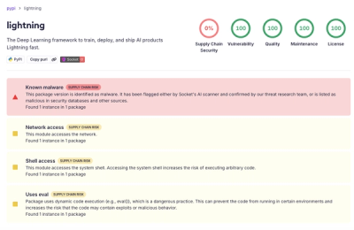
lightning PyPI Package Compromised in Supply Chain Attack
Socket detected a malicious supply chain attack on PyPI package lightning versions 2.6.2 and 2.6.3, which execute credential-stealing malware on import.
angular-formly-templates-vanilla
Advanced tools
Angular-Formly plugin which outputs plain html form fields.
This is a template for Angular-Formly which adds template basic files with no css classes. Each field is wrapped in a div. This library is not standalone and requires angular-formly to be present and loaded.
There were some significant changes that you'll want to be aware of. In order to upgrade and get all the cool features, you're going to need to change your field configurations. Here is a tool that should help make that process easier. Also, if you are not able to update the configuration very easily, see this issue for ideas on how to ease things a little.
Required to use Formly:
Angular
Angular-Formly
Dev dependencies to build Formly
npm
Install Angular-Formly
Install Angular-Formly: Bootstrap Templates
$ bower install angular-formly angular-formly-templates-vanilla --save
or
$ npm install angular-formly angular-formly-templates-vanilla --save
<script src="bower_components/angular-formly/dist/formly.min.js"></script>
<script src="bower_components/angular-formly-templates-vanilla/dist/angular-formly-templates-vanilla.min.js"></script>and
angular.module('yourModule', ['formly', 'formlyVanilla']);
or
angular.module('yourModule', [require('angular-formly'), require('angular-formly-templates-vanilla')]);
See Angular-Formly for formly core documentation.
NOTE: All of these properties will be under the templateOptions property as of angular-formly 3.0.0
labelis used to add an html label to each field.
A default is set for each field based on its type. ie
Text,Checkbox,Password
requiredis used to add the required attribute to a form field.
undefined
hideis used to conditionally show the input. When true, the input is hidden (meant to be used with a watch).
undefined
disabledis used to add the disabled attribute to a form field.
undefined
placeholderis used to add placeholder text to some inputs.
undefined
descriptionis used to add descriptive text to all inputs.
undefined
Below is a detailed description of each form fields and its custom properties.
The input uses the element and allows you to specify it's type via the type property
Example text field
	{
		"type": "text",
		"key": "firstName",
		"templateOptions": {
		  "type": "email", // or url, or text, etc.
      "placeholder": "jane doe",
      "label": "First name"
		}
	}
The textarea field creates multiline input with a textarea element.
linessets the rows attribute for the textarea element.
Example textarea field
	{
		"type": "textarea",
		"key": "about",
		"templateOptions": {
      "placeholder": "I like puppies",
      "label": "Tell me about yourself",
      "rows": 4,
      "cols": 15
		}
	}
The checkbox field allows checkbox input with a input element set to
type='checkbox'. It doesn't have any custom properties.
Example checkbox field
	{
		"type": "checkbox",
		"key": "checkThis",
		"templateUrl": {
      "label": "Check this box"
		}
	}
The radio field allows multiple choice input with a series of linked inputs, with
type='radio'.
optionsis an array of options for the radio form field to display. Each option should be an object with aname(string) andvalue(string or number).
Example radio field
	{
		"key": "triedEmber",
		"type": "radio",
		"templateOptions": {
      "label": "Have you tried EmberJs yet?",
      "options": [
        {
          "name": "Yes, and I love it!",
          "value": "yesyes"
        },
        {
          "name": "Yes, but I'm not a fan...",
          "value": "yesno"
        },
        {
          "name": "Nope",
          "value": "no"
        }
      ]
		}
	}
The select field allows selection via dropdown using the select element.
The default can be set to the index of one of the
options.
optionsis an array of options for the select form field to display. Each option should be an object with aname(string). You may optionally add agroupto some or all of your options.
Example select field
	{
		"key": "transportation",
		"type": "select",
		"templateOptions": {
      "label": "How do you get around in the city",
      "options": [
        {
          "name": "Car"
        },
        {
          "name": "Helicopter"
        },
        {
          "name": "Sport Utility Vehicle"
        },
        {
          "name": "Bicycle",
          "group": "low emissions"
        },
        {
          "name": "Skateboard",
          "group": "low emissions"
        },
        {
          "name": "Walk",
          "group": "low emissions"
        },
        {
          "name": "Bus",
          "group": "low emissions"
        },
        {
          "name": "Scooter",
          "group": "low emissions"
        },
        {
          "name": "Train",
          "group": "low emissions"
        },
        {
          "name": "Hot Air Baloon",
          "group": "low emissions"
        }
      ]
		}
	}
Please see the CONTRIBUTING Guidelines.
A special thanks to Nimbly for creating/sponsoring Angular-Formly's development. Thanks to Kent C. Dodds for his continued support on the project.
FAQs
Angular-Formly plugin which outputs plain html form fields.
We found that angular-formly-templates-vanilla demonstrated a not healthy version release cadence and project activity because the last version was released a year ago. It has 2 open source maintainers collaborating on the project.
Did you know?

Socket for GitHub automatically highlights issues in each pull request and monitors the health of all your open source dependencies. Discover the contents of your packages and block harmful activity before you install or update your dependencies.

Research
Socket detected a malicious supply chain attack on PyPI package lightning versions 2.6.2 and 2.6.3, which execute credential-stealing malware on import.

Research
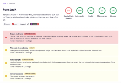
A brand-squatted TanStack npm package used postinstall scripts to steal .env files and exfiltrate developer secrets to an attacker-controlled endpoint.

Research
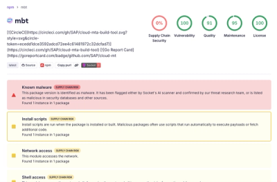
Compromised SAP CAP npm packages download and execute unverified binaries, creating urgent supply chain risk for affected developers and CI/CD environments.