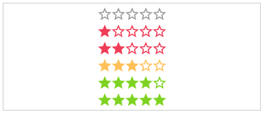
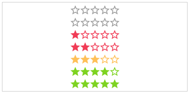
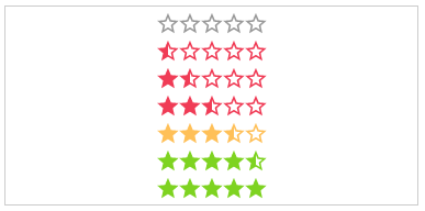
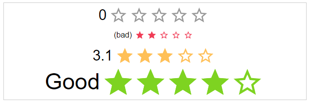
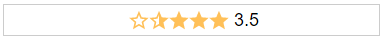
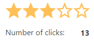
Angular Star Rating ⭐⭐⭐⭐⭐
⭐ Angular Component written in typescript, based on css only techniques. ⭐


Angular Star Rating is a >2 Angular component written in typescript.
It is based on css-sar-rating, a fully featured and customizable css only star rating component written in scss.

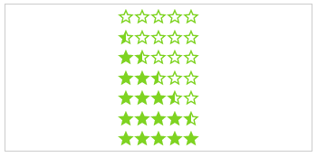
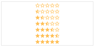
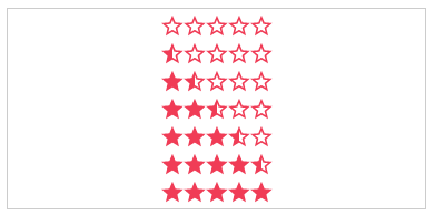
DEMO
Related Projects
Features
This module implements all Features from CSS-STAR-RATING.
It also provides callbacks for all calculation functions used in the component as well as all possible event emitters.
Browser support
| IE | Firefox | Chrome | Safari | Opera |
|---|
| >11 | >50 | >55 | >10 | >41 |
 |  |  |  |  |
Installation
Get Angular Star Rating:
- clone & build this repository
- download as .zip
- via npm: by running
$ npm install angular-star-rating --save from your console - via bower: by running
$ bower install angular2-star-rating --save from your console
Consuming the library
Once you have published your library to npm, you can import your library in any Angular application by running:
$ npm install angular-star-rating
and then from your Angular AppModule:
import { BrowserModule } from '@angular/platform-browser';
import { NgModule } from '@angular/core';
import { AppComponent } from './app.component';
import { StarRatingModule } from 'angular-star-rating';
@NgModule({
declarations: [
AppComponent
],
imports: [
BrowserModule,
StarRatingModule
],
providers: [],
bootstrap: [AppComponent]
})
export class AppModule { }
Once your library is imported, you can use its components, directives and pipes in your Angular application:
<h1>
{{title}}
</h1>
<star-rating-comp></star-rating-comp>
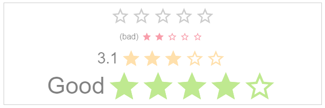
If you want to ust the svg style be shure to copy the image to your assets/images folder.
Component Properties
Inputs
id: string (Optional)
The html id attribute of the star rating
Default: undefined
<star-rating-comp [id]="'my-id'"></star-rating-comp>
rating: number (Optional)
The actual star rating value
Default: no
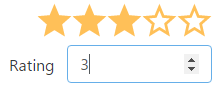
<star-rating-comp [rating]="3"></star-rating-comp>
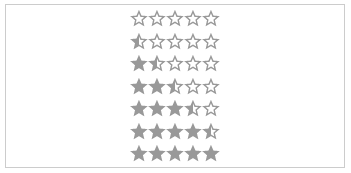
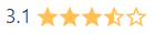
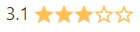
showHalfStars: boolean (Optional)
To show half stars or not
Options: true, false
Default: false
<star-rating-comp [showHalfStars]="true"></star-rating-comp>
numOfStars: number (Optional)
The possible number of stars to choose from
Default: 5
<star-rating-comp [numOfStars]="6"></star-rating-comp>
text: string (Optional)
The text next to the stars.
Default: undefined
<star-rating-comp [labelText]="'My text!'"></star-rating-comp>
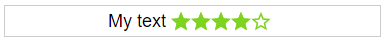
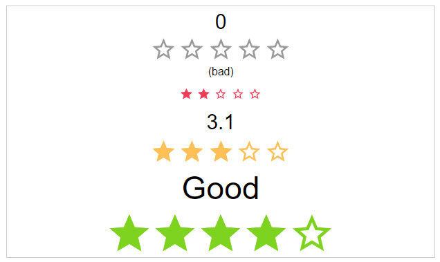
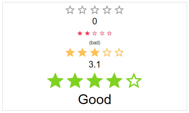
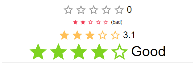
labelPosition: starRatingPosition (Optional)
The position of the label
Options: top, right, bottom, left
Default: left
<star-rating-comp [labelPosition]="'top'"></star-rating-comp>
space: starRatingStarSpace (Optional)
If the start use the whole space or not.
Options: no, between, around
Default: no
<star-rating-comp [space]="'around'"></star-rating-comp>


size: starRatingSizes (Optional)
The height and width of the stars.
Options: small, medium, large
Default: middle
<star-rating-comp [size]="'small'"></star-rating-comp>

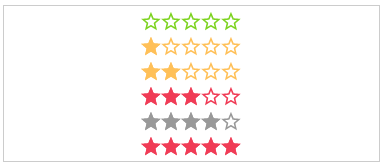
staticColor: starRatingColors (Optional)
Possible color names for the stars.
Options: default, negative, middle, positive
Default: undefined
<star-rating-comp [staticColor]="'positive'"></star-rating-comp>
disabled: boolean (Optional)
The click callback is disabled, colors are transparent
Default: false
<star-rating-comp [disabled]="true"></star-rating-comp>

direction: string (Optional)
The direction of the stars and label.
Options: rtl, ltr
Default: rtl
<star-rating-comp [direction]="'ltr'"></star-rating-comp>

readOnly: boolean (Optional)
The click callback is disabled
Default: false
<star-rating-comp [readOnly]="true"></star-rating-comp>
speed: starRatingSpeed (Optional)
The duration of the animation in ms.
Options: immediately, noticeable, slow
Default: noticeable
<star-rating-comp [speed]="'slow'"></star-rating-comp>


starType: starRatingStarTypes (Optional)
The type of start resource to use.
Options: svg, icon
Default: svg
<star-rating-comp [starType]="'icon'"></star-rating-comp>
getColor: Function (Optional)
Calculation of the color by rating.
Params: rating, number,numOfStars and staticColor
Return: color name
<star-rating-comp [getColor]="ctrl.getColor(rating, numOfStars, staticColor)"></star-rating-comp>
getHalfStarVisible: Function (Optional)
Calculation for adding the "half" class or not, depending on the rating value.
Params: rating
Return: boolean
<star-rating-comp [getHalfStarClass]="ctrl.getHalfStarClass(rating)" rating="3.2"></star-rating-comp>
Outputs
onClick: Function (Optional)
Callback function for star click event
Params: $event
<star-rating-comp (onClick)="ctrl.onClick($event)"></star-rating-comp>
onRatingChange: Function (Optional)
Callback function for rating change event
Params: $event
<star-rating-comp (onRatingChange)="ctrl.onRatingChange($event)"></star-rating-comp>
License
MIT © Michael Hladky