Input
An advance Input component that should render nicely on any platform. Supports a great level of customization.
for version 1.0.3 and above now you can use startIcon and EndIcon instead of Icon props.

Installation
to install the latest version of azir-input you only need to run:
npm install azir-input --save
or
yarn add azir-input
Examples
Basic
import Input from "azir-input";
import {SolidIcons} from "azir-icon";
---
<Input help="error!!" label="Nice Input ;)" placeholder="Email"
endIcon={SolidIcons.boxOpen} endIconSize={60} endIconColor="error"  />

RTL with custom Icon
import Input from "azir-input";
import Icon, {SolidIcons} from "azir-icon";
import AzirTheme from "azir-theme";
---
<View style={ { width: "80%" } }>
<Input
    endIcon={<Icon icon={SolidIcons.at} size={22} color={AzirTheme.COLORS.SUCCESS} />}
    inputStyle={ { color: "green" } }
    help="خطأ !!"
    label="البريد الإلكتروني : "
    labelPosition="right"
    helpStyle={ { marginRight: 110 } }
/>
</View>

advance Themes => Theme 1
import Input from "azir-input";
import Icon, {SolidIcons} from "azir-icon";
---
<Input
    labelPosition="top"
    helpPosition="top"
    label="Password"
    labelStyle={ { color: "#fff", padding: 5 } }
    inputStyle={ { fontSize: 18, paddingHorizontal: 10, color: "#34495e" } }
    style={ { height: 55, paddingHorizontal: 0, backgroundColor: "#fff" } }
    containerStyle={ { backgroundColor: "#34495e" } }
    password
    renderPasswordIcon={password => {
    return <Icon style={ [ { backgroundColor: "#34495e", padding: 13 }, props.iconStyle] }
    icon={password ? SolidIcons.eye : SolidIcons.ellipsisHh} size={24} color="#ccc" />;
    } }
></Input>

advance Themes => Theme 2
import Input from "azir-input";
import Icon, {SolidIcons} from "azir-icon";
---
 <Input
    labelPosition="top"
    label="Email"
    helpPosition="top"
    labelStyle={ {  color: "#2196f3" } }
    inputStyle={ { fontSize: 18, paddingHorizontal: 10, color: "#2196f3" } }
    style={ {
    borderColor: "#2196f3",
    borderBottomWidth: 2,
    borderTopWidth: 0,
    borderLeftWidth: 0,
    borderRightWidth: 0,
    height: 55,
    paddingHorizontal: 0,
    backgroundColor: "transparent"
    } }
    endIcon={<Icon style={ { padding: 13 } } icon={SolidIcons.at} size={24} color={"#2196f3"}></Icon>}
></Input>

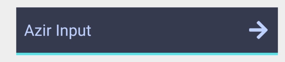
advance Themes => Theme 3
import Input from "azir-input";
import Icon, {SolidIcons} from "azir-icon";
---
<Input
    labelPosition="top"
    helpPosition="top"
    labelStyle={ { color: "#BFD2FF" } }
    inputStyle={ { fontSize: 18, paddingHorizontal: 10, color: "#BFD2FF" } }
    style={ {
    borderColor: "#59e3e6",
    borderBottomWidth: 3,
    borderTopWidth: 0,
    borderLeftWidth: 0,
    borderRightWidth: 0,
    height: 60,
    paddingHorizontal: 0,
    backgroundColor: "#363a4e"
    } }
    endIcon={<Icon style={ { padding: 13 } } icon={SolidIcons.arrowRight} size={24} color={"#BFD2FF"}>
    </Icon>}>
</Input>
Props
Reference
type
Determines which keyboard to open, e.g.numeric.
| Type | Required | Default |
|---|
| enum('default', 'email-address', 'numeric', 'phone-pad', 'ascii-capable', 'numbers-and-punctuation', 'url', 'number-pad', 'name-phone-pad', 'decimal-pad', 'twitter', 'web-search', 'visible-password') | No | default |
endIcon
Set the end Icon of the input Text, can be string or jsx element.
| Type | Required | Default |
|---|
| string, JSX element | No | Not Set |
endIconSize
Set the end Icon Size of the input Text.
| Type | Required | Default |
|---|
| number | No | Not Set |
endIconColor
Set the end Icon Color of the input Text.
startIcon
Set the start Icon of the input Text, can be string or jsx element.
| Type | Required | Default |
|---|
| string, JSX element | No | Not Set |
startIconSize
Set the start Icon Size of the input Text.
| Type | Required | Default |
|---|
| number | No | Not Set |
startIconColor
Set the start Icon Color of the input Text.
password
Tells the input that this is going to be a password input. ( it will show eye icon which you can press to toggle show pass or not)
| Type | Required | Default |
|---|
| bool | No | false |
disabled
If true, disable all interactions for this component.
| Type | Required | Default |
|---|
| bool | No | false |
borderless
Sets the Input's borderWidth to 0
| Type | Required | Default |
|---|
| bool | No | false |
rounded
Sets the corners to be rounded
| Type | Required | Default |
|---|
| bool | No | false |
renderPasswordIcon
Render Props Function you can override Input icon , we pass password boolean args
| Type | Required | Default |
|---|
| Render Prop Function | No | null |
placeholderTextColor
Sets the placeholder's text color
| Type | Required | Default |
|---|
| azir-color | No | AzirTheme.COLORS.GREY |
color
Input Text color
selectionColor
Input Text cursor color
bgColor
Input background color
label
Sets the label of the input
| Type | Required | Default |
|---|
| string, JSX element | No | Not Set |
labelPosition
Sets the label Position
| Type | Required | Default |
|---|
| "top" , "left" , "right" | No | top |
labelStyle
override Label Style
help
Sets the help of the input
| Type | Required | Default |
|---|
| string, JSX element | No | Not Set |
helpPosition
Sets the help Position
| Type | Required | Default |
|---|
| "top" , "bottom" | No | bottom |
helpStyle
override help Style
containerStyle
override input container Style which include ( input text + icon)


