Research
/Security News
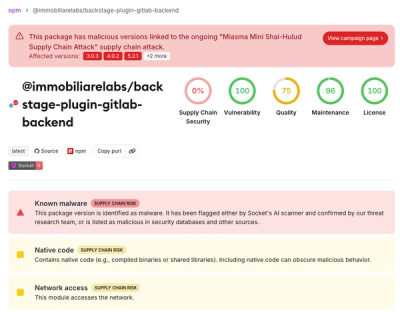
Miasma Mini Shai-Hulud Hits ImmobiliareLabs npm Packages
Miasma Mini Shai-Hulud hits @immobiliarelabs Backstage plugins, targeting GitLab and LDAP auth packages on npm.
By Socket Research Team - Jun 26, 2026
crypto-icon-next-cli
Advanced tools
CLI tool for generating crypto icon components for Next.js projects with shadcn/ui and Tailwind CSS
🚀 A CLI tool for generating crypto icon components specifically designed for Next.js projects using shadcn/ui, Tailwind CSS, and Next.js Image component.
Image component for optimal performanceCryptoIcon component for all icons| AAVE | AELF | AI16Z | AIRI | ALGO 🌗 | APT 🌗 |
| AR 🌗 | ARB | ATI | ATOM | AVAX | AXS |
| Aimstrong | BASE | BNB | BONK | BTC | BTCB |
| BTT 🌗 | BUSD 🌗 | COMP 🌗 | DAI | DOGE | EDU |
| ETH | FDUSD 🌗 | FIL | FLOKI 🌗 | FLOW | FLUX |
| GALA | GNO | GNRT | GRT | HBAR 🌗 | HNT |
| HOT 🌗 | HT | HTX 🌗 | IMX | INJ | ION |
| IOTX | JASMY | JITOSOL | JST | JUP | KAS |
| KCS | KWT | LEE | LFG 🌗 | LTC | MANA |
| MAX | METIS | MILKY | MINA | MKR | NEO |
| NEXO | NFT 🌗 | NTMPI | OCH | ORAI 🌗 | ORAIX 🌗 |
| OSMO | PEPE | PYTH | RACKS | RAY 🌗 | ROSE |
| SHIB | SNX | SOL 🌗 | STRX | STUSDT | STX |
| SUN | SUNOLD | TIA | TON | TRUMP 🌗 | TRX |
| TUSD | USD1 | USDAI 🌗 | USDC | USDD | USDJ |
| USDT | VET | VIRTUAL | WBTC | WETH | WIF |
| WIN | XLM 🌗 | XMR | XRP 🌗 | ZEC 🌗 | ZRX 🌗 |
| aUSDT | sORAI | sSOL | scATOM | scINJ | scORAI |
| scOSMO | stATOM | stOSMO | xOCH |
| Bitget | Bybit | Keplr | LazorKit | Leap | Ledger |
| MetaMask | Owallet | Phantom | Solflare | TronLink | WalletConnect |
| BSC | Jito 🌗 | JustLendDAO 🌗 | Kamino 🌗 | Orchai 🌗 |
The CryptoIcon component accepts these props:
type CryptoIconProps = {
    name: string; // Icon name (e.g., "BTC", "MetaMask", "Ethereum")
    mode?: "light" | "dark"; // Display mode (default: "light")
    className?: string; // Additional CSS classes
    size?: number; // For square icons (default: 24)
    width?: number; // Specific width (overrides size)
    height?: number; // Specific height (overrides size)
    alt?: string; // Alt text (default: icon name)
    fallback?: React.ReactNode; // Custom fallback when icon not found
};
Examples:
// Basic usage (light mode by default)
<CryptoIcon name="BTC" size={32} />

// Dark mode
<CryptoIcon name="BTC" size={32} mode="dark" />

// With TypeScript enums
import { TokenSymbol, WalletName } from "./components/crypto-icons/types";
<CryptoIcon name={TokenSymbol.BTC} size={32} mode="dark" />
<CryptoIcon name={WalletName.MetaMask} size={24} />

// Custom dimensions
<CryptoIcon name="BTC" width={40} height={30} />

// With styling
<CryptoIcon name="BTC" size={24} className="rounded-full border" />

// With custom fallback
<CryptoIcon name="UNKNOWN" size={24} fallback={<span>❓</span>} />

// Dynamic mode switching based on your app's theme state
const [isDark, setIsDark] = useState(false);
<CryptoIcon name="ETH" size={32} mode={isDark ? "dark" : "light"} />
No installation required! Use with npx:
npx crypto-icon-next-cli@latest init
npx crypto-icon-next-cli@latest init
Supported for VITE projects as well!
npx crypto-icon-next-cli@latest init -f vite
npx crypto-icon-next-cli@latest add --token BTC ETH
npx crypto-icon-next-cli@latest add --wallet MetaMask TrustWallet
npx crypto-icon-next-cli@latest add --system Ethereum Polygon
import { CryptoIcon } from "./components/crypto-icons";

export function WalletBalance() {
    return (
        <div className="flex items-center gap-2">
            {/* Icons that exist in the map will display the image */}
            <CryptoIcon name="BTC" size={32} />
            <CryptoIcon name="ETH" size={32} mode="dark" className="rounded-full" />
            <CryptoIcon name="MetaMask" size={24} />

            {/* Icons that don't exist will show fallback text */}
            <CryptoIcon name="UNKNOWN" size={24} />

            {/* Custom fallback */}
            <CryptoIcon name="NOTFOUND" size={24} fallback={<div className="w-6 h-6 bg-gray-300 rounded">?</div>} />
        </div>
    );
}
Universal Icon Component Benefits:
✅ One component for all icons - No need for separate IconBTC, IconETH, etc.
✅ Dynamic icon loading - Pass any icon name as a string
✅ Fallback support - Shows text or custom component when icon not found
✅ Type-safe - Full TypeScript support with intellisense
✅ No bundle bloat - Only loads the icons you actually use
configConfigure default settings for the CLI:
npx crypto-icon-next-cli@latest config

Options:
  -d, --dir <directory>           Set default target directory
  -i, --image-path <path>         Set default image base path
  -r, --reset                     Reset configuration to defaults

Examples:
  npx crypto-icon-next-cli@latest config
  npx crypto-icon-next-cli@latest config --dir ./components/icons
  npx crypto-icon-next-cli@latest config --image-path /assets/crypto
  npx crypto-icon-next-cli@latest config --reset
initInitialize the crypto icons structure in your project:
npx crypto-icon-next-cli@latest init [options]

Options:
  -d, --dir <directory>  Target directory (default: from config or ./src/components/crypto-icons)
addAdd crypto icon components:
npx crypto-icon-next-cli@latest add [options]

Options:
  -t, --token <tokens...>    Add token icons (e.g., BTC ETH SOL)
  -w, --wallet <wallets...>  Add wallet icons (e.g., MetaMask TrustWallet)
  -s, --system <systems...>  Add system icons (e.g., Ethereum Polygon)
  -d, --dir <directory>      Target directory (default: from config or ./src/components/crypto-icons)

Examples:
  npx crypto-icon-next-cli@latest add --token BTC ETH SOL
  npx crypto-icon-next-cli@latest add --wallet MetaMask TrustWallet Coinbase
  npx crypto-icon-next-cli@latest add --system Ethereum Polygon BSC
removeRemove crypto icon components:
npx crypto-icon-next-cli@latest remove [options]

Options:
  -t, --token <tokens...>    Remove token icons
  -w, --wallet <wallets...>  Remove wallet icons
  -s, --system <systems...>  Remove system icons
  -d, --dir <directory>      Target directory (default: from config or ./src/components/crypto-icons)

Examples:
  npx crypto-icon-next-cli@latest remove --token BTC
  npx crypto-icon-next-cli@latest remove --wallet MetaMask
After initialization, your project will have this structure:
src/components/crypto-icons/
├── CryptoIcon.tsx          # Universal icon component
├── types/
│   ├── index.ts           # Main type exports
│   ├── TokenSymbol.ts     # Token symbols enum
│   ├── WalletName.ts      # Wallet names enum
│   └── SystemName.ts      # System names enum
├── constants/
│   └── imagePaths.ts      # Central icon map
├── utils/
│   └── theme.ts           # Theme detection utilities
└── index.ts               # Main exports
Instead of generating individual component files for each icon, this CLI uses a universal component approach:
// ❌ Old approach (individual components)
import { IconBTC, IconETH, IconMetaMask } from "./crypto-icons/tokens";

// ✅ New approach (universal component)
import { CryptoIcon, TokenSymbol, WalletName } from "./crypto-icons";

function Portfolio() {
    return (
        <div>
            <CryptoIcon name="BTC" size={32} />
            <CryptoIcon name={TokenSymbol.ETH} size={32} mode="dark" />
            <CryptoIcon name={WalletName.MetaMask} size={24} />
        </div>
    );
}
All icons are automatically loaded from Firebase Storage:
// constants/imagePaths.ts
export const iconMap: Record<string, ImagePaths> = {
    BTC: {
        lightMode: baseImgUrlToken("BTC-lightmode"),
        darkMode: baseImgUrlToken("BTC-darkmode"),
    },
    MetaMask: {
        lightMode: baseImgUrlWallet("MetaMask-lightmode"),
        darkMode: baseImgUrlWallet("MetaMask-darkmode"),
    },
    Ethereum: {
        lightMode: baseImgUrlSystem("Ethereum-lightmode"),
        darkMode: baseImgUrlSystem("Ethereum-darkmode"),
    },
    // ... more icons
};
https://firebasestorage.googleapis.com/v0/b/crypto-images-token/o/[TOKEN_NAME]-[mode].png?alt=mediahttps://firebasestorage.googleapis.com/v0/b/crypto-images-wallet/o/[WALLET_NAME]-[mode].png?alt=mediahttps://firebasestorage.googleapis.com/v0/b/crypto-images-system/o/[SYSTEM_NAME]-[mode].png?alt=mediaIcons support both light and dark variants. You control the display mode manually:
// Light mode (default)
<CryptoIcon name="BTC" size={32} />

// Dark mode
<CryptoIcon name="BTC" size={32} mode="dark" />

// Dynamic mode based on your app's theme state
const [isDark, setIsDark] = useState(false);
<CryptoIcon name="BTC" size={32} mode={isDark ? "dark" : "light"} />

// With next-themes or other theme libraries
import { useTheme } from "next-themes";

function MyComponent() {
    const { theme } = useTheme();
    return (
        <CryptoIcon
            name="BTC"
            size={32}
            mode={theme === "dark" ? "dark" : "light"}
        />
    );
}
If you're using Git Bash on Windows and encounter issues with image paths being converted to Windows paths (e.g., C:/Program Files/Git/assets/crypto), you can:
Use quotes around the path:
npx crypto-icon-next-cli@latest config --image-path "/images/crypto"
Manually edit the config file:
# Edit .crypto-icons.json directly
{
  "defaultDirectory": "./src/components/icons",
  "imageBasePath": "/images/crypto"
}
Use double slashes to escape:
npx crypto-icon-next-cli@latest config --image-path "//images/crypto"
The CLI stores configuration in .crypto-icons.json in your project root. You can edit this file directly if needed:
{
    "defaultDirectory": "./src/components/crypto-icons",
    "imageBasePath": "/images/crypto"
}
Contributions are welcome! Please feel free to submit a Pull Request.
MIT License
The CryptoIcon component supports comprehensive error handling and loading states:
import { CryptoIcon } from "./components/crypto-icons";

export function AdvancedIconExample() {
    const [loadingState, setLoadingState] = useState<string>("");

    return (
        <div className="space-y-4">
            {/* Basic error handling */}
            <CryptoIcon
                name="BTC"
                size={48}
                onError={(error) => console.error("Icon failed to load:", error)}
                onLoadingComplete={(result) => console.log("Icon loaded:", result.naturalWidth, "x", result.naturalHeight)}
            />

            {/* Custom loading component */}
            <CryptoIcon name="ETH" size={48} loadingComponent={<div className="w-12 h-12 bg-gray-200 animate-pulse rounded-full" />} />

            {/* Custom error component */}
            <CryptoIcon
                name="INVALID_ICON"
                size={48}
                errorComponent={
                    <div className="w-12 h-12 bg-red-100 border-2 border-red-300 rounded-full flex items-center justify-center">
                        <span className="text-red-600">❌</span>
                    </div>
                }
            />

            {/* Blur placeholder */}
            <CryptoIcon name="SOL" size={48} placeholder="blur" blurDataURL="data:image/jpeg;base64,/9j/4AAQSkZJRgABAQAAAQABAAD..." />
        </div>
    );
}
Pass any Next.js Image props for advanced customization:
import { CryptoIcon } from "./components/crypto-icons";

export function CustomizedIcon() {
    return (
        <CryptoIcon
            name="BTC"
            size={64}
            // Next.js Image props
            priority={true}
            quality={90}
            placeholder="blur"
            blurDataURL="data:image/jpeg;base64,..."
            unoptimized={false}
            loader={({ src, width, quality }) => {
                return `${src}?w=${width}&q=${quality || 75}`;
            }}
            // Custom callbacks
            onLoadingComplete={(result) => {
                console.log("Image loaded successfully");
            }}
            onError={(error) => {
                console.error("Failed to load image:", error);
            }}
            // Styling
            className="rounded-full border-2 border-blue-500 shadow-lg hover:scale-110 transition-transform"
            style={{ filter: "drop-shadow(0 4px 8px rgba(0,0,0,0.2))" }}
        />
    );
}
import { CryptoIcon } from "./components/crypto-icons";
import { useTheme } from "next-themes";

export function ThemeAwareIcon() {
    const { theme } = useTheme();

    return (
        <CryptoIcon
            name="SOL" // SOL is a special icon with different light/dark versions
            mode={theme === "dark" ? "dark" : "light"}
            size={48}
            className="transition-all duration-300"
        />
    );
}
import { CryptoIcon } from "./components/crypto-icons";
import { useState } from "react";

const tokens = ["BTC", "ETH", "SOL", "ADA", "DOT", "AVAX"];

export function IconGrid() {
    const [loadedIcons, setLoadedIcons] = useState<Set<string>>(new Set());

    const handleIconLoad = (iconName: string) => {
        setLoadedIcons((prev) => new Set(prev).add(iconName));
    };

    return (
        <div className="grid grid-cols-3 gap-4">
            {tokens.map((token) => (
                <div key={token} className="p-4 border rounded-lg">
                    <CryptoIcon
                        name={token}
                        size={48}
                        className="mx-auto"
                        loadingComponent={<div className="w-12 h-12 bg-gray-200 animate-pulse rounded-full mx-auto" />}
                        onLoadingComplete={() => handleIconLoad(token)}
                        fallback={
                            <div className="w-12 h-12 bg-gray-100 rounded-full flex items-center justify-center mx-auto">
                                <span className="text-xs font-medium text-gray-600">{token.slice(0, 3)}</span>
                            </div>
                        }
                    />
                    <p className="text-center mt-2 text-sm">
                        {token}
                        {loadedIcons.has(token) && <span className="text-green-600 ml-1">✓</span>}
                    </p>
                </div>
            ))}
        </div>
    );
}
FAQs
CLI tool for generating crypto icon components for Next.js projects with shadcn/ui and Tailwind CSS
The npm package crypto-icon-next-cli receives a total of 786 weekly downloads. As such, crypto-icon-next-cli popularity was classified as not popular.
We found that crypto-icon-next-cli demonstrated a healthy version release cadence and project activity because the last version was released less than a year ago. It has 1 open source maintainer collaborating on the project.
Did you know?

Socket for GitHub automatically highlights issues in each pull request and monitors the health of all your open source dependencies. Discover the contents of your packages and block harmful activity before you install or update your dependencies.
Research
/Security News
Miasma Mini Shai-Hulud hits @immobiliarelabs Backstage plugins, targeting GitLab and LDAP auth packages on npm.

Security News
Rolldown paused Rust React Compiler integration after a 5MB binary size increase raised concerns about shipping React-specific code to all Vite users.

Security News
/Research
Mini Shai-Hulud expands into the Go ecosystem after hitting LeoPlatform npm packages and targeting GitHub Actions workflows.