digito
The only framework-agnostic OTP input state machine powering React, Vue, Svelte, Alpine, Vanilla JS, and Web Components from a single core.
By @Olawale Balo — Product Designer + Design Engineer





Overview
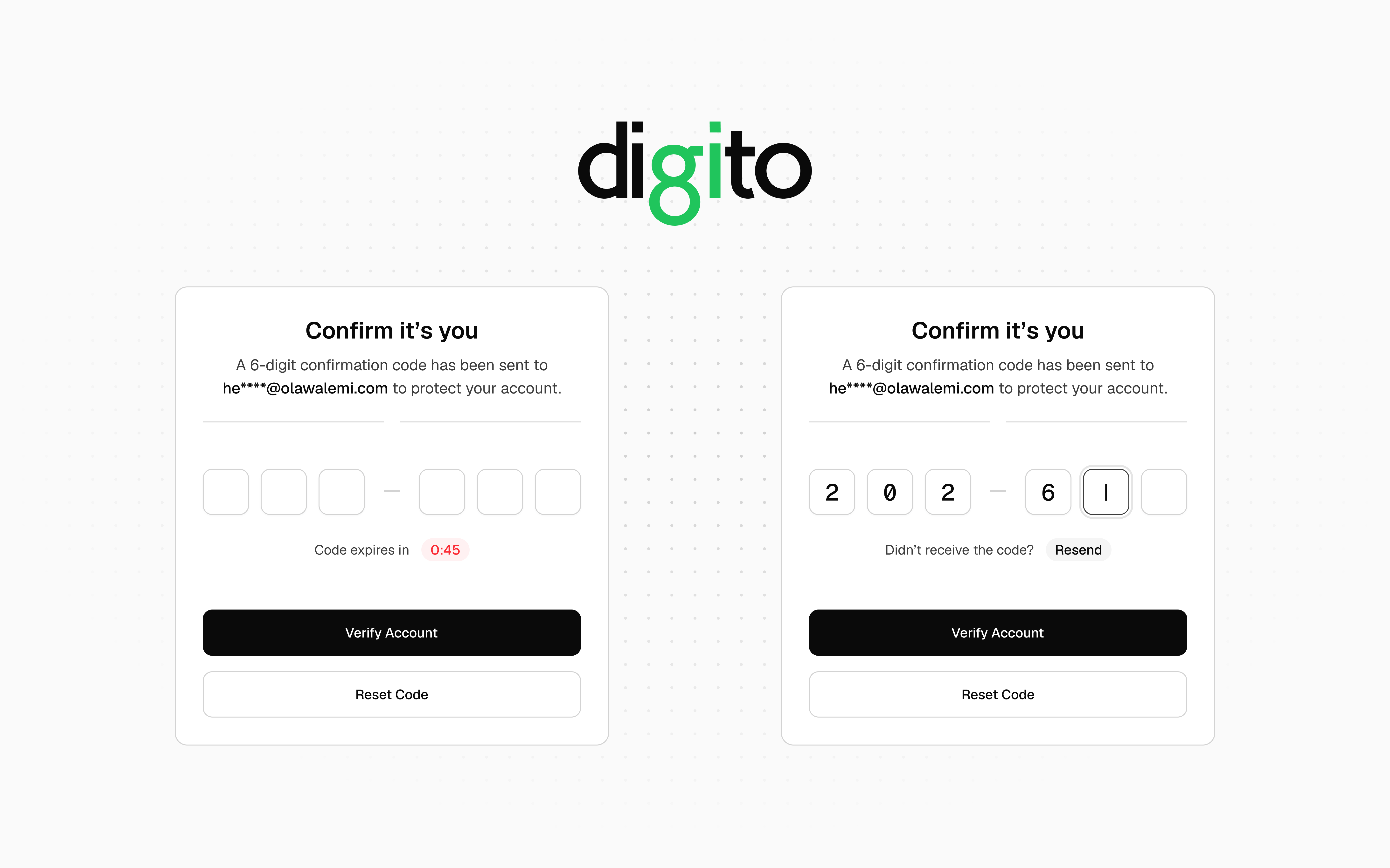
Digito is a fully-featured, zero-dependency OTP input library for the web. It handles SMS autofill, password managers, smart paste, screen readers, countdown timers, and resend flows without requiring you to patch or work around any of them.
Most OTP libraries render one <input> per slot. This breaks native autofill, confuses screen readers, and creates complex focus-juggling logic. Digito instead renders one transparent input that captures all keyboard and paste events, with purely visual <div> elements mirroring the state. The browser sees a single real field, so everything works as expected.
The core is a pure state machine with no DOM or framework dependencies, wrapped by six independent adapters: Vanilla JS, React, Vue, Svelte, Alpine.js, and Web Component.
Features
- Single hidden-input architecture — full SMS autofill, password manager, and screen reader support out of the box
- Six framework adapters — Vanilla, React, Vue 3, Svelte, Alpine.js, and Web Component (
<digito-input>)
- Zero dependencies — framework peer deps are all optional
- Pure TypeScript — fully typed, ships with declaration maps
- Built-in timer + resend UI — countdown badge and resend button injected automatically, or drive your own with
onTick
- Smart paste — distributes valid characters from cursor slot forward, wrapping around if needed
- Password manager guard — detects badges from LastPass, 1Password, Dashlane, Bitwarden, and Keeper; prevents visual overlap automatically
- Web OTP API — intercepts incoming SMS codes on Android Chrome automatically
- Fake caret — blinking caret rendered on the active empty slot for native feel
- Masked mode —
masked: true renders ● glyphs and sets type="password" on the hidden input
- Visual separators —
separatorAfter groups slots visually (e.g. XXX — XXX) without affecting the value
- Custom charset —
pattern: RegExp overrides type for any per-character validation rule
- Haptic + sound feedback —
navigator.vibrate and Web Audio API on completion and error
onComplete deferral — fires after DOM sync; cancellable without clearing slot values- Native form support —
name option wires the hidden input into <form> / FormData
- Fully accessible — single ARIA-labelled input,
inputMode, autocomplete="one-time-code", all visual elements aria-hidden
readOnly mode — field stays focusable and copyable but blocks all mutations; semantically distinct from disableddefaultValue — uncontrolled pre-fill applied once on mount without triggering onComplete- Data attribute state hooks —
data-complete, data-invalid, data-disabled, data-readonly set on the wrapper across all adapters for Tailwind data-* variant and plain CSS attribute styling
- CDN-ready — two IIFE bundles for no-build usage
How digito compares
| Pure headless state machine | ✅ | ✗ | ✗ |
| Web OTP API (SMS intercept) | ✅ | ✗ | ✗ |
| Built-in timer and resend | ✅ | ✗ | ✗ |
| Masked mode | ✅ | ✗ | ✗ |
Programmatic API (setError, setSuccess, reset, focus) | ✅ | ✗ | ✗ |
| Haptic + sound feedback | ✅ | ✗ | ✗ |
blurOnComplete (auto-advance) | ✅ | ✗ | ✗ |
onInvalidChar callback | ✅ | ✗ | ✗ |
readOnly mode (focusable, no mutations) | ✅ | ✗ | ✗ |
| Data attribute state hooks | ✅ | ✗ | ✗ |
| Vanilla JS | ✅ | ✗ | ✗ |
| Vue | ✅ | ✗ | ✗ |
| Svelte | ✅ | ✗ | ✗ |
| Alpine.js | ✅ | ✗ | ✗ |
| Web Component | ✅ | ✗ | ✗ |
| React | ✅ | ✅ | ✅ |
| Single hidden input | ✅ | ✅ | ✗ |
| Fake caret | ✅ | ✅ | ✗ |
| Password manager guard | ✅ | ✅ | ✗ |
| Zero dependencies | ✅ | ✅ | ✗ |
| TypeScript | ✅ | ✅ | ✅ |
Installation
npm i digitojs
pnpm add digitojs
yarn add digitojs
CDN (no build step):
<script src="https://unpkg.com/digitojs/dist/digito.min.js"></script>
<script src="https://unpkg.com/digitojs/dist/digito-wc.min.js"></script>
Quick Start
Vanilla JS — add a <div> and call initDigito():
<div class="digito-wrapper" data-length="6" data-timer="60"></div>

<script type="module">
  import { initDigito } from 'digitojs'

  const [otp] = initDigito('.digito-wrapper', {
    onComplete: (code) => console.log('Code:', code),
    onResend:   () => sendOTP(),
  })
</script>
Digito injects the slot inputs, styles, countdown badge, and resend button automatically. Nothing else to configure.
Note: verify(code), sendOTP(), and similar functions used throughout the examples are placeholder names, so replace them with your own API calls or application logic.
Usage
Common Patterns
| SMS / email OTP (6-digit numeric) | type: 'numeric', timer: 60, onResend |
| 2FA / TOTP with grouping | separatorAfter: 3 |
| PIN entry (hidden) | masked: true, blurOnComplete: true |
| Alphanumeric verification code | type: 'alphanumeric', pasteTransformer |
| Invite / referral code (grouped) | separatorAfter: [3, 6], pattern: /^[A-Z0-9]$/ |
| Activation key (hex charset) | pattern: /^[0-9A-F]$/, separatorAfter: [5, 10, 15] |
| Native form submission | name: 'otp_code' |
| Async verification with lock | setDisabled(true/false) around API call |
| Auto-advance after entry | blurOnComplete: true |
| Pre-fill on mount (uncontrolled) | defaultValue: '123456' |
| Display-only / read-only field | readOnly: true |
Vanilla JS
<div
class="digito-wrapper"
data-length="6"
data-type="numeric"
data-timer="60"
data-resend="30"
data-separator-after="2,4"
data-separator="—"
></div>
<script type="module">
import { initDigito } from 'digitojs'
const [otp] = initDigito('.digito-wrapper', {
onComplete: (code) => verify(code),
onResend: () => sendOTP(),
})
otp.getCode()
otp.reset()
otp.setError(true)
otp.setSuccess(true)
otp.setDisabled(true)
otp.destroy()
</script>
Custom timer UI — pass onTick to suppress the built-in timer UI and drive your own:
const [otp] = initDigito('.digito-wrapper', {
  timer:    60,
  onTick:   (remaining) => (timerEl.textContent = `0:${String(remaining).padStart(2, '0')}`),
  onExpire: () => showResendButton(),
  onResend: () => { otp.resend(); hideResendButton() },
})
React
import { useOTP, HiddenOTPInput } from 'digitojs/react'

export function OTPInput() {
  const otp = useOTP({
    length:     6,
    onComplete: (code) => verify(code),
  })

  return (
    <div {...otp.wrapperProps} style={{ position: 'relative', display: 'inline-flex', gap: 10 }}>
      <HiddenOTPInput {...otp.hiddenInputProps} />

      {otp.slotValues.map((_, i) => {
        const { char, isActive, isFilled, isError, hasFakeCaret } = otp.getSlotProps(i)
        return (
          <div
            key={i}
            className={[
              'slot',
              isActive  ? 'is-active'  : '',
              isFilled  ? 'is-filled'  : '',
              isError   ? 'is-error'   : '',
            ].filter(Boolean).join(' ')}
          >
            {hasFakeCaret && <span className="caret" />}
            {char}
          </div>
        )
      })}
    </div>
  )
}
Controlled / react-hook-form:
const [code, setCode] = useState('')
const otp = useOTP({ length: 6, value: code, onChange: setCode })
Vue 3
<script setup lang="ts">
import { useOTP } from 'digitojs/vue'

const otp = useOTP({ length: 6, onComplete: (code) => verify(code) })
</script>

<template>
  <div v-bind="otp.wrapperAttrs.value" style="position: relative; display: inline-flex; gap: 10px">
    <input
      :ref="(el) => (otp.inputRef.value = el as HTMLInputElement)"
      v-bind="otp.hiddenInputAttrs"
      style="position: absolute; inset: 0; opacity: 0; z-index: 1"
      @keydown="otp.onKeydown"
      @input="otp.onChange"
      @paste="otp.onPaste"
      @focus="otp.onFocus"
      @blur="otp.onBlur"
    />
    <template v-for="(char, i) in otp.slotValues.value" :key="i">
      <span
        v-if="otp.separatorAfter.value && i === otp.separatorAfter.value"
        aria-hidden="true"
      >{{ otp.separator.value }}</span>
      <div
        class="slot"
        :class="{
          'is-active':  i === otp.activeSlot.value && otp.isFocused.value,
          'is-filled':  !!char,
          'is-error':   otp.hasError.value,
        }"
      >
        {{ char || otp.placeholder }}
      </div>
    </template>
  </div>
</template>
Reactive controlled value:
const code = ref('')
const otp = useOTP({ length: 6, value: code })
code.value = ''
Svelte
<script>
  import { useOTP } from 'digitojs/svelte'

  const otp = useOTP({ length: 6, onComplete: (code) => verify(code) })
</script>

<div {...$otp.wrapperAttrs} style="position: relative; display: inline-flex; gap: 10px">
  <input
    use:otp.action
    style="position: absolute; inset: 0; opacity: 0; z-index: 1"
  />

  {#each $otp.slotValues as char, i}
    {#if $otp.separatorAfter && i === $otp.separatorAfter}
      <span aria-hidden="true">{$otp.separator}</span>
    {/if}
    <div
      class="slot"
      class:is-active={i === $otp.activeSlot}
      class:is-filled={!!char}
      class:is-error={$otp.hasError}
    >
      {char || otp.placeholder}
    </div>
  {/each}
</div>
Alpine.js
import Alpine from 'alpinejs'
import { DigitoAlpine } from 'digitojs/alpine'

Alpine.plugin(DigitoAlpine)
Alpine.start()
<div x-digito="{
  length: 6,
  timer: 60,
  onComplete(code) { verify(code) },
  onResend()       { sendOTP()   },
}"></div>
Access the instance API via el._digito:
const el = document.querySelector('[x-digito]')
el._digito.getCode()
el._digito.setError(true)
el._digito.reset()
Web Component
import 'digitojs/web-component'
<digito-input
length="6"
type="numeric"
timer="60"
placeholder="·"
separator-after="3"
name="otp_code"
></digito-input>
<script>
const el = document.querySelector('digito-input')
el.pattern = /^[A-Z0-9]$/
el.pasteTransformer = s => s.toUpperCase()
el.onComplete = code => verify(code)
el.onResend = () => sendOTP()
el.addEventListener('complete', e => console.log(e.detail.code))
el.addEventListener('expire', () => showResendButton())
el.addEventListener('change', e => console.log(e.detail.code))
el.reset()
el.setError(true)
el.getCode()
</script>
API Reference
initDigito(target?, options?) — Vanilla
Mounts Digito on one or more wrapper elements. Returns an array of DigitoInstance.
initDigito(target?: string | HTMLElement | HTMLElement[], options?: VanillaOptions): DigitoInstance[]
DigitoInstance methods:
getCode() | Returns the current joined code string |
reset() | Clears all slots, restarts timer, re-focuses |
resend() | reset() + fires onResend |
setError(bool) | Applies or clears error state on all slots |
setSuccess(bool) | Applies or clears success state on all slots |
setDisabled(bool) | Disables or enables all input; navigation always allowed |
focus(slotIndex) | Programmatically moves focus to a slot |
destroy() | Removes all event listeners, stops timer, aborts Web OTP request |
useOTP(options) — React
import { useOTP, HiddenOTPInput } from 'digitojs/react'
const otp = useOTP(options)
Returns:
hiddenInputProps | object | Spread onto the <input> or use <HiddenOTPInput> |
wrapperProps | object | Spread onto the wrapper <div> — carries data-* state attributes |
slotValues | string[] | Current character per slot ('' = empty) |
activeSlot | number | Zero-based index of the focused slot |
isComplete | boolean | All slots filled |
hasError | boolean | Error state active |
isDisabled | boolean | Disabled state active |
isFocused | boolean | Hidden input has browser focus |
timerSeconds | number | Remaining countdown seconds |
separatorAfter | number | number[] | Separator position(s) for JSX rendering |
separator | string | Separator character to render |
getSlotProps(i) | (number) => SlotRenderProps | Full render metadata for slot i |
getCode() | () => string | Joined code string |
reset() | () => void | Clear all slots, restart timer |
setError(bool) | (boolean) => void | Toggle error state |
focus(i) | (number) => void | Move focus to slot |
Note: React does not expose a setDisabled() method. Pass disabled as an option prop instead — update it via your component's state (e.g. const [isVerifying, setIsVerifying] = useState(false) → useOTP({ disabled: isVerifying })).
SlotRenderProps (from getSlotProps(i)):
char | string | Slot character, '' when unfilled |
index | number | Zero-based slot index |
isActive | boolean | This slot has visual focus |
isFilled | boolean | Slot contains a character |
isError | boolean | Error state active |
isComplete | boolean | All slots filled |
isDisabled | boolean | Input is disabled |
isFocused | boolean | Hidden input has browser focus |
hasFakeCaret | boolean | isActive && !isFilled && isFocused |
masked | boolean | Masked mode active |
maskChar | string | Configured mask glyph |
placeholder | string | Configured placeholder character |
HiddenOTPInput — forwardRef wrapper that applies absolute-positioning styles automatically.
useOTP(options) — Vue 3
import { useOTP } from 'digitojs/vue'
const otp = useOTP(options)
Returns:
hiddenInputAttrs | object | Bind with v-bind on the hidden <input> |
wrapperAttrs | Ref<object> | Bind with v-bind on the wrapper element — carries data-* state attributes |
inputRef | Ref<HTMLInputElement | null> | Bind with :ref |
slotValues | Ref<string[]> | Current slot values |
activeSlot | Ref<number> | Focused slot index |
value | Ref<string> | Computed joined code |
isComplete | Ref<boolean> | All slots filled |
hasError | Ref<boolean> | Error state |
isFocused | Ref<boolean> | Hidden input focused |
timerSeconds | Ref<number> | Remaining countdown |
isDisabled | Ref<boolean> | Disabled state active |
masked | Ref<boolean> | Masked mode active |
maskChar | Ref<string> | Configured mask glyph |
separatorAfter | Ref<number | number[]> | Separator position(s) for template rendering |
separator | Ref<string> | Separator character to render |
placeholder | string | Placeholder character for empty slots |
onKeydown | handler | Bind with @keydown |
onChange | handler | Bind with @input |
onPaste | handler | Bind with @paste |
onFocus | handler | Bind with @focus |
onBlur | handler | Bind with @blur |
getCode() | () => string | Joined code |
reset() | () => void | Clear and reset |
setError(bool) | (boolean) => void | Toggle error |
focus(i) | (number) => void | Move focus |
value also accepts Ref<string> — assigning it resets the field reactively without firing onComplete.
useOTP(options) — Svelte
import { useOTP } from 'digitojs/svelte'
const otp = useOTP(options)
Returns:
subscribe | Store | Subscribe to full OTP state |
action | Svelte action | Use with use:otp.action on the hidden <input> |
wrapperAttrs | Readable<object> | Spread with {...$otp.wrapperAttrs} on wrapper — carries data-* state attributes |
value | Derived store | Joined code string |
isComplete | Derived store | All slots filled |
hasError | Derived store | Error state |
activeSlot | Derived store | Focused slot index |
timerSeconds | Writable store | Remaining countdown |
masked | Writable store | Masked mode |
separatorAfter | Writable store | Separator position(s) for template rendering |
separator | Writable store | Separator character to render |
placeholder | string | Placeholder character for empty slots |
getCode() | () => string | Joined code |
reset() | () => void | Clear and reset |
setError(bool) | (boolean) => void | Toggle error |
setDisabled(bool) | (boolean) => void | Toggle disabled state |
setValue(v) | (string) => void | Programmatic fill without triggering onComplete |
focus(i) | (number) => void | Move focus |
createDigito(options) — Core (headless)
Pure state machine with no DOM or framework dependency.
import { createDigito } from 'digitojs'
const otp = createDigito({ length: 6, type: 'numeric' })
otp.inputChar(slotIndex, char)
otp.deleteChar(slotIndex)
otp.pasteString(cursorSlot, rawText)
otp.moveFocusLeft(pos)
otp.moveFocusRight(pos)
otp.moveFocusTo(index)
otp.setError(bool)
otp.resetState()
otp.setDisabled(bool)
otp.setReadOnly(bool)
otp.clearSlot(slotIndex)
otp.cancelPendingComplete()
otp.state
otp.getCode()
otp.getSnapshot()
otp.getState()
const unsub = otp.subscribe(state => render(state))
unsub()
createTimer(options) — Standalone
import { createTimer } from 'digitojs'
const timer = createTimer({
totalSeconds: 60,
onTick: (remaining) => updateUI(remaining),
onExpire: () => showResendButton(),
})
timer.start()
timer.stop()
timer.reset()
timer.restart()
If totalSeconds <= 0, onExpire fires immediately on start(). The start() method is idempotent, so calling it twice never double-ticks.
filterChar / filterString — Utilities
import { filterChar, filterString } from 'digitojs'
filterChar('A', 'numeric')
filterChar('5', 'numeric')
filterChar('A', 'alphanumeric')
filterChar('Z', 'any', /^[A-Z]$/)
filterString('84AB91', 'numeric')
formatCountdown(totalSeconds) — Utility
Formats a second count as a m:ss string. Used internally by the built-in timer UI; exported for custom timer displays.
import { formatCountdown } from 'digitojs/core'
formatCountdown(65)
formatCountdown(30)
formatCountdown(9)
Configuration Options
All options are accepted by every adapter unless otherwise noted.
length | number | 6 | Number of input slots |
type | 'numeric' | 'alphabet' | 'alphanumeric' | 'any' | 'numeric' | Character class |
pattern | RegExp | — | Per-character regex; overrides type for validation |
pasteTransformer | (raw: string) => string | — | Transforms clipboard text before filtering |
onComplete | (code: string) => void | — | Fired when all slots are filled |
onExpire | () => void | — | Fired when countdown reaches zero |
onResend | () => void | — | Fired when resend is triggered |
onTick | (remaining: number) => void | — | Fired every second; suppresses built-in timer UI (vanilla) |
onInvalidChar | (char: string, index: number) => void | — | Fired when a typed character is rejected |
onChange | (code: string) => void | — | Fired on every user interaction |
onFocus | () => void | — | Fired when hidden input gains focus |
onBlur | () => void | — | Fired when hidden input loses focus |
timer | number | 0 | Countdown duration in seconds (0 = disabled) |
resendAfter | number | 30 | Resend button cooldown in seconds (vanilla) |
autoFocus | boolean | true | Focus the hidden input on mount |
blurOnComplete | boolean | false | Blur on completion (auto-advance to next field) |
selectOnFocus | boolean | false | Select-and-replace behavior on focused filled slot |
placeholder | string | '' | Character shown in empty slots (e.g. '○', '_') |
masked | boolean | false | Render maskChar in slots; type="password" on hidden input |
maskChar | string | '●' | Glyph used in masked mode |
name | string | — | Hidden input name for <form> / FormData |
separatorAfter | number | number[] | — | 1-based slot index/indices to insert a visual separator after |
separator | string | '—' | Separator character to render |
disabled | boolean | false | Disable all input on mount |
readOnly | boolean | false | Block mutations while keeping the field focusable and copyable |
defaultValue | string | — | Uncontrolled pre-fill applied once on mount; does not trigger onComplete |
haptic | boolean | true | navigator.vibrate(10) on completion and error |
sound | boolean | false | Play 880 Hz tone via Web Audio on completion |
Styling & Customization
CSS Custom Properties
Set on .digito-wrapper (vanilla) or digito-input (web component) to theme the entire component:
.digito-wrapper {
--digito-size: 56px;
--digito-gap: 12px;
--digito-radius: 10px;
--digito-font-size: 24px;
--digito-color: #0A0A0A;
--digito-bg: #FAFAFA;
--digito-bg-filled: #FFFFFF;
--digito-border-color: #E5E5E5;
--digito-active-color: #3D3D3D;
--digito-error-color: #FB2C36;
--digito-success-color: #00C950;
--digito-caret-color: #3D3D3D;
--digito-timer-color: #5C5C5C;
--digito-placeholder-color: #D3D3D3;
--digito-placeholder-size: 16px;
--digito-separator-color: #A1A1A1;
--digito-separator-size: 18px;
--digito-masked-size: 16px;
}
CSS Classes (Vanilla & Web Component)
.digito-slot | Always — on every visual slot div |
.digito-slot.is-active | Slot is the currently focused position |
.digito-slot.is-filled | Slot contains a character |
.digito-slot.is-error | Error state is active |
.digito-slot.is-success | Success state is active |
.digito-slot.is-disabled | Field is disabled |
.digito-caret | The blinking caret inside the active empty slot |
.digito-timer | The "Code expires in…" countdown row |
.digito-timer-badge | The red pill countdown badge |
.digito-resend | The "Didn't receive the code?" resend row |
.digito-resend-btn | The resend chip button |
.digito-separator | The visual separator between slot groups |
Data Attribute State Hooks
All adapters set boolean presence attributes on the wrapper element that mirror the current field state, with no extra JS needed. It works with Tailwind data-* variants and plain CSS attribute selectors.
data-complete | All slots are filled |
data-invalid | Error state is active |
data-disabled | Field is disabled |
data-readonly | Field is in read-only mode |
.digito-wrapper[data-complete] { border-color: var(--digito-success-color); }
.digito-wrapper[data-invalid] { animation: shake 0.2s; }
<div class="digito-wrapper data-[complete]:ring-green-500 data-[invalid]:ring-red-500"></div>
Accessibility
Digito is built with accessibility as a first-class concern:
- Single ARIA-labelled input — the hidden input carries
aria-label="Enter your N-digit code" (or N-character code for non-numeric types). Screen readers announce one field, not six.
- All visual elements
aria-hidden — slot divs, separators, caret, and timer UI are hidden from the accessibility tree.
inputMode — set to "numeric" or "text" based on type, triggering the correct mobile keyboard.autocomplete="one-time-code" — enables native SMS autofill on iOS and Android.- Anti-interference —
spellcheck="false", autocorrect="off", autocapitalize="off" prevent browser UI from interfering.
maxLength — constrains native input to length.type="password" in masked mode — triggers the OS password keyboard on mobile.- Native form integration — the
name option wires the hidden input into <form> and FormData, compatible with any form submission approach.
- Keyboard navigation — full keyboard support (
←, →, Backspace, Delete, Tab). No mouse required.
Keyboard Navigation
0–9 / a–z / A–Z | Fill current slot and advance focus |
Backspace | Clear current slot; step back if already empty |
Delete | Clear current slot; focus stays in place |
← | Move focus one slot left |
→ | Move focus one slot right |
Cmd/Ctrl+V | Smart paste from cursor slot, wrapping if needed |
Tab | Standard browser tab order |
Browser & Environment Support
Browsers:
| Chrome / Edge | Full support including Web OTP API |
| Firefox | Full support |
| Safari / iOS Safari | Full support including SMS autofill |
| Android Chrome | Full support including Web OTP API |
Frameworks (peer deps, all optional):
| React | >= 17 |
| Vue | >= 3 |
| Svelte | >= 4 |
| Alpine.js | >= 3 |
Runtimes:
- Node.js (core state machine — no DOM required)
- All modern browsers
- CDN / no-build via IIFE bundles (ES2017 target)
Package Exports
digitojs                → Vanilla JS adapter + core utilities
digitojs/core           → createDigito, createTimer, formatCountdown, filterChar, filterString (no DOM)
digitojs/react          → useOTP hook + HiddenOTPInput + SlotRenderProps
digitojs/vue            → useOTP composable
digitojs/svelte         → useOTP store + action
digitojs/alpine         → DigitoAlpine plugin
digitojs/web-component  → <digito-input> custom element
All exports are fully typed. Core utilities are also available from the main entry:
import { createDigito, createTimer, filterChar, filterString } from 'digitojs'
import { formatCountdown } from 'digitojs/core'
License
MIT © Olawale Balo