Product
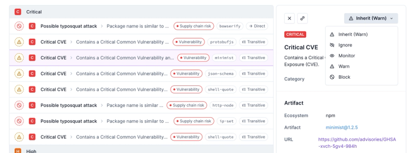
Introducing Enhanced Alert Actions and Triage Functionality
Socket now supports four distinct alert actions instead of the previous two, and alert triaging allows users to override the actions taken for all individual alerts.
estyle
Advanced tools
Readme
SCSS responsive design pattern

npm install estyle
Add link to file:
@import "~estyle/index.scss";
Adds spacing between children rows
.container {
  @include row-space(10px);
}
Adds spacing between children columns
.container {
  @include col-space(10px);
}
Add spacing for container and child tiles
.container {
  @include tile(10px);
}
Breaskpoints - the screen width values which usually defines different devices.
| Breaskpoint | Width | Mobile First CSS | Desktop First CSS |
|---|---|---|---|
sm | 640px | @media (min-width: 640px) { ... } | @media (max-width: 640px) { ... } |
md | 768px | @media (min-width: 768px) { ... } | @media (max-width: 768px) { ... } |
lg | 1024px | @media (min-width: 1024px) { ... } | @media (max-width: 1024px) { ... } |
xl | 1280px | @media (min-width: 1280px) { ... } | @media (max-width: 1280px) { ... } |
2xl | 640px | @media (min-width: 1536px) { ... } | @media (max-width: 1536px) { ... } |
Mobile first breakpoint system. Means that by default styles applyied to all screens, but when you set styles for mf-lg they will be applied to lg(1024px) screens or above.
| SCSS mixing | Minimum width | CSS |
|---|---|---|
mf-sm | 640px | @media (min-width: 640px) { ... } |
mf-md | 768px | @media (min-width: 768px) { ... } |
mf-lg | 1024px | @media (min-width: 1024px) { ... } |
mf-xl | 1280px | @media (min-width: 1280px) { ... } |
mf-2xl | 1536px | @media (min-width: 1536px) { ... } |
mf($value) | custom | @media (min-width: $value) { ... } |
Example:
.container {
  font-size: 12px;

  // when scrren is `lg` or more
  @include mf-lg {
    font-size: 16px;
  }

  // when scrren is `1500px` or more
  @include mf(1500px) {
    font-size: 16px;
  }
}
Desktop first breakpoint system. Means that by default styles applyied to all screens, but when you set styles for df-lg they will be applied to lg(1024px) screens or below.
| SCSS mixing | Maximum width | CSS |
|---|---|---|
df-sm | 640px | @media (max-width: 640px) { ... } |
df-md | 768px | @media (max-width: 768px) { ... } |
df-lg | 1024px | @media (max-width: 1024px) { ... } |
df-xl | 1280px | @media (max-width: 1280px) { ... } |
df-2xl | 1536px | @media (max-width: 1536px) { ... } |
df($value) | custom | @media (max-width: $value) { ... } |
Example:
.container {
  font-size: 12px;

  // when scrren is `lg` or less
  @include df-lg {
    font-size: 16px;
  }

  // when scrren is `1500px` or less
  @include df(1500px) {
    font-size: 16px;
  }
}
Adds styles to all children tags
.container {
  @include children {
    color: white;
    background-color: black;
  }
}
FAQs
Common styles patterns
The npm package estyle receives a total of 0 weekly downloads. As such, estyle popularity was classified as not popular.
We found that estyle demonstrated a healthy version release cadence and project activity because the last version was released less than a year ago. It has 1 open source maintainer collaborating on the project.
Did you know?

Socket for GitHub automatically highlights issues in each pull request and monitors the health of all your open source dependencies. Discover the contents of your packages and block harmful activity before you install or update your dependencies.

Product
Socket now supports four distinct alert actions instead of the previous two, and alert triaging allows users to override the actions taken for all individual alerts.

Security News
Polyfill.io has been serving malware for months via its CDN, after the project's open source maintainer sold the service to a company based in China.

Security News
OpenSSF is warning open source maintainers to stay vigilant against reputation farming on GitHub, where users artificially inflate their status by manipulating interactions on closed issues and PRs.