expo-images-picker
Multiple Asset Photos | Videos selecting package for Expo SDK 43+.
For users who use React native and managed workflow + Styled Components.
MediaLibrary.
Image-manipulator.
styled-components
Best Practice just watch the video or Copy the snack :)
Features
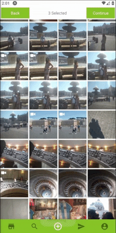
- expo multiple image selector
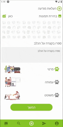
- Allow selecting multiple Photos or Videos.
- Allow getting extra metadata.
- Allow resizing and get base64 images.
- Permission requests built in.
- Support Both landscape and portrait.
- Simple Indicator for the selected Assets.
- Custom Indicator for the selected Assets.
- Allow using custom navbar component.
- Optimized for speed.
Usage
- Install with
$ npm install expo-images-picker
or
$ yarn add expo-images-picker
- import to the top of your file like
import { AssetsSelector } from 'expo-images-picker'
- install @expo-vectors package and send icons as props to the widget
import { Ionicons } from '@expo/vector-icons'
- Use the imported as Following =>
<AssetsSelector
Settings={widgetSettings}
Errors={widgetErrors}
Styles={widgetStyles}
Resize={widgetResize}
Navigator={widgetNavigator}
CustomNavigator={{
Component: CustomNavigator,
props: {
backFunction: true,
onSuccess,
text: T.ACTIONS.SELECT,
},
}}
/>
##[📚 Params]
Settings :
you better create this const out of your component ,
if you do need it inside your component ,
use useMemo from react.
   const widgetSettings = useMemo(
       () => ({
           getImageMetaData: false,
           initialLoad: 100,
           assetsType: [MediaType.photo, MediaType.video],
           minSelection: 1,
           maxSelection: 3,
           portraitCols: 4,
           landscapeCols: 4,
       }),
       []
   )
getImageMetaData - return an asset with extra metadata fields * may cause slower results .
but on some ios versions its a must , because u need the absolute file path file:// and not asset-library://
-
initialLoad - initial amount of assets to load first time.
-
assetsType - array that includes [MediaType.photo, MediaType.video].
[photo , video ].
-
minSelection - min amount of images user need to select.
-
maxSelection - max amount of images user need to select.
-
portraitCols - Number of columns in portrait Mode.
-
landscapeCols - Number of columns in landscape Mode.
Errors :
    const widgetErrors = useMemo(
        () => ({
            errorTextColor: polar_text_2,
            errorMessages: {
                hasErrorWithPermissions: translator(
                    T.ERROR.HAS_PERMISSIONS_ERROR
                ),
                hasErrorWithLoading: translator(T.ERROR.HAS_INTERNAL_ERROR),
                hasErrorWithResizing: translator(T.ERROR.HAS_INTERNAL_ERROR),
                hasNoAssets: translator(T.ERROR.HAS_NO_ASSETS),
            },
        }),
        []
    )
-
onError - callback function that you can pass and will fire whenever there is an error.
-
errorTextColor - set the text color of an error message.
-
errorMessages
`hasErrorWithPermissions`- error text when there are no permissions.
`hasErrorWithLoading` - error text for issue with loading assets.
`hasErrorWithResizing` - error text for issue with resizing.
`hasNoAssets` - text shows when there are no assets to show.
Styles :
    const widgetStyles = useMemo(
        () => ({
            margin: 2,
            bgColor: bg,
            spinnerColor: main,
            widgetWidth: 99,
            videoIcon: {
                Component: Ionicons,
                iconName: 'ios-videocam',
                color: polar_text_1,
                size: 20,
            },
            selectedIcon: {
                Component: Ionicons,
                iconName: 'ios-checkmark-circle-outline',
                color: 'white',
                bg: mainWithOpacity,
                size: 26,
            },
        }),
        [polar_text_1, mainWithOpacity]
    )
-
margin - set margin between the images.
-
bgColor - set the widget background color.
-
spinnerColor - set the color of the spinner (loading indicator).
-
widgetWidth - the widget width in percentages .
-
videoIcon
Component - the icon component.(from @expo/vector-icons).
iconName - the icon name.
Component - the icon color.
Component - the icon size.
-
selectedIcon - the widget width in percentages .
Component - the icon component.(from @expo/vector-icons).
iconName - the icon name.
color - the icon color.
bg - set the cover color when an asset is select.
size - the icon size.
Navigator :
    const widgetNavigator = useMemo(
        () => ({
            Texts: {
                finish: 'finish',
                back: 'back',
                selected: 'selected',
            },
            midTextColor: polar_text_2,
            minSelection: 3,
            buttonTextStyle: _textStyle,
            buttonStyle: _buttonStyle,
            onBack: () => navigation.goBack(),
            onSuccess: (data: Asset[]) => onSuccess(data),
        }),
        []
    )
-
Texts - send in finish back selected texts.
-
midTextColor - set the color of the middle text aka "selected" .
-
minSelection - set the min selection , continue button will be unavailable until user select this amount of images.
-
buttonTextStyle - Text Style Object , design the text inside the buttons.
-
buttonStyle - View Style Object, design the button itself.
-
onBack - Send in a function to go back to your screen.
-
onSuccess - Send in a function to go back and send the returned data.
Resize :
    const widgetResize = useMemo(
        () => ({
            width: 512,
            compress: 0.7,
            base64: false,
            saveTo: SaveType.JPG,
        }),
        []
    )
**Note that using manipulate might result with crash or slow loading times on older phones.
- All fields are optional , in order to resize and keep images Ratio its recommend sending only width or height, and it will resize using this axis only.
-
width - Manipulate image width optional
-
height - Manipulate image width optional
-
compress - compress 0.1 Super low quality 1.0 leave as is (high quality).
-
base64 - will add extra result , image as a base64 string.
-
saveTo - can be png or jpeg .
CustomNavigator :
Make sure your CustomTopNavigator can receive onSuccess function.
And bind this onFinish function on the correct button.
<AssetsSelector
  options={{
    ...otherProps,
    CustomTopNavigator: {
      Component: CustomNavImageSelection,
      props: {
        onSuccess: (data: Asset[]) => onDone(data),
        backFunction: true,
        text: T.ACTIONS.SELECT
      },
    },
  }}
/>


