Product
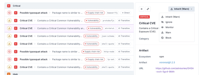
Introducing Enhanced Alert Actions and Triage Functionality
Socket now supports four distinct alert actions instead of the previous two, and alert triaging allows users to override the actions taken for all individual alerts.
focus-trap-react
Advanced tools
Package description
The focus-trap-react package is a React wrapper for the focus-trap library, which is used to manage focus within a DOM node. This is particularly useful for accessibility purposes, ensuring that keyboard navigation is contained within a specific area, such as a modal dialog or a dropdown menu.
Basic Focus Trap
This example demonstrates a basic focus trap that contains three buttons. When the focus is within this div, it will be trapped and cannot move outside of it using keyboard navigation.
import React from 'react';
import FocusTrap from 'focus-trap-react';
const BasicFocusTrap = () => (
<FocusTrap>
<div>
<button>Button 1</button>
<button>Button 2</button>
<button>Button 3</button>
</div>
</FocusTrap>
);
export default BasicFocusTrap;Focus Trap with Initial Focus
This example shows a focus trap where the initial focus is set to a specific button using the `initialFocus` prop. When the focus trap is activated, the focus will automatically move to the button with the ID 'initial-focus'.
import React from 'react';
import FocusTrap from 'focus-trap-react';

const FocusTrapWithInitialFocus = () => (
  <FocusTrap initialFocus='#initial-focus'>
    <div>
      <button id='initial-focus'>Initial Focus Button</button>
      <button>Button 2</button>
      <button>Button 3</button>
    </div>
  </FocusTrap>
);

export default FocusTrapWithInitialFocus;
Focus Trap with Return Focus
This example demonstrates a focus trap that will return the focus to the element that activated it once the trap is deactivated. The `returnFocus` prop ensures that the focus goes back to the button that was clicked to activate the focus trap.
import React, { useState } from 'react';
import FocusTrap from 'focus-trap-react';

const FocusTrapWithReturnFocus = () => {
  const [isTrapActive, setIsTrapActive] = useState(false);

  return (
    <div>
      <button onClick={() => setIsTrapActive(true)}>Activate Focus Trap</button>
      {isTrapActive && (
        <FocusTrap returnFocus>
          <div>
            <button onClick={() => setIsTrapActive(false)}>Deactivate Focus Trap</button>
            <button>Button 2</button>
            <button>Button 3</button>
          </div>
        </FocusTrap>
      )}
    </div>
  );
};

export default FocusTrapWithReturnFocus;react-focus-lock is another React component that provides a focus management solution. It ensures that the focus stays within a specified area, similar to focus-trap-react. However, react-focus-lock offers additional features like auto-locking and focus restoration, making it a more feature-rich alternative.
react-aria-modal is a React component for creating accessible modal dialogs. It includes focus trapping as part of its functionality, ensuring that keyboard navigation is contained within the modal. While it is more specialized for modal dialogs, it provides a robust solution for focus management within modals.
react-modal is a widely-used React component for creating modals. It includes built-in focus management to trap focus within the modal when it is open. While it is primarily focused on modal dialogs, it offers a comprehensive solution for focus trapping within modals.
Changelog
2.1.1
Readme
A React component that traps focus.
This component is a light wrapper around focus-trap, tailored to your React-specific needs.
You might want it for, say, building an accessible modal?
Please read the focus-trap documentation to understand what a focus trap is, what happens when a focus trap is activated, and what happens when one is deactivated.
This module simply provides a React component that creates a focus trap.
npm install focus-trap-react
Version 2+ is compatible with React 0.14.x.
Version 1 is compatible with React 0.13.x.
Basically IE9+. See .zuul.yml for more details.
Why? Because this module's core functionality comes from focus-trap, which uses a couple of IE9+ functions.
Automated testing is done with zuul and Open Suace.
Read code in demo/ (it's very simple), and see how it works.
Here's one simple example:
var React = require('react');
var FocusTrap = require('focus-trap-react');

var DemoOne = React.createClass({
  getInitialState: function() {
    return {
      activeTrap: false,
    };
  },

  mountTrap: function() {
    this.setState({ activeTrap: true });
  },

  unmountTrap: function() {
    this.setState({ activeTrap: false });
  },

  render: function() {
    var trap = (this.state.activeTrap) ? (
      <FocusTrap
        onDeactivate={this.unmountTrap}
        className='trap'
      >
        <p>
          Here is a focus trap <a href='#'>with</a> <a href='#'>some</a> <a href='#'>focusable</a> parts.
        </p>
        <p>
          <button onClick={this.unmountTrap}>
            deactivate trap
          </button>
        </p>
      </FocusTrap>
    ) : false;

    return (
      <div>
        <p>
          <button onClick={this.mountTrap}>
            activate trap
          </button>
        </p>
        {trap}
      </div>
    );
  },
});
Easy enough.
Type: Function, required
This function is called when the FocusTrap deactivates. If, for example, a user hits Escape within the FocusTrap, the trap deactivates; and you need to tell it what to do next. The FocusTrap does not manage its own visible/hidden state: you do that.
Type: String, optional
By default, when the FocusTrap activates it will pass focus to the first element in its tab order. If you want that initial focus to pass to some other element (e.g. a Submit button at the bottom of a modal dialog),
pass a selector identifying the element that should receive initial focus when the FocusTrap activates.
(This will be passed to document.querySelector() to find the element.)
See demo/demo-two.jsx.
Type: Boolean, Default: true
If false, the Escape key will not trigger deactivation of the focus trap. This can be useful if you want to force the user to make a decision instead of allowing an easy way out.
Type: Boolean, Default: false
If true, a click outside the focus trap will deactivate the focus trap and allow the click event to carry on.
Type: Boolean, optional
By default, the FocusTrap activates when it mounts. So you activate and deactivate it via mounting and unmounting. If, however, you want to keep the FocusTrap mounted while still toggling its activation state, you can do that with this prop.
See demo/demo-three.jsx.
Type: String, Default: div, optional
An HTML tag for the FocusTrap's DOM node.
All props not mentioned above are passed directly to the <div> element. This means that you can pass id, className, style, aria-attributes, data-attributes, or any other arbitrary property that you want to use to customize the element.
Please note that this project is released with a Contributor Code of Conduct. By participating in this project you agree to abide by its terms.
Lint with npm run lint.
Test with npm run test-dev, which will give you a URL to open in your browser. Look at the console log for TAP output.
FAQs
A React component that traps focus.
The npm package focus-trap-react receives a total of 621,122 weekly downloads. As such, focus-trap-react popularity was classified as popular.
We found that focus-trap-react demonstrated a healthy version release cadence and project activity because the last version was released less than a year ago. It has 4 open source maintainers collaborating on the project.
Did you know?

Socket for GitHub automatically highlights issues in each pull request and monitors the health of all your open source dependencies. Discover the contents of your packages and block harmful activity before you install or update your dependencies.

Product
Socket now supports four distinct alert actions instead of the previous two, and alert triaging allows users to override the actions taken for all individual alerts.

Security News
Polyfill.io has been serving malware for months via its CDN, after the project's open source maintainer sold the service to a company based in China.

Security News
OpenSSF is warning open source maintainers to stay vigilant against reputation farming on GitHub, where users artificially inflate their status by manipulating interactions on closed issues and PRs.