Hotel Datepicker
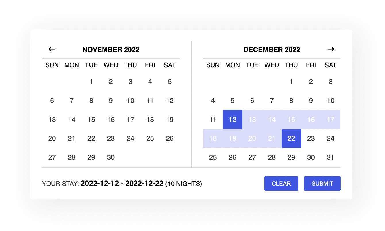
The Hotel Datepicker is a responsive JavaScript date range picker for hotels. It supports modern browsers and it requires Fecha 4.0.0 (or above).
View the demo here.

Installation
As a module:
Install with:
npm i hotel-datepicker
Then import the modules with:
import * as fecha from "fecha";
import HotelDatepicker from "hotel-datepicker";
import "hotel-datepicker/dist/css/hotel-datepicker.css";
As a script:
Download Fecha.
[BREAK CHANGE] Use Fecha 4.0.0 or above.
Include files:
<link href="/path/to/hotel-datepicker.css" rel="stylesheet" />
<script src="/path/to/fecha.js"></script>
<script src="/path/to/hotel-datepicker.min.js"></script>
Usage
Initialize with vanilla JS.
<input id="input-id" type="text" />
var hdpkr = new HotelDatepicker(document.getElementById("input-id"), options);
Options
className
- Type:
String - Default:
datepicker
The CSS selector of the datepicker.
format
- Type:
String - Default:
YYYY-MM-DD
The date format string.
infoFormat
- Type:
String - Default:
YYYY-MM-DD
The date format string in the info box. If not set, it uses the format option.
ariaDayFormat
- Type:
String - Default:
dddd, MMMM DD, YYYY
The date format string in the aria label strings.
separator
The separator string used between date strings.
startOfWeek
- Type:
String - Default:
sunday
Default start week: sunday or monday.
startDate
- Type:
Date or String - Default:
new Date()
The start view date. All the dates before this date will be disabled.
endDate
- Type:
Date or String or Boolean - Default:
false
The end view date. All the dates after this date will be disabled.
minNights
Minimum nights required to select a range of dates.
maxNights
Maximum nights required to select a range of dates.
minNightsMultiple
- Type:
Boolean - Default:
false
If true, only ranges that are multiples of minNights are allowed.
selectForward
- Type:
Boolean - Default:
false
If true, the selection of the second date must be after the first date. If false, you can select a range of dates in both directions.
disabledDates
An array of strings in this format: 'YYYY-MM-DD' (note the ''). All the dates passed to the list will be disabled.
enableCheckout
- Type:
Boolean - Default:
false
If true, allows the checkout on a disabled date. But with a criteria. Let's say we have these disabled dates: 03 April 2020 and 04 April 2020. With this option enabled, an user can still select the first date (03 April 2020) for the checkout. But not 04 April 2020.
noCheckInDates
An array of strings in this format: 'YYYY-MM-DD' (note the ''). All the dates passed to the list will not allow a check-in on that day.
noCheckOutDates
An array of strings in this format: 'YYYY-MM-DD' (note the ''). All the dates passed to the list will not allow a check-out on that day.
disabledDaysOfWeek
An array of strings of day names in your language (same names used in i18n['day-names']): 'Monday' (note the '' and the uppercase).
noCheckInDaysOfWeek
An array of strings of day names in your language (same names used in i18n['day-names']): 'Monday' (note the '' and the uppercase).
noCheckOutDaysOfWeek
An array of strings of day names in your language (same names used in i18n['day-names']): 'Monday' (note the '' and the uppercase).
["Monday", "Tuesday", "Wednesday"];
container
An element for putting the datepicker. If not set, the datepicker will be appended to the parent of the input.
inline
- Type:
Boolean - Default:
false
Render the datepicker inline.
clearButton
- Type:
Boolean - Default:
false
If true, a button to clear the selected dates is shown. Works only when showTopbar is true.
submitButton
- Type:
Boolean - Default:
false
If true, a submit button is shown. Works only when inline and showTopbar are true.
submitButtonName
The name of the button to reference the form-data. Works only when submitButton is true.
animationSpeed
The duration (in seconds) of the animation (open/close datepicker).
hoveringTooltip
- Type:
Boolean or Function - Default:
true
Shows a tooltip when hovering a date. It can be a custom function:
hoveringTooltip: function(nights, startTime, hoverTime) {
    return nights;
}
showTopbar
- Type:
Boolean - Default:
true
Show/hide the toolbar.
topbarPosition
Set the position of the toolbar.
autoClose
- Type:
Boolean - Default:
true
Close the datepicker after the selection of the second date.
preventContainerClose
- Type:
Boolean - Default:
false
When a click is done outside the datepicker container, the datepicker closes. Use this option to disable this behavior.
moveBothMonths
- Type:
Boolean - Default:
false
Move both months when clicking on the next/prev month button.
closeOnScroll
- Type:
Boolean - Default:
false
Close datepicker on scroll. Some devices might trigger the scroll event in an unpredictable way. Use it at your own risk.
onDayClick
- Type:
Function - Default:
false
Run a custom function every time a day is clicked:
onDayClick: function() {
    console.log('Day clicked!');
}
onOpenDatepicker
- Type:
Function - Default:
false
Run a custom function when the datepicker is opened:
onOpenDatepicker: function() {
    console.log('Datepicker opened!');
}
onSelectRange
- Type:
Function - Default:
false
Run a custom function when a range is selected:
onSelectRange: function() {
    console.log('Date range selected!');
}
- Type:
Function - Default:
false
Run a custom function to show extra text in day cells:
extraDayText: function(date, attributes) {
    if (attributes.class.includes("datepicker__month-day--visibleMonth")) {
        console.log(date);
        console.log(attributes);
        return "<span>$150</span>";
    }
}
i18n
[BREAK CHANGE] Two new options has been introduced in the v.3: month-names-short and day-names-short. Previously, the short day name version ('Sun', 'Mon', 'Tue', etc) was used in the day-names option. Now, the day-names option uses the long version.
Default:
i18n: {
    selected: 'Your stay:',
    night: 'Night',
    nights: 'Nights',
    button: 'Close',
    clearButton: 'Clear',
    submitButton: 'Submit',
    'checkin-disabled': 'Check-in disabled',
    'checkout-disabled': 'Check-out disabled',
    'day-names-short': ['Sun', 'Mon', 'Tue', 'Wed', 'Thu', 'Fri', 'Sat'],
    'day-names': ['Sunday', 'Monday', 'Tuesday', 'Wednesday', 'Thursday', 'Friday', 'Saturday'],
    'month-names-short': ['Jan', 'Feb', 'Mar', 'Apr', 'May', 'Jun', 'Jul', 'Aug', 'Sep', 'Oct', 'Nov', 'Dec'],
    'month-names': ['January', 'February', 'March', 'April', 'May', 'June', 'July', 'August', 'September', 'October', 'November', 'December'],
    'error-more': 'Date range should not be more than 1 night',
    'error-more-plural': 'Date range should not be more than %d nights',
    'error-less': 'Date range should not be less than 1 night',
    'error-less-plural': 'Date range should not be less than %d nights',
    'info-more': 'Please select a date range of at least 1 night',
    'info-more-plural': 'Please select a date range of at least %d nights',
    'info-range': 'Please select a date range between %d and %d nights',
    'info-range-equal': 'Please select a date range of %d nights',
    'info-default': 'Please select a date range',
    'aria-application': 'Calendar',
    'aria-selected-checkin': 'Selected as check-in date, %s',
    'aria-selected-checkout': 'Selected as check-out date, %s',
    'aria-selected': 'Selected, %s',
    'aria-disabled': 'Not available, %s',
    'aria-choose-checkin': 'Choose %s as your check-in date',
    'aria-choose-checkout': 'Choose %s as your check-out date',
    'aria-prev-month': 'Move backward to switch to the previous month',
    'aria-next-month': 'Move forward to switch to the next month',
    'aria-close-button': 'Close the datepicker',
    'aria-clear-button': 'Clear the selected dates',
    'aria-submit-button': 'Submit the form'
}
Methods
getValue()
This function is called when the picker gets the date range string from the input.
setValue()
This function is called when the picker sets the input value.
API
open()
Opens the datepicker.
close()
Closes the datepicker.
getDatePicker()
Gets the datepicker DOM element.
setRange(d1, d2)
Sets the date range value.
clear()
Clears the datepicker value.
getNights()
Gets the number of nights selected. Returns 0 otherwise.
destroy()
Destroys the datepicker.
Events
afterClose
You can listen for this event when the datepicker closes.
var input = document.getElementById("input-id");

input.addEventListener(
    "afterClose",
    function () {
        console.log("Closed!");
    },
    false
);
afterClear
You can listen for this event when the datepicker clears the dates.
var input = document.getElementById("input-id");

input.addEventListener(
    "afterClear",
    function () {
        console.log("Cleared!");
    },
    false
);
Keyboard Shortcuts
←/→: Move backward (left) and forward (right) by one day.↑/↓: Move backward (up) and forward (down) by one week.PGUP/PGDN: Switch months.HOME/END: Go to the first or last day of a week.↵: Select the date in focus or trigger click on button in focus.ESC: Return to the date input field.
Versioning
Maintained under the Semantic Versioning guidelines.
Credits
Hotel Datepicker was initially developed as a fork of jQuery Date Range Picker Plugin by Chunlong. But it was entirely rewritten in the version 2. It is now an independent project.
License
MIT Copyright (c) 2024 Benito Lopez


