InTouch-Phone-Input
Highly customizable phone input component with auto formatting for InTouch projects.


Installation
npm install intouch-phone-input --save
Usage
import PhoneInput from "intouch-phone-input";
import "intouch-phone-input/lib/style.css";

<PhoneInput
  country={"us"}
  value={this.state.phone}
  onChange={(phone) => this.setState({ phone })}
/>;
available styles - style • high-res • material • bootstrap • semantic-ui • plain
Options
| Name | Type | Description | Example |
|---|
| country | string | initial country | 'us' | 1 |
| value | string | input state value |
| onlyCountries | array | country codes to be included | ['cu','cw','kz'] |
| preferredCountries | array | country codes to be at the top | ['cu','cw','kz'] |
| excludeCountries | array | array of country codes to be excluded | ['cu','cw','kz'] |
| placeholder | string | custom placeholder |
| inputProps | object | props to pass into the input |
| Booleans | Default | Description |
|---|
| autoFormat | true | on/off phone formatting |
| disabled | false | disable input and dropdown |
| disableDropdown | false | disable dropdown only |
| disableCountryCode | false | |
| enableAreaCodes | false | enable local codes for all countries |
| enableTerritories | false | enable dependent territories with population of ~100,000 or lower |
| enableLongNumbers | false | boolean/number |
| countryCodeEditable | true | |
| enableSearch | false | enable search in the dropdown |
| disableSearchIcon | false | hide icon for the search field |
<PhoneInput
  inputProps={{
    name: "phone",
    required: true,
    autoFocus: true,
  }}
/>
Contents
Style
| containerClass | string | class for container |
| inputClass | string | class for input |
| buttonClass | string | class for dropdown button |
| dropdownClass | string | class for dropdown container |
| searchClass | string | class for search field |
| containerStyle | object | styles for container |
| inputStyle | object | styles for input |
| buttonStyle | object | styles for dropdown button |
| dropdownStyle | object | styles for dropdown container |
| searchStyle | object | styles for search field |
Events
| onChange | onFocus | onBlur | onClick | onKeyDown |
onChange(value, country, e, formattedValue)
Country data object not returns from onKeyDown event
| Data | Type | Description |
|---|
| value/event | string/object | event or the phone number |
| country data | object | country object { name, dialCode, countryCode (iso2) } |
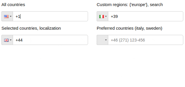
Regions
| Name | Type | Description |
|---|
| regions | array/string | to show countries only from specified regions |
| Regions |
|---|
| ['america', 'europe', 'asia', 'oceania', 'africa'] |
| Subregions |
|---|
| ['north-america', 'south-america', 'central-america', 'carribean', 'eu-union', 'ex-ussr', 'ex-yugos', 'baltic', 'middle-east', 'north-africa'] |
<PhoneInput
  country='de'
  regions={'europe'}
/>

<PhoneInput
  country='us'
  regions={['north-america', 'carribean']}
/>
Predefined localization
es Spanish, de Deutsch, ru Russian, fr French
jp Japanese, cn Chinese, pt Portuguese, it Italian
ir Iranian, ar Arabic, tr Turkish, id Indonesian
hu Hungarian, pl Polish, ko Korean
import es from "react-phone-input-2/lang/es.json";

<PhoneInput localization={es} />;
Local area codes
<PhoneInput
  enableAreaCodes={true}
  enableAreaCodes={["us", "ca"]}
  enableAreaCodeStretch
/>
Flexible mask
If enableAreaCodeStretch is added, the part of the mask with the area code will not stretch to length of the respective section of phone mask.
Example: +61 (2), +61 (02)
Custom masks
<PhoneInput
  onlyCountries={["fr", "at"]}
  masks={{ fr: "(...) ..-..-..", at: "(....) ...-...." }}
/>
Custom area codes
<PhoneInput
  onlyCountries={["gr", "fr", "us"]}
  areaCodes={{ gr: ["2694", "2647"], fr: ["369", "463"], us: ["300"] }}
/>
Other props
| defaultMask | ... ... ... ... .. |
| alwaysDefaultMask | false |
| prefix | + |
| searchPlaceholder | 'search' |
| searchNotFound | 'No entries to show' |
| copyNumbersOnly | true |
| renderStringAsFlag | string |
| autocompleteSearch | false |
| jumpCursorToEnd | false |
| priority | {{ca: 0, us: 1, kz: 0, ru: 1}} |
| enableClickOutside | true |
| showDropdown | false |
| defaultErrorMessage | string |
| specialLabel | string |
| disableInitialCountryGuess | false |
| disableCountryGuess | false |
Custom localization
<PhoneInput
  onlyCountries={['de', 'es']}
  localization={{de: 'Deutschland', es: 'España'}}
/>

<PhoneInput
  onlyCountries={['de', 'es']}
  localization={{'Germany': 'Deutschland', 'Spain': 'España'}}
/>
Preserve countries order
<PhoneInput
  onlyCountries={["fr", "at"]}
  preserveOrder={["onlyCountries", "preferredCountries"]}
/>
Guides
Phone without dialCode
handleOnChange(value, data, event, formattedValue) {
  this.setState({ rawPhone: value.slice(data.dialCode.length) })
}
Check validity of the phone number
isValid(value, country, countries, hiddenAreaCodes)
<PhoneInput
  isValid={(value, country) => {
    if (value.match(/12345/)) {
      return "Invalid value: " + value + ", " + country.name;
    } else if (value.match(/1234/)) {
      return false;
    } else {
      return true;
    }
  }}
/>
import startsWith from "lodash.startswith";

<PhoneInput
  isValid={(inputNumber, country, countries) => {
    return countries.some((country) => {
      return (
        startsWith(inputNumber, country.dialCode) ||
        startsWith(country.dialCode, inputNumber)
      );
    });
  }}
/>;
Clear country
To clear country, pass null as value.
Dynamic placeholder
Show
const phoneCountryFormat = useMemo(
() => phoneCountry?.format || undefined,
[phoneCountry]
);
const placeholder = useMemo(() => {
if (phoneCountryFormat) {
const words = phoneCountryFormat.split(" ");
words.shift();
let text = words.join(" ");
if (country === "fr") {
text = text.replace(".", "6");
}
while (text.indexOf(".") > -1) {
text = text.replace(
".",
`${Math.min(9, Math.max(1, Math.floor(Math.random() * 10)))}`
);
}
return text;
}
return "";
}, [phoneCountryFormat, country]);
Based on react-phone-input-2


